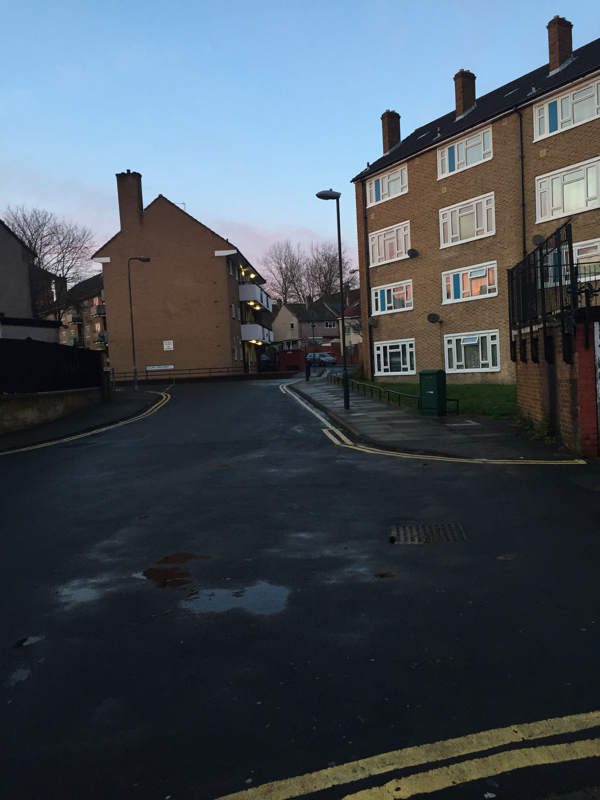
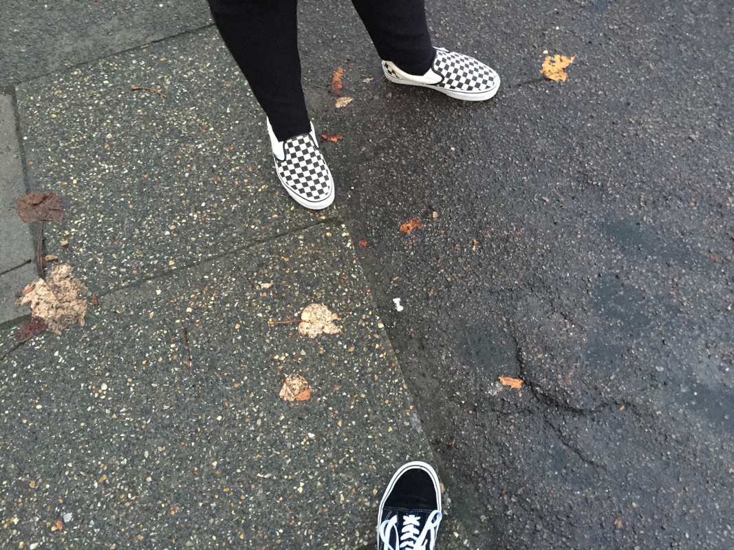
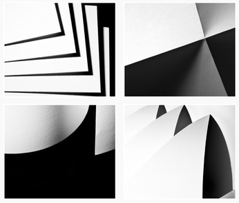
This term our focus is "Edges".In photography you would look at objects way different then you would if you did not the world would be dull. Here are the "Edges" work I have so far been doing:
WWW ( What Went Well) :
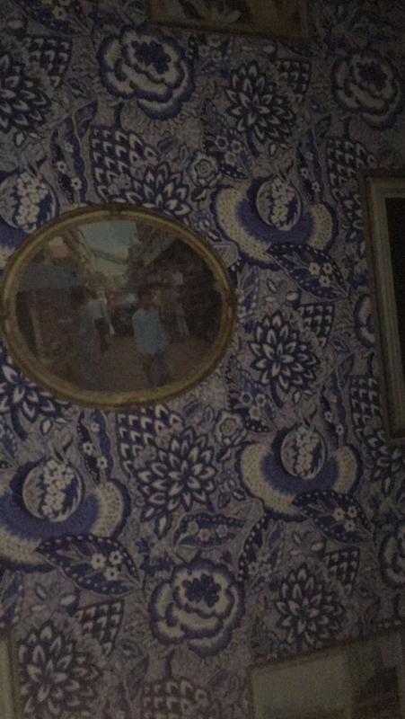
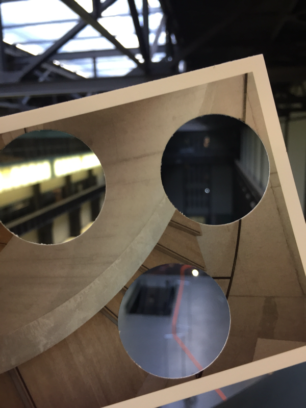
The pictures I took were different as in when the mirror was in the trees it looks abstract because the tree is kind of splitting up the mirror and you can see the tree in different types of ways.
EBI (Even Better If ) :
I could have tried more different ways of taking the edge of things because most of them was the whole mirror which looked kind of wired.

|
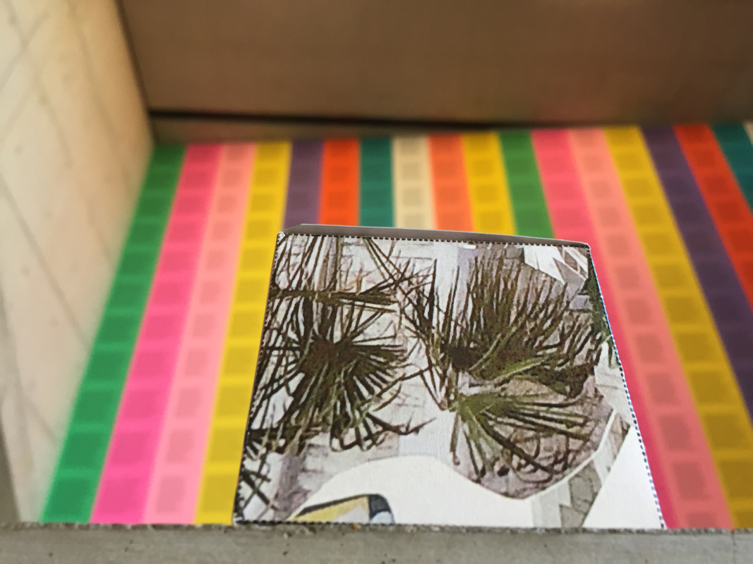
WWW (What Went Well) :This is my favourite picture because it has different textures that you can see.
EBI (Even Better If) : Next time i take these types of pictures i would make the camera stay still it would have been better because the camera has been exposed for too long. |
I took some pictures (interesting ones) but we had to do it in away that no one would really do , fold it in different ways. .
I picked one of my pictures that was too dark and I wanted too lighten it up. So I went to photoshop clicked on images (on the menu bar) and clicked on adjustments and a variation of tools are there , but i clicked on "Curves" and the first image you see of a straight line on a graph and then i moved it around to lighten the background and i wanted the paper to be more white. So i just kept moving it around till i thought it was perfect.And the last picture is how it turn't out . Photoshop is really hard the whole class kept calling sir but it is really helpful for your work.
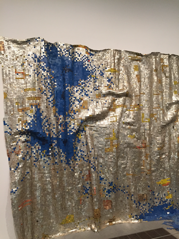
Here is some of John Reed's paper works.
I think the way he did it he probably had a team holding down the pieces of papers down or he selo-taped it , either way he is doing a great job.
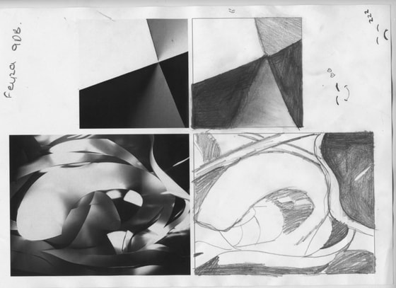
.Sir set us a task on were we had to draw 2 pictures the top one was really easy but the bottom one was really difficult.
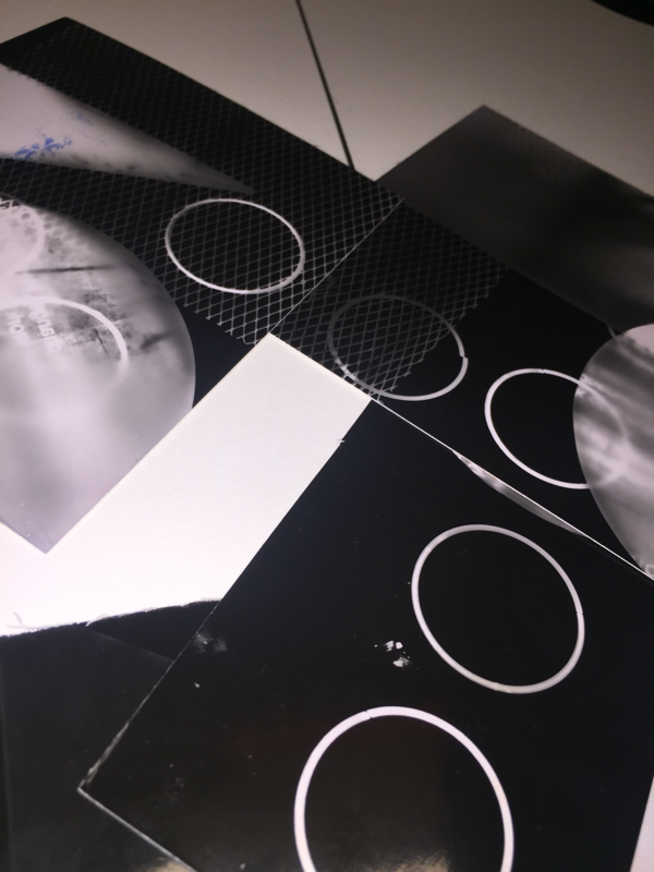
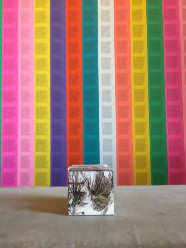
As you see here i took some odd pictures with coloured paper inspired by many many artists/photographers.
WWW(What Went Well): The cuts on some were really good so that light can seep through it which I thought was really good.
EBI(Even Better If): The artist made their work look like a structure and mine actually looks like a piece of paper with some cuts, next time Im going to make sure it looks more abstract.
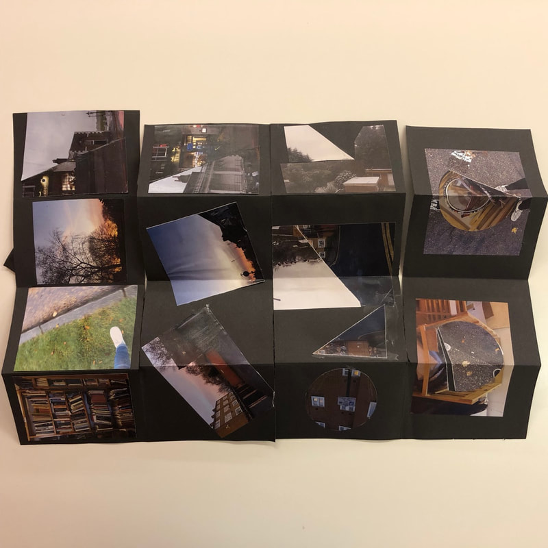
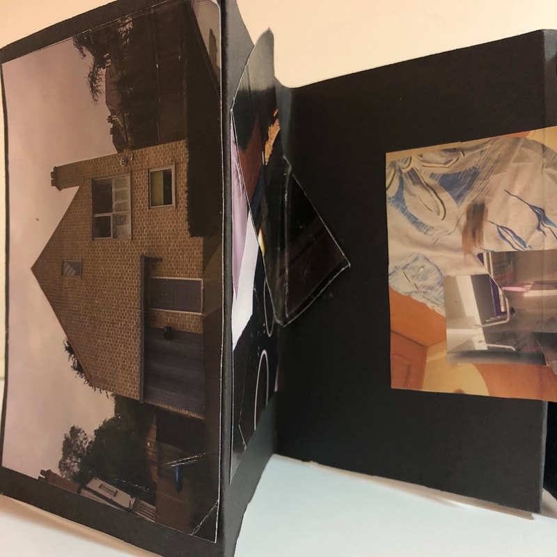
CONCERTNA BOOK:
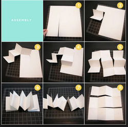
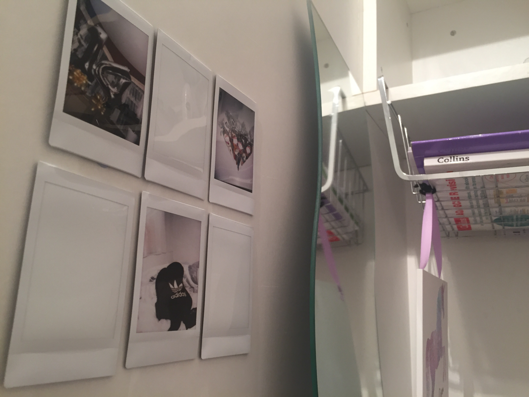
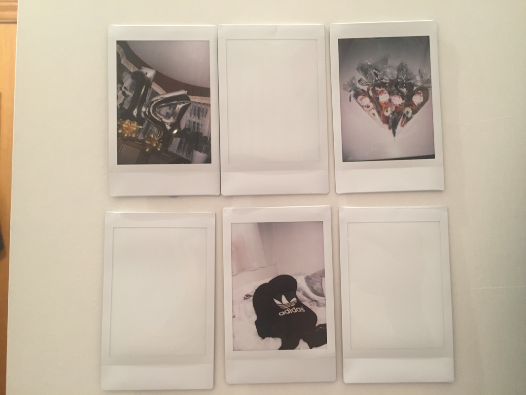
As shown on here this is a concertina book.All my pictures that I took over half term were put on to a concertina book that we had to make. Here is my concertina book:
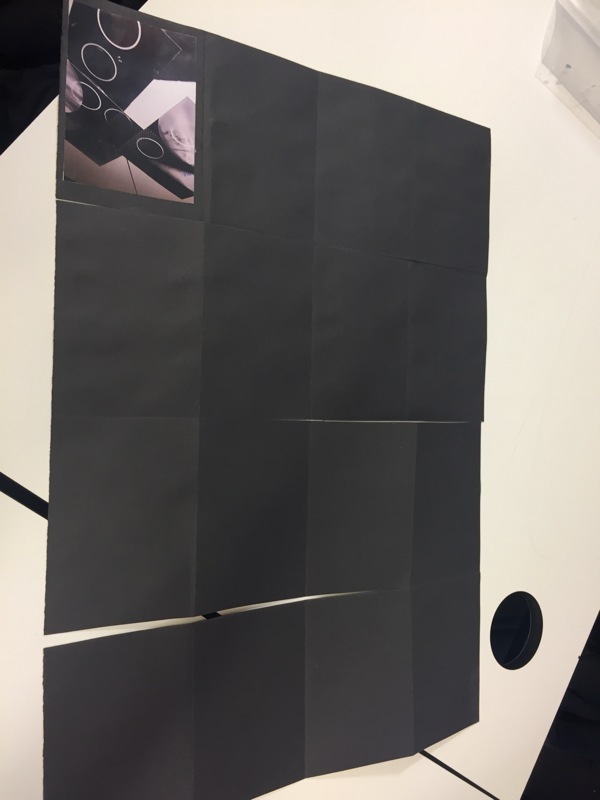
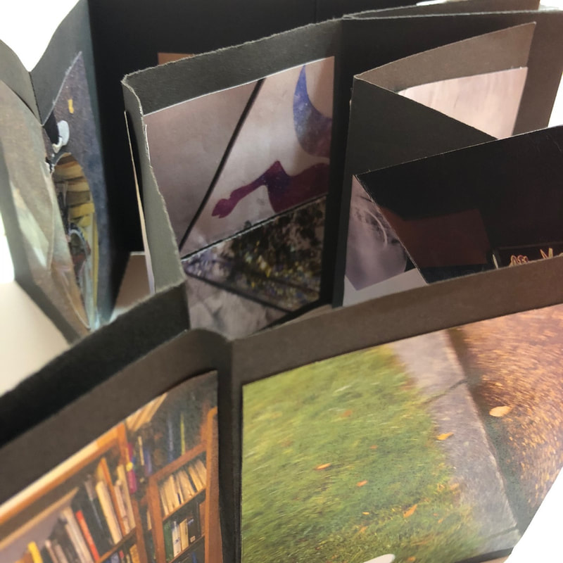
On the edges book I think I did really good I would do it again and I am really happy on how it turned out, but I would do a different colour and different material and maybe try different size of paper and maybe a small piece or a really big piece.
Edges Assessment:
This assessment is to give us a practice to working to a deadline.I chose these pictures because they are all linked by the colour green. Some are city pictures some are actual pictures of grass and some are pictures of buildings. Here are the pictures that i took:
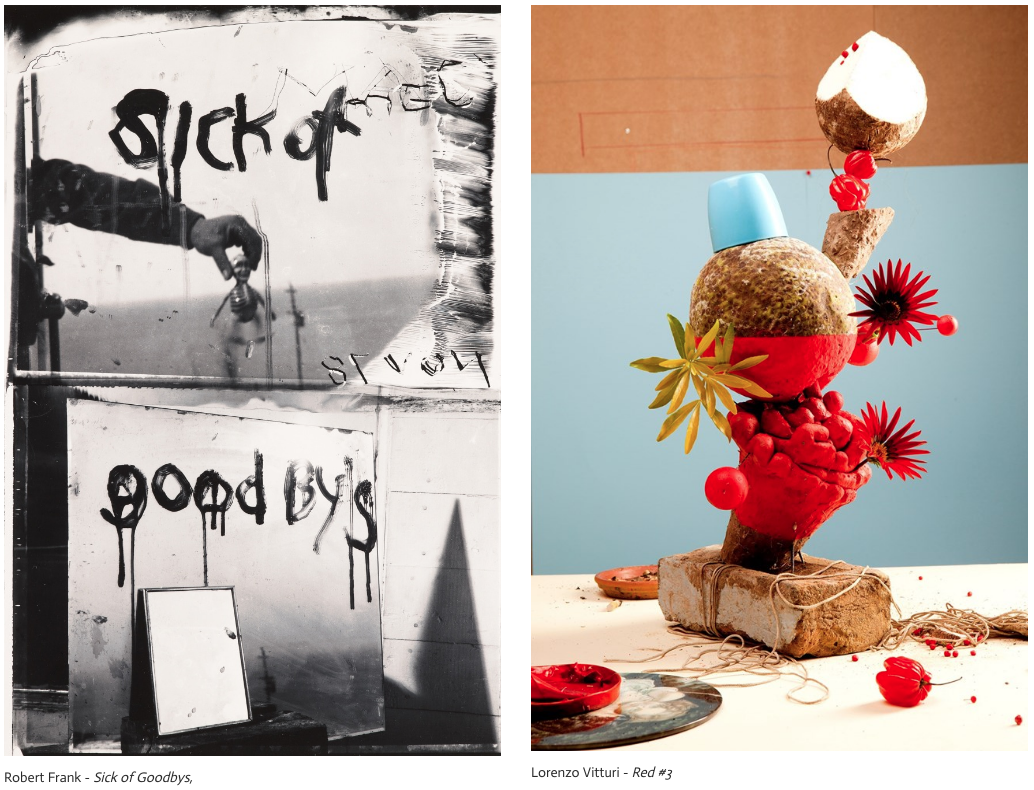
In Robert Franks's image 'Sick of Goodbys' the image would firstly suggest a eerie mood.The genre of the photo is more portrait, however there are/is a landscape, the sea and there is a still life that we can see that looks like some sort of skeleton. The thing that seems new to me is that this would not be your first thought on 'how do I make this setting more eerie and uncomfortable?' However, Lornzo Vitturi's photo 'red 1' gives a more sophisticated look but also a messy mood aswell. The genre is limited theres still life in most of it but it's also portrait. The unusualness of the image is that there is a fruit and they are put onto each other in a more abstract way.
There is a few similar things with both of these images, they are both complex images. They have more than 2 things in there images . The format is similar ,they are both portrait not landscape. The focus of them are both in great focus. The more darker objects are at the front, this is unusual because we would generally want the darker things at the back so the light objects can be seen but in this case its the other way around. The Frank piece is a little of everything, it has fore ground which is the mirror, middle ground which is the doll and background is the sea and shadows. Vitturi's piece only has foreground and a mix of middle and backgrounds. The objects are foreground and the 'back' is a mix of them both.The doll I find interesting because it gives a creepy setting to the picture, and the red pot is also interesting because that is mostly were all the red comes from and it gives it a warm feeling.
The difference kinds of edges I can see are the mirrors shadows edges, the mirrors edges, the fruits edges and the bricks edge.They both have a different relationship with edges 'Sick of Goodbys' has a lot of edges and shapes, however 'Red 1' has edges but ones that aren't really easy to spot. I would ask Robert Frank, was it hard to take this eerie picture with out getting a lot of attention? Where did the idea come from? For Vitturi I would ask : was it hard to put them in a way that they wouldn't fall? Whilst you were doing or planning it did you want there to be harmonizing and contrasting colours?
I would rename Frank's photograph ' Eerie Doll ' because the doll/skeleton looks so awkward but it compliments the picture as the picture is supposed to give you a eerie mood. I would rename Vitturi's photograph 'Red Coconut' because theres alot of red but theres also a few coconuts there, which I really like. If i were in those pictures I would feel scared - for franks- but I would also feel truth full with whats on the mirrors. I would feel calm and relaxed for Vituris because the colours are nice and warm colours which are relaxing colours that'll make you more calm and relaxed.I think the reason they chose these objects and settings because no one would do them either because they didn't know if they were up to that challenge or they just didn't have the same idea and they both are different photographs who actually are up to take risks.
EDGES ASSESSMENT:
When i did this assessment i realised that it was difficult at times but we still did really well during it. If we did another assesment i wouldn't be as nervous as i was definatlely because i now know how we do assessments in photography.
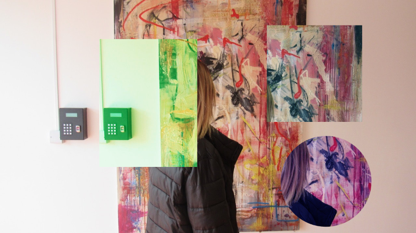
TATE MODERN.
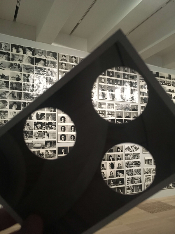
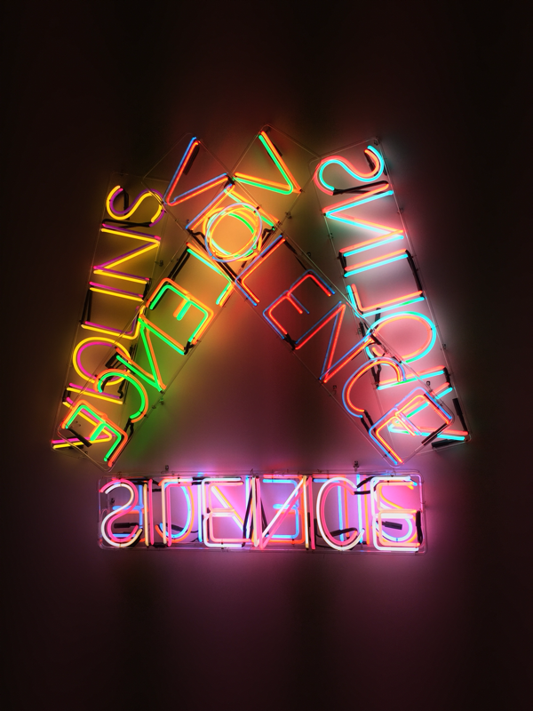
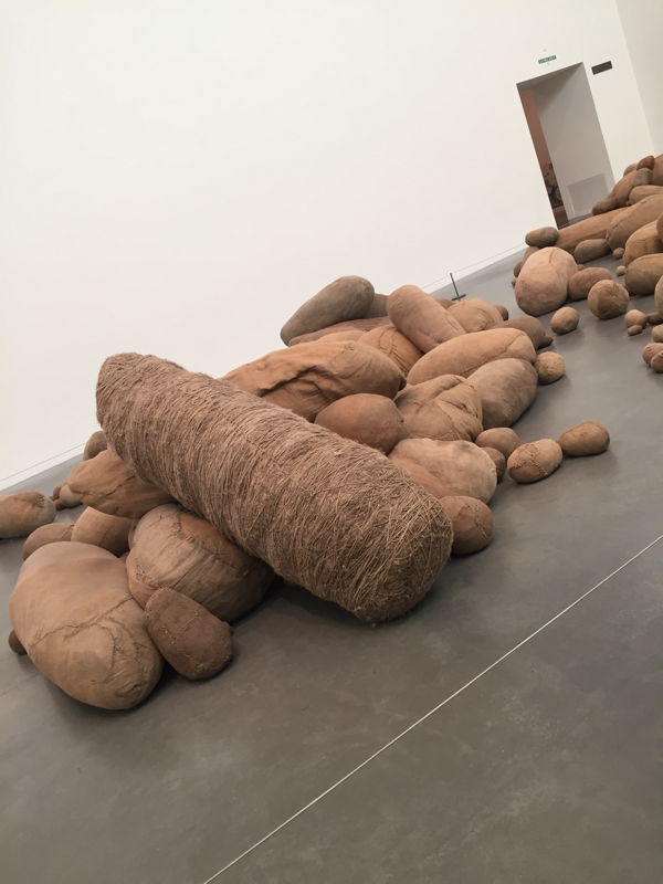
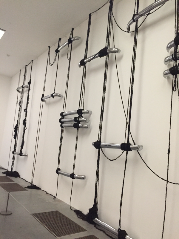

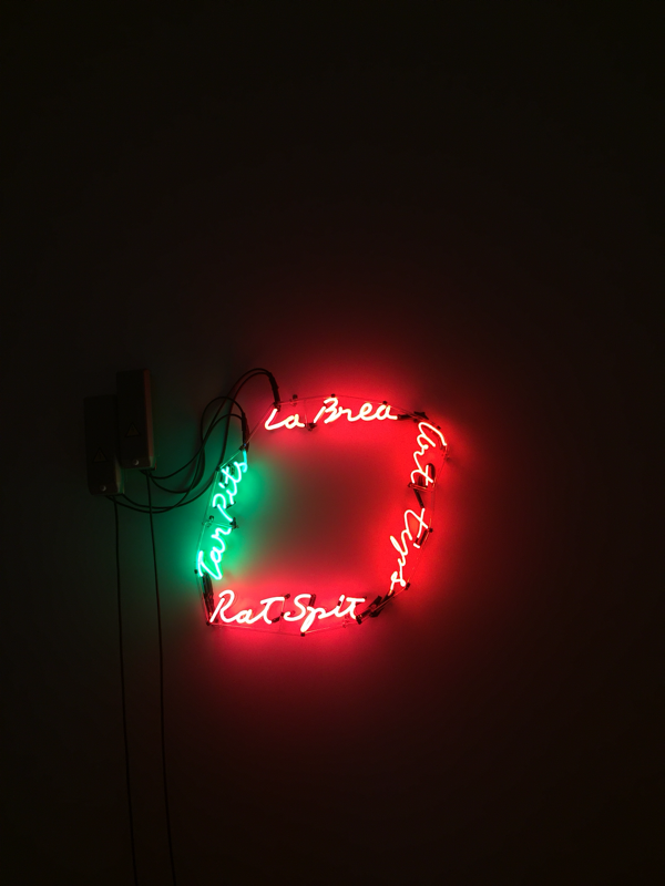
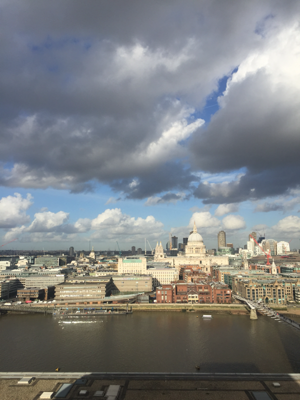
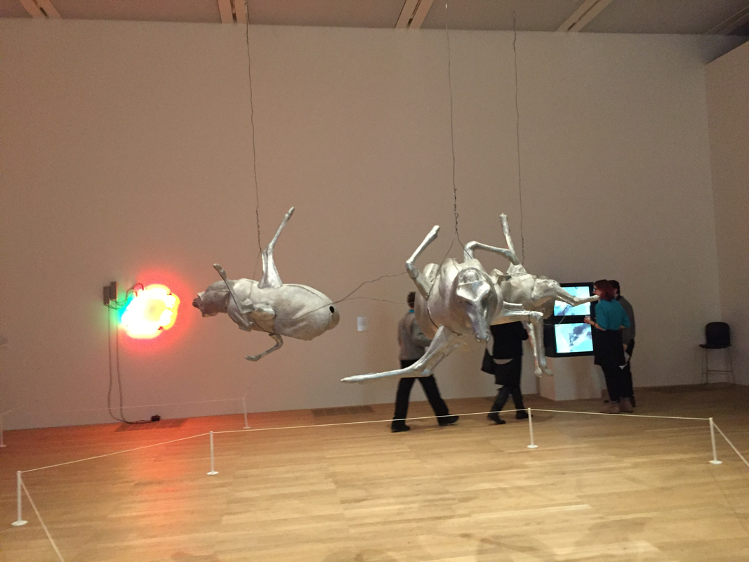
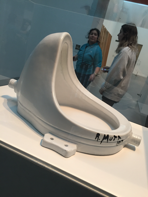
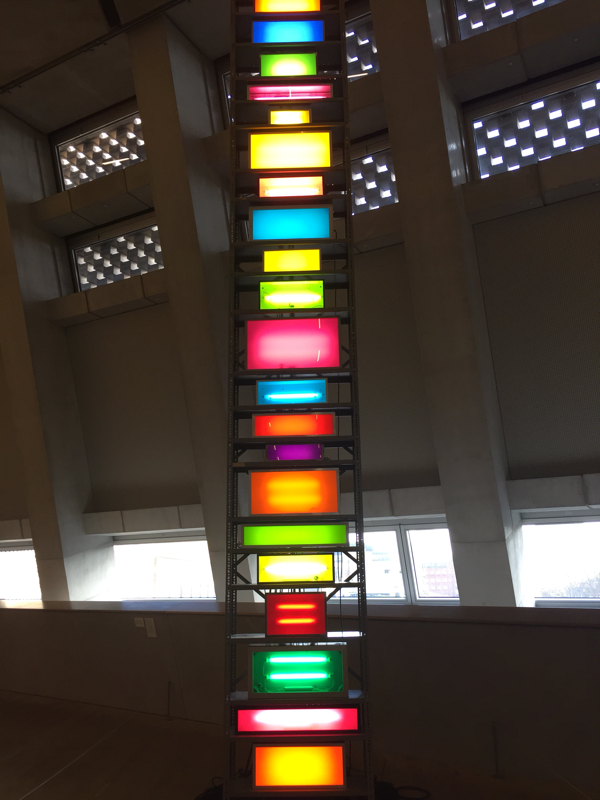
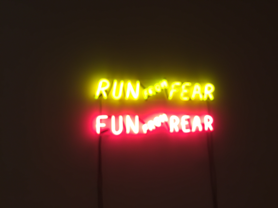
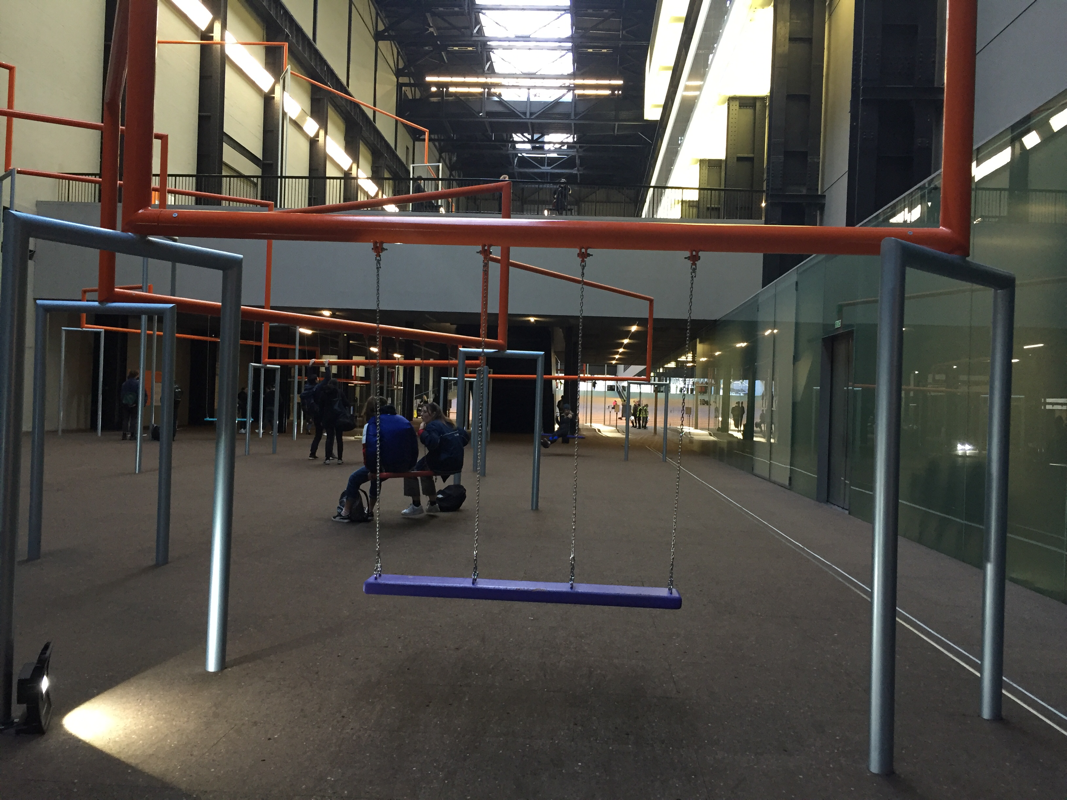
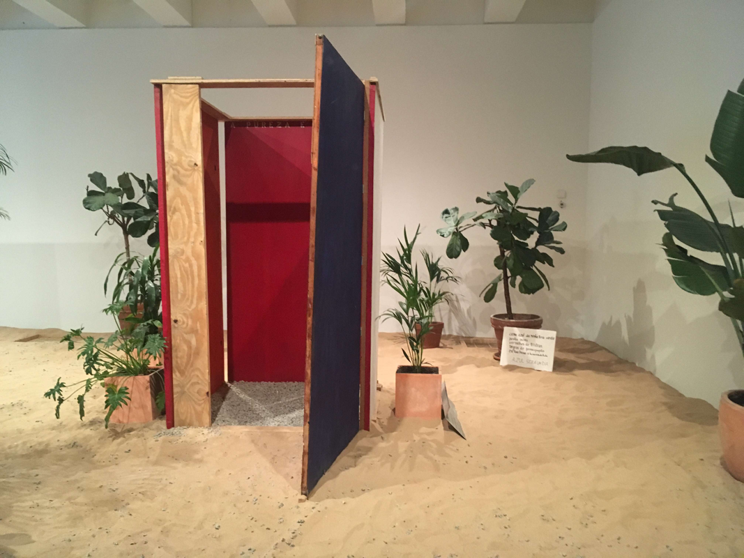
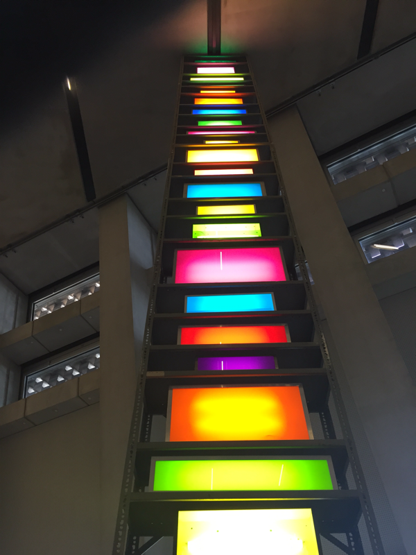
When I went to Tate Modern I learnt that anything could be art litarally. But it was really beautiful to me the the room that loved was the neon light room because I didn't expect that at Tate Modern.
With 2 of these pictures i photoshopped them together and the result turned out to be pretty good
I didn't want any colour because everything else is colour and i wanted it to be more muted colours.
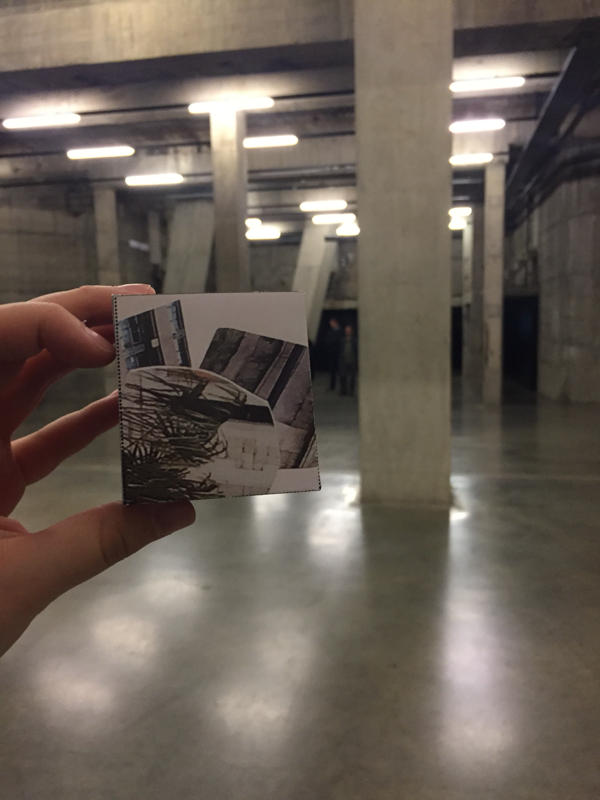
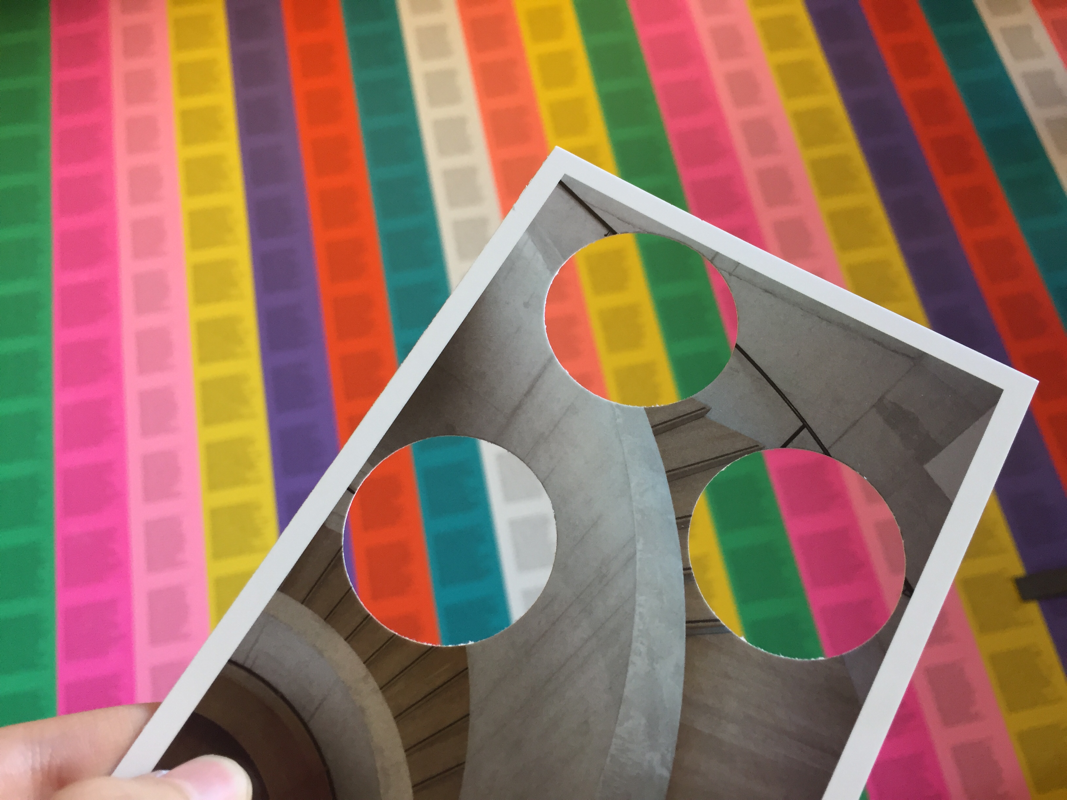
PHOTO CLIPPING.
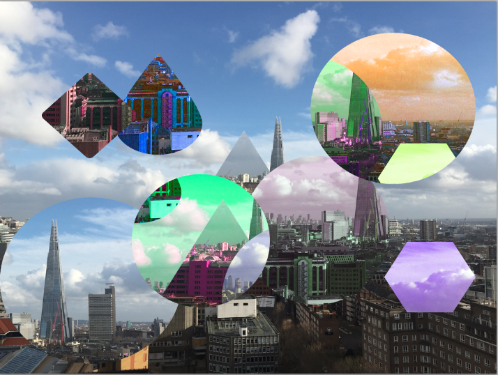
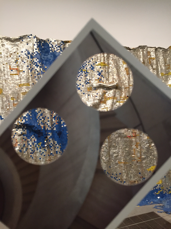
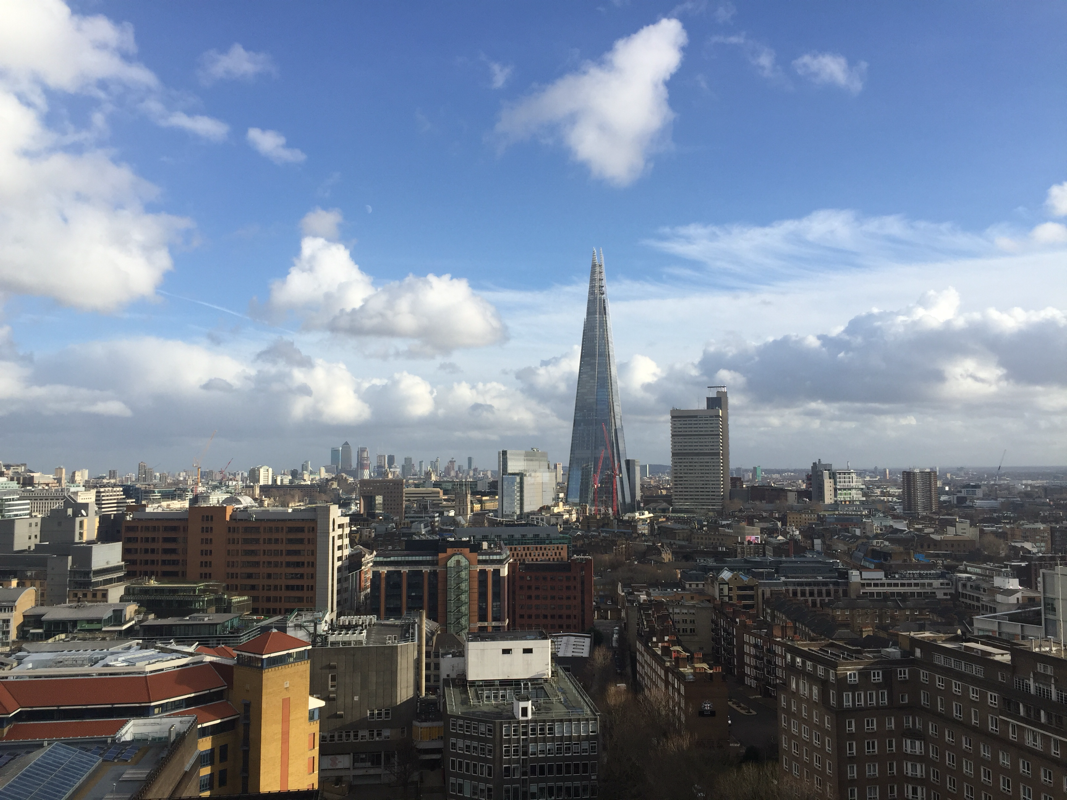
This is my final piece on photo clipping. The original picture was The Shard, the reason I picked The Shard was because i wanted to do a building and the city.
WWW: the colours worked really well and he shapes actually looked great with it. If I did another one then I would've limited the amount of shapes that I would use.
EBI: The only thing I don't really like is the rain drop and the diamond at the top because it looks quite odd, and I would also try using different type of pictures when I get the hang of it really well.
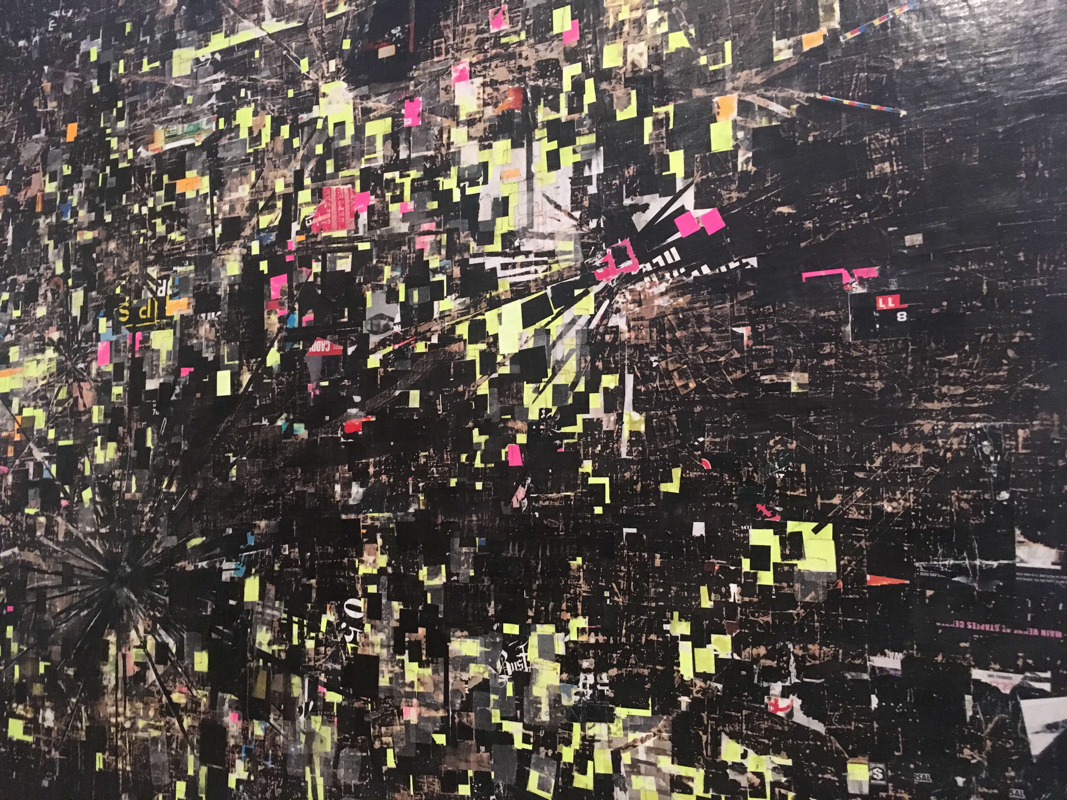
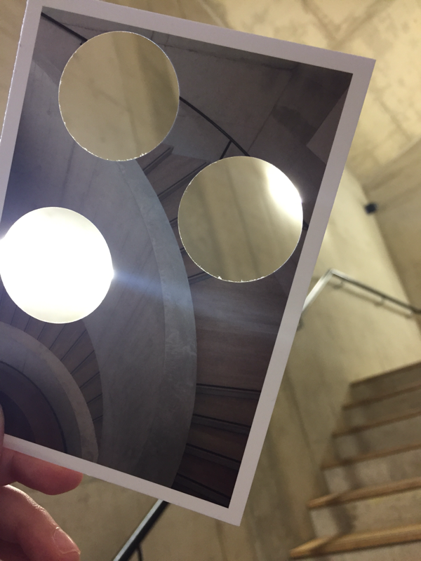
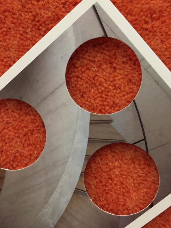
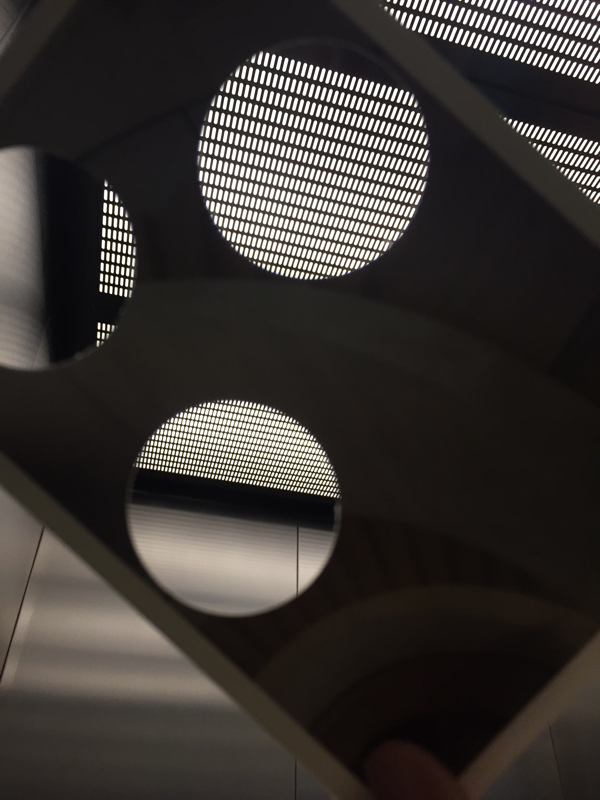
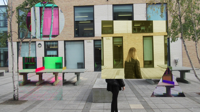
This is how you do Photo Clipping. I didn't use The Shard picture instead i used this piece of art that i saw at Tate Morden:
To start off you will see at the right side there would be something saying 'background' with a lock you will need to copy that by pressing 'cmd and j' once you do that 'layer 1' will appear then do it again and there would be something else called 'layer 1 copy" keep any one of them free you will need them. After that on your left side theres the tools there will be a rectangle that when you hold it down it'll come with a side drop and there will be a 'Custom Shape Tool' , at the top of the bar and you should see an arrow click that and there should be a variation of shapes. After that pick what shape you want hold shift and drag it to what size you want it on your photo then on the right side of photo shop where you see 'layer 1' and it will say 'shape 1' the 'layer 1' would be above so drag that down so that 'shape 1' is above, whilst pressing 'alt' hover the mouse over both of the pictures there would be a small black and white circle once you see that click and it would be locked. Every time your going to do a layer go back to the original. Once your done always remember to save your work. And thats how you Photo clip.
|
|
