Abstraction:
The first thing I thought of when the word "Abstraction" was said I thought of 3 main words: Psychedelic, Different, Mysterious.To me the word Abstraction means: A picture or any type of media that is seen in many different ways. E.g, Psychedelic, mysterious: because the viewer doesn't have a clue on what it is supposed to be. I searched it up, asking what it actually meant and: Abstraction: depicting a visual image that does not have an immediate association with the object world and that has been created through the use of photographic equipment, processes or materials.
First abstract photo shoot:
|
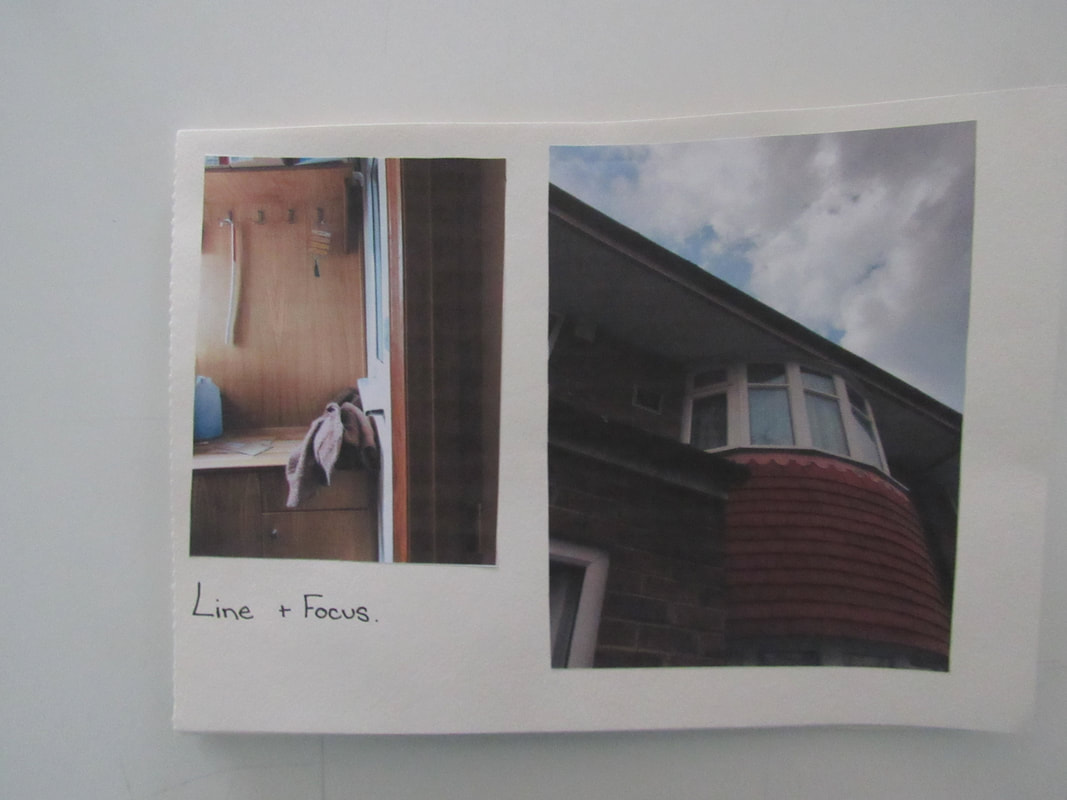
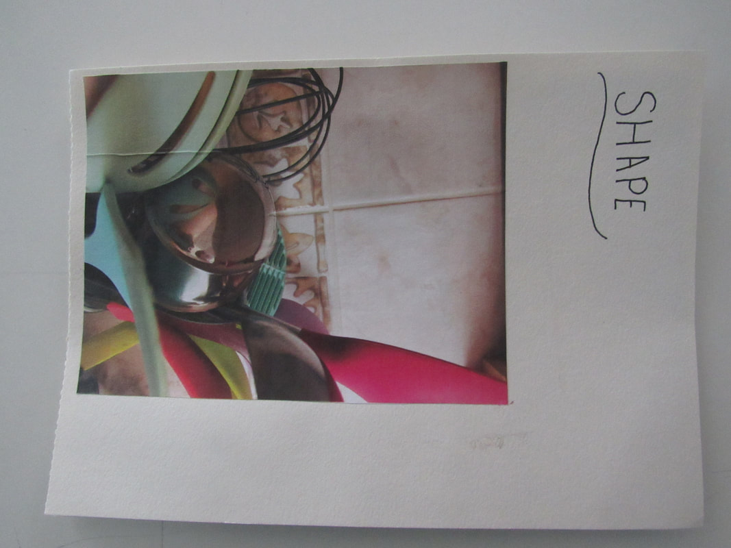
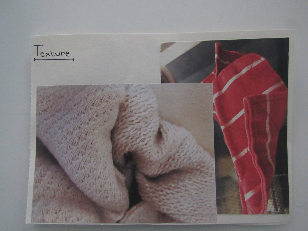
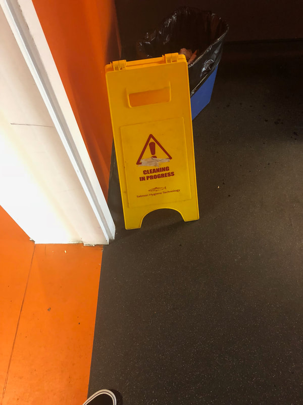
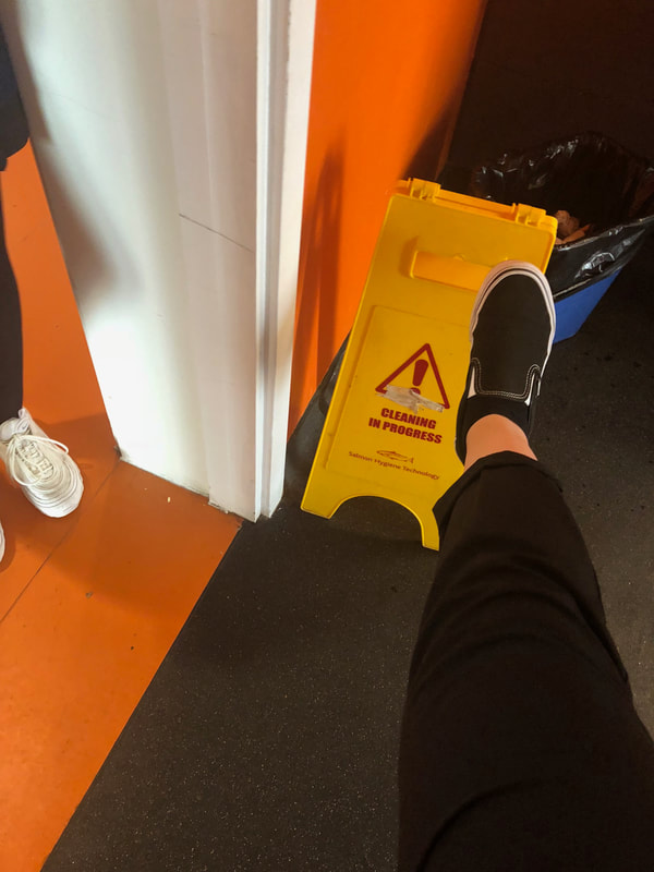
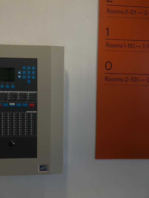
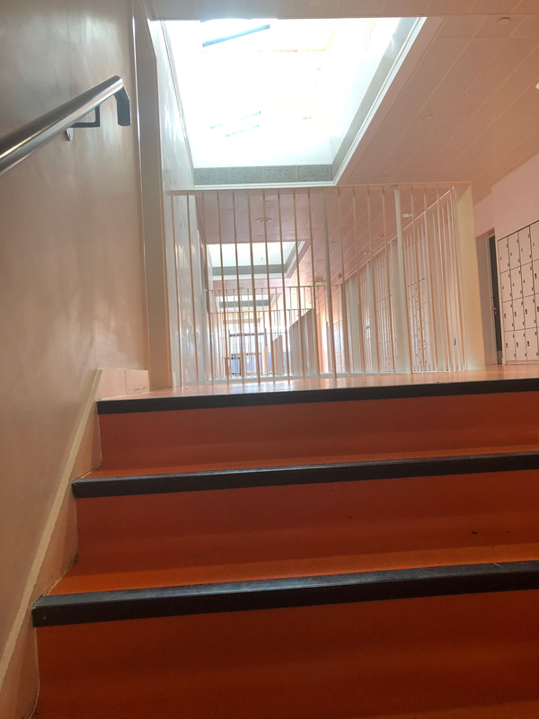
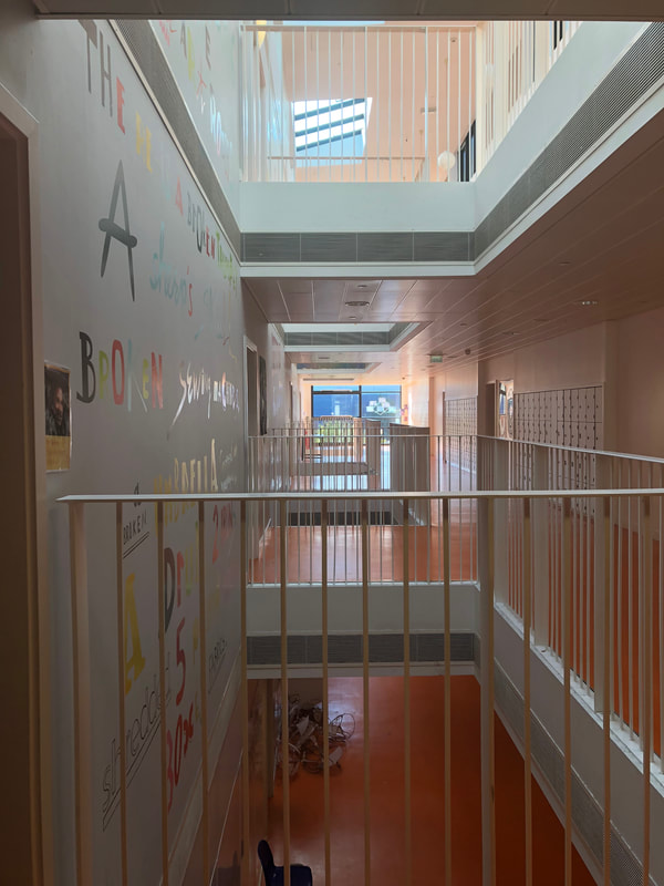
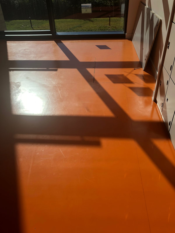
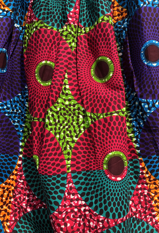
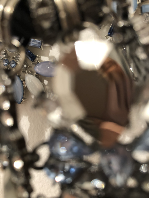
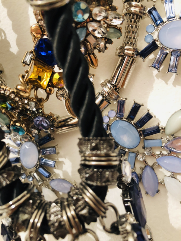
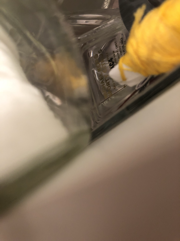
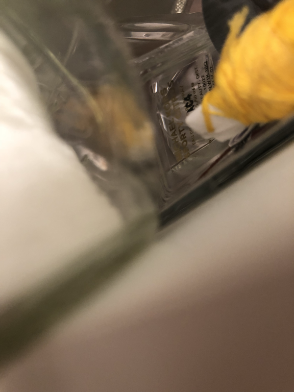
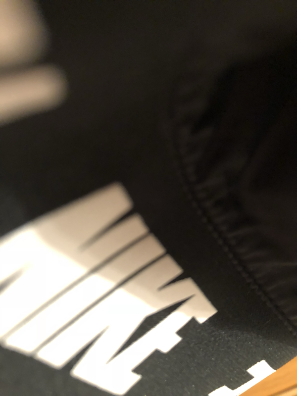
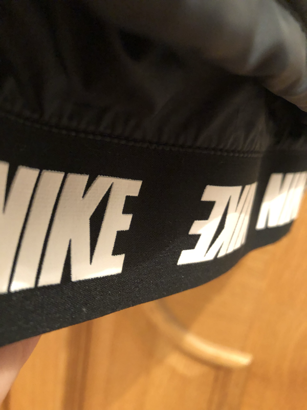
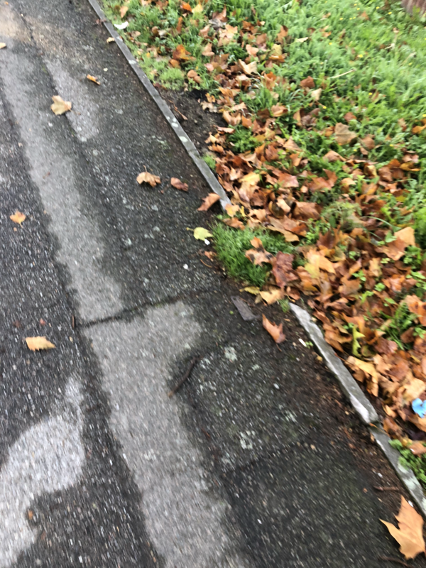
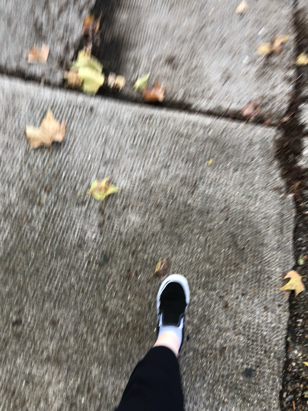
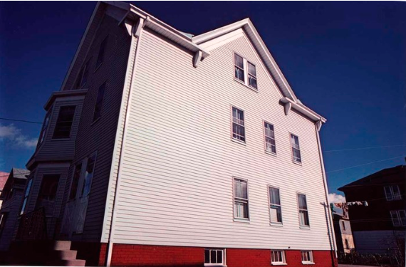
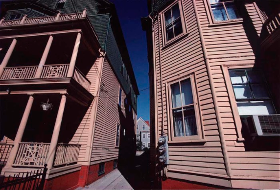
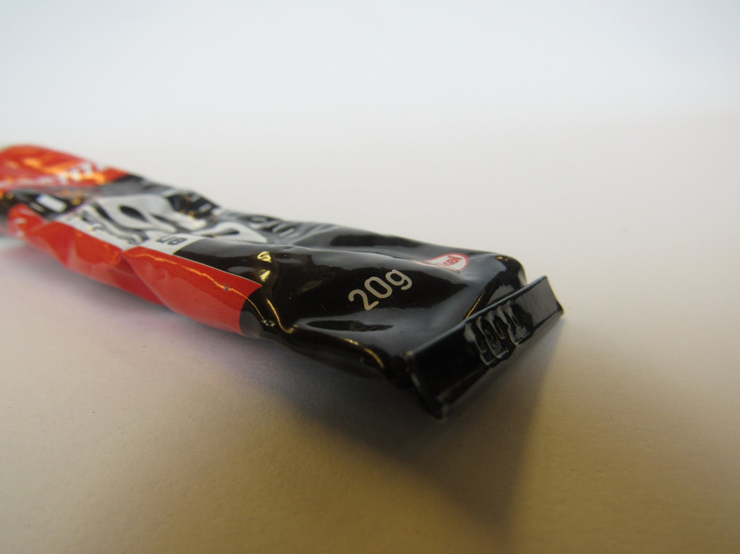
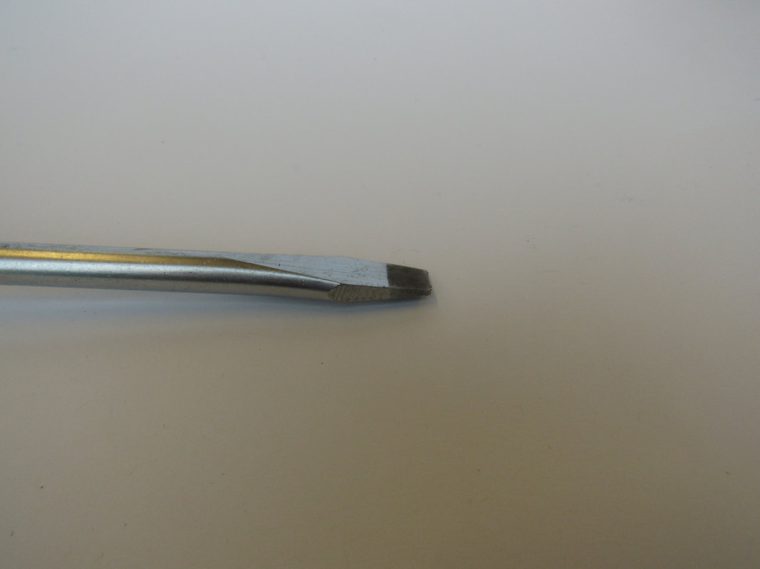
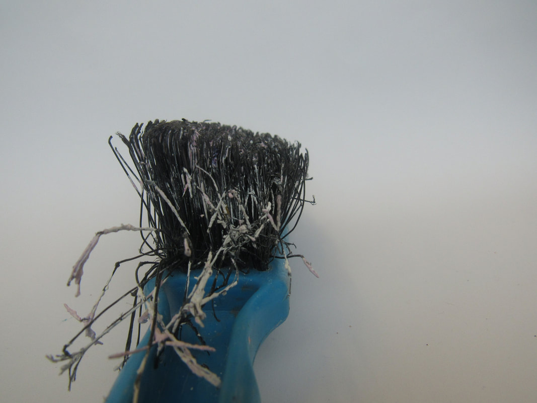
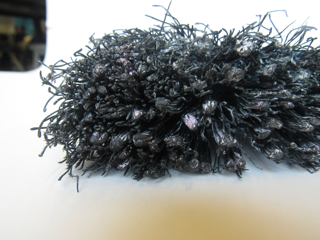
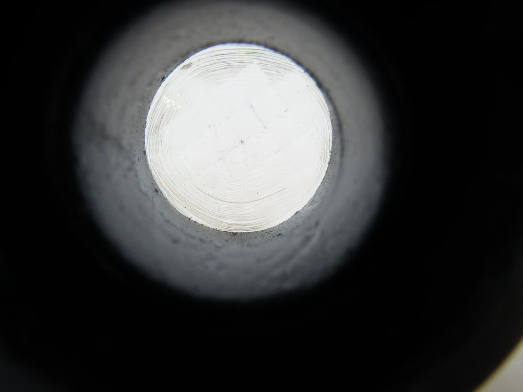
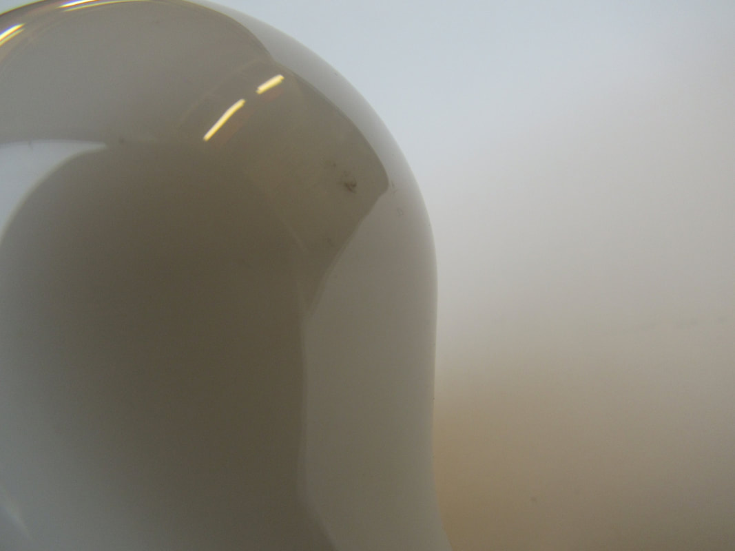
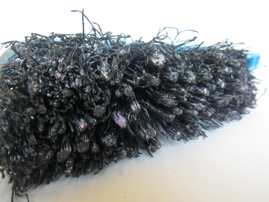
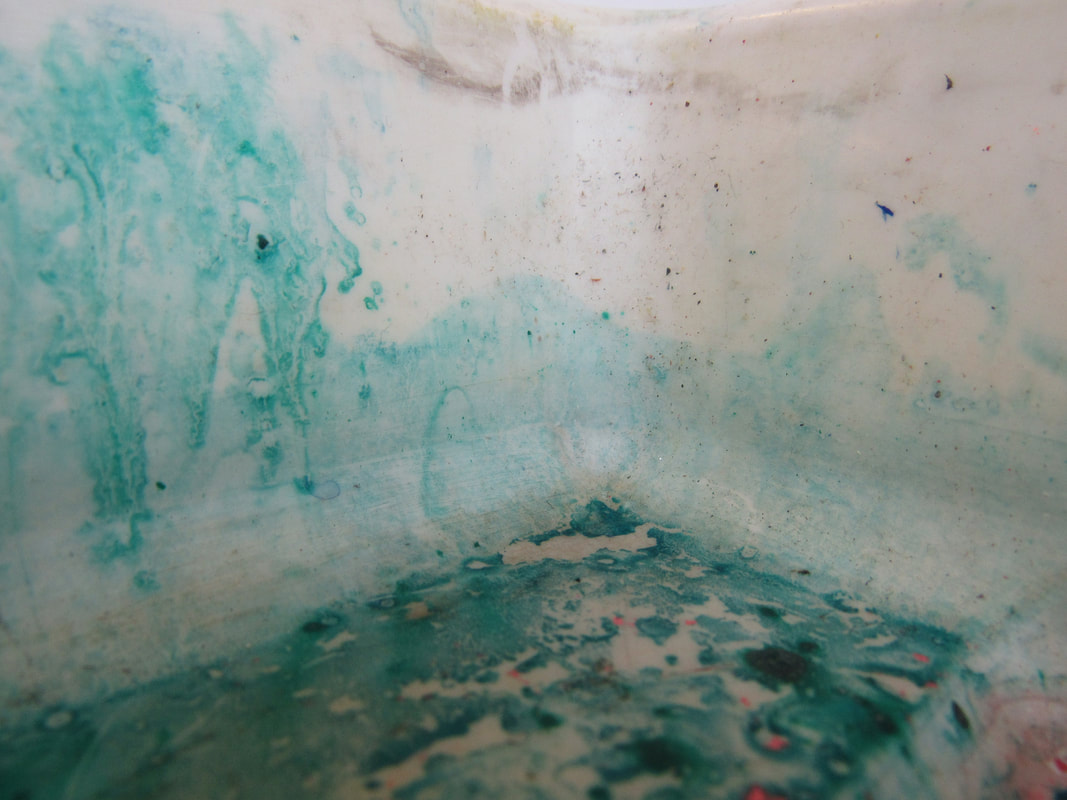
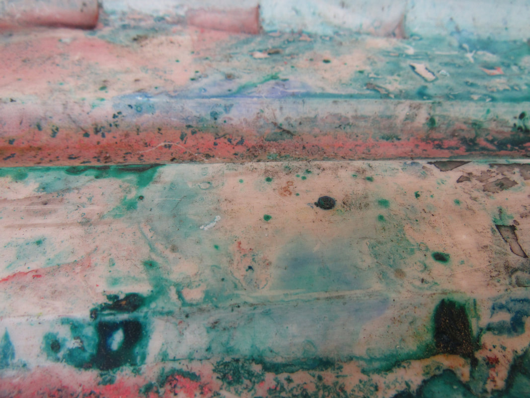
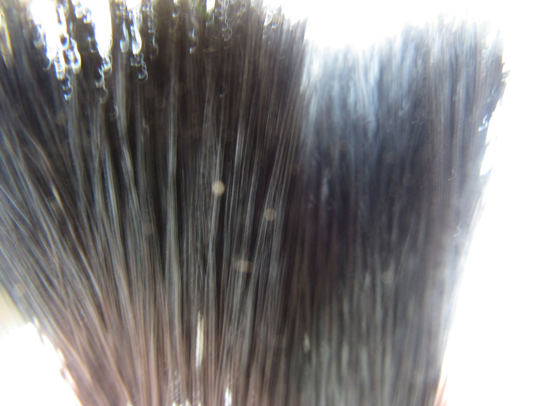
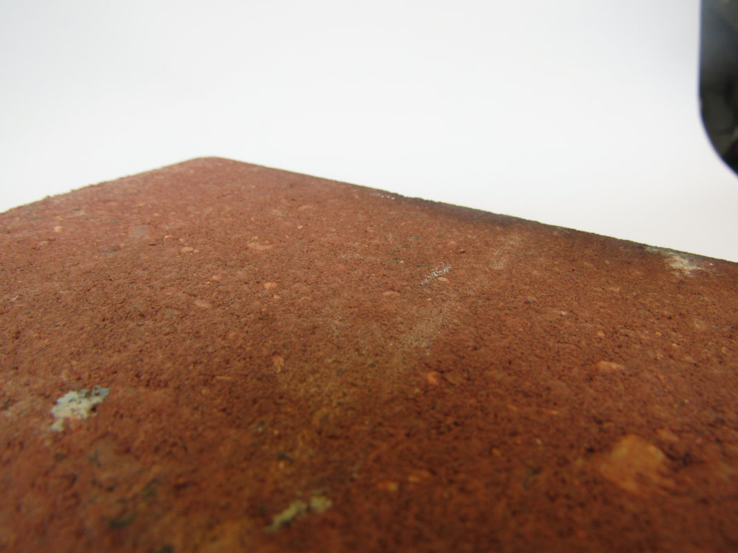
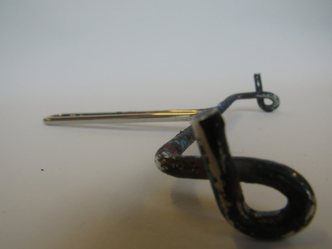
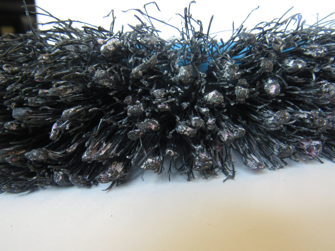
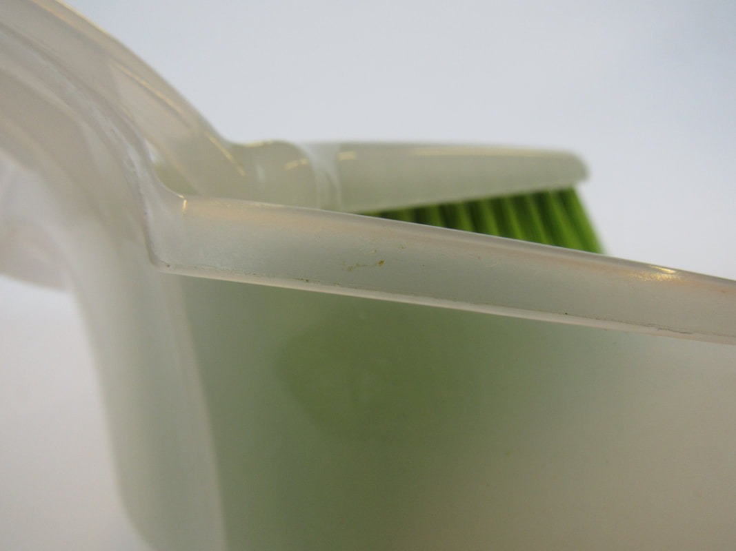
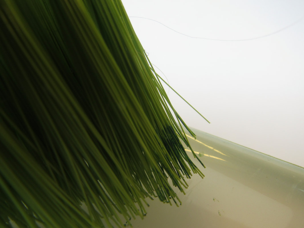
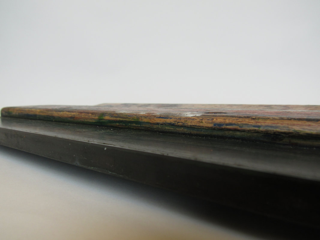
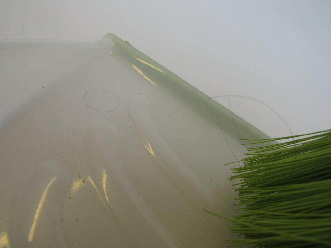
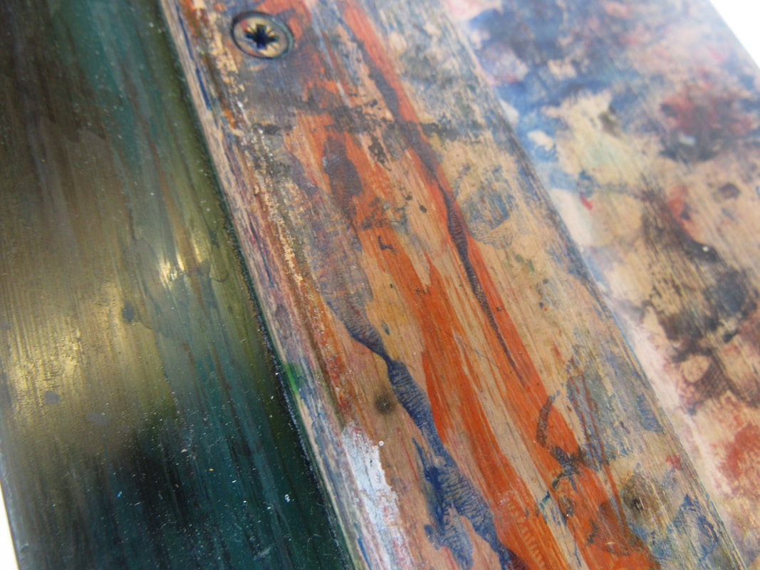
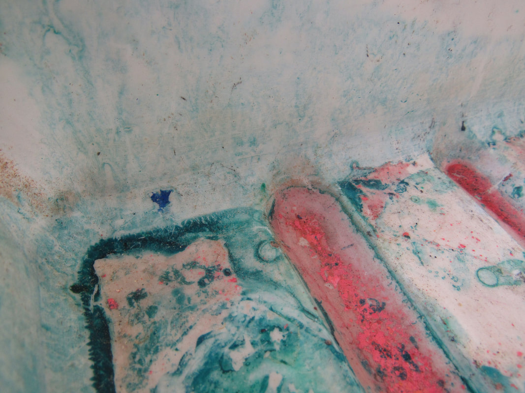
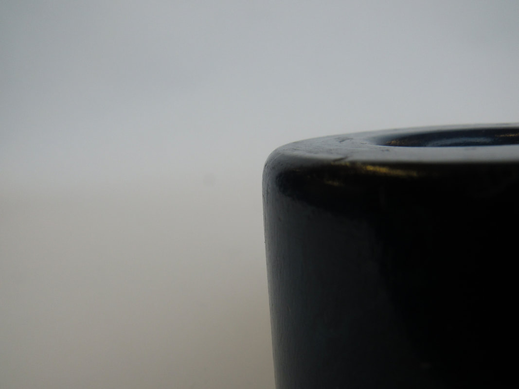
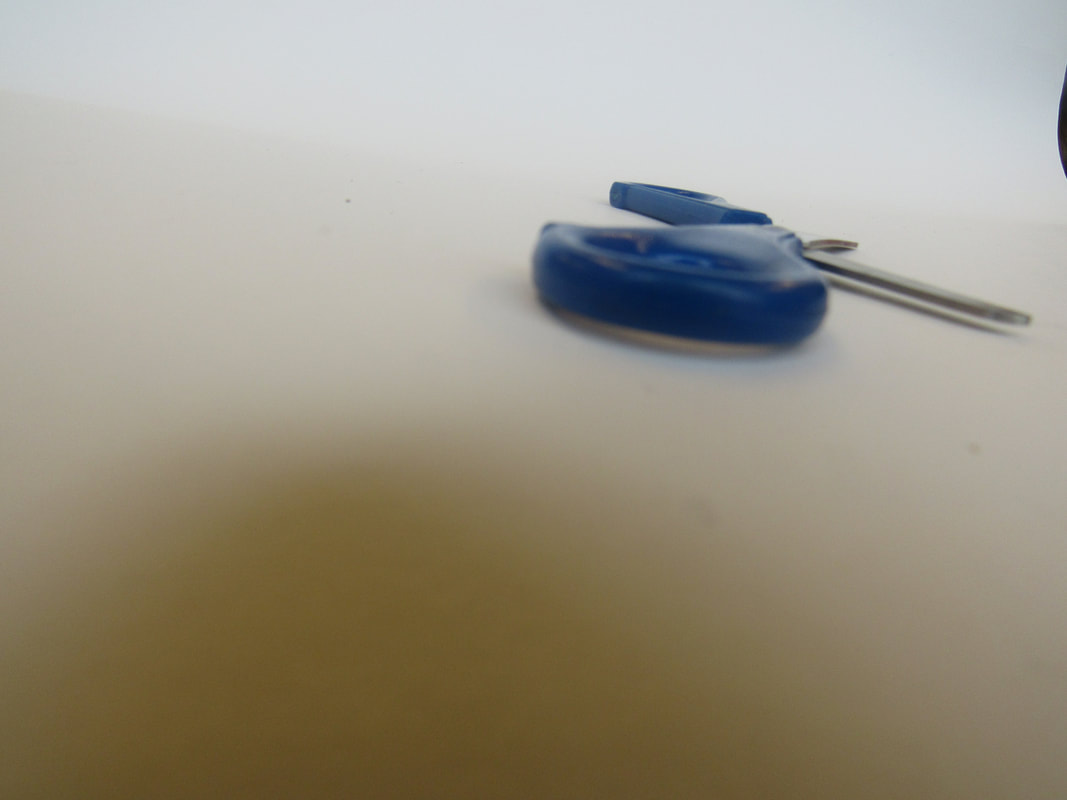
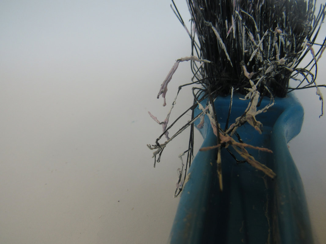
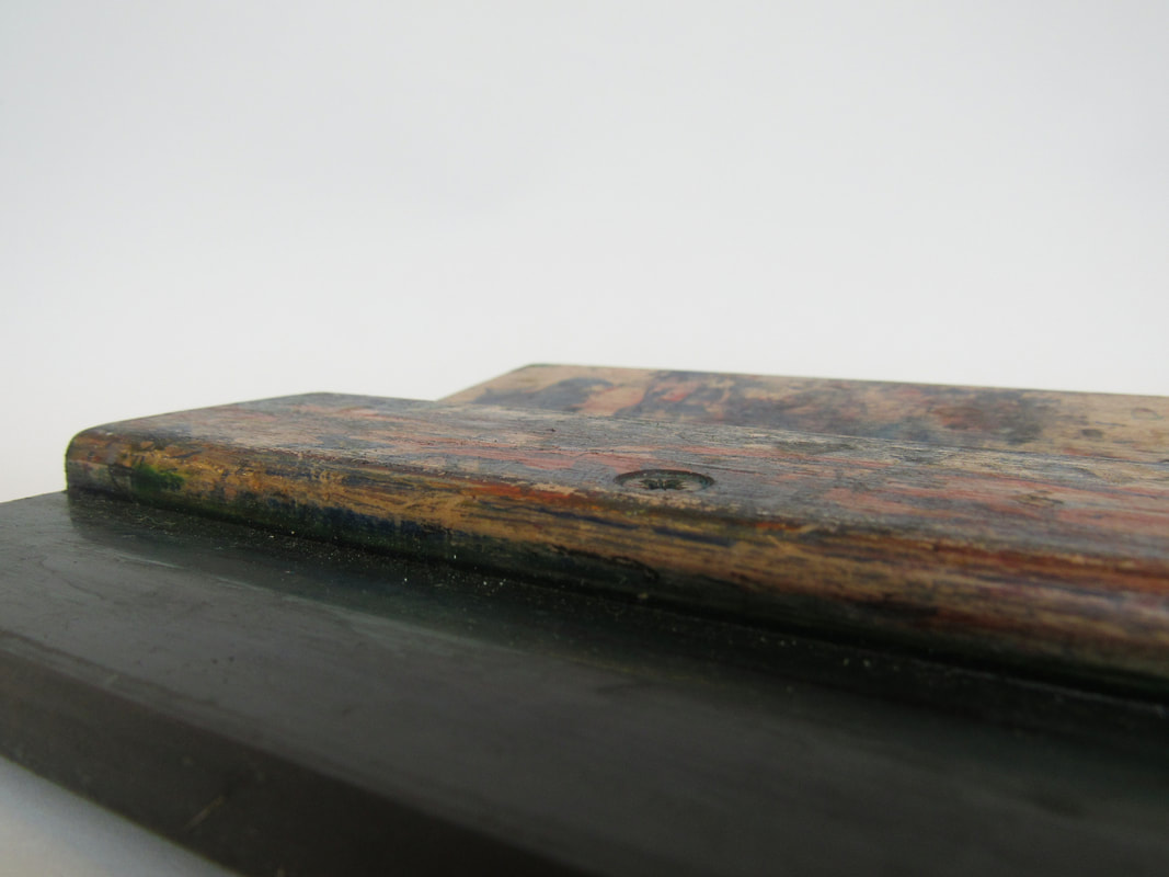
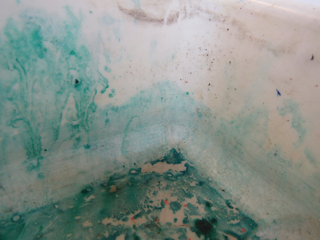
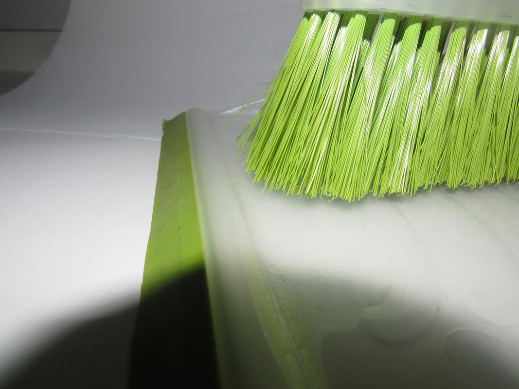
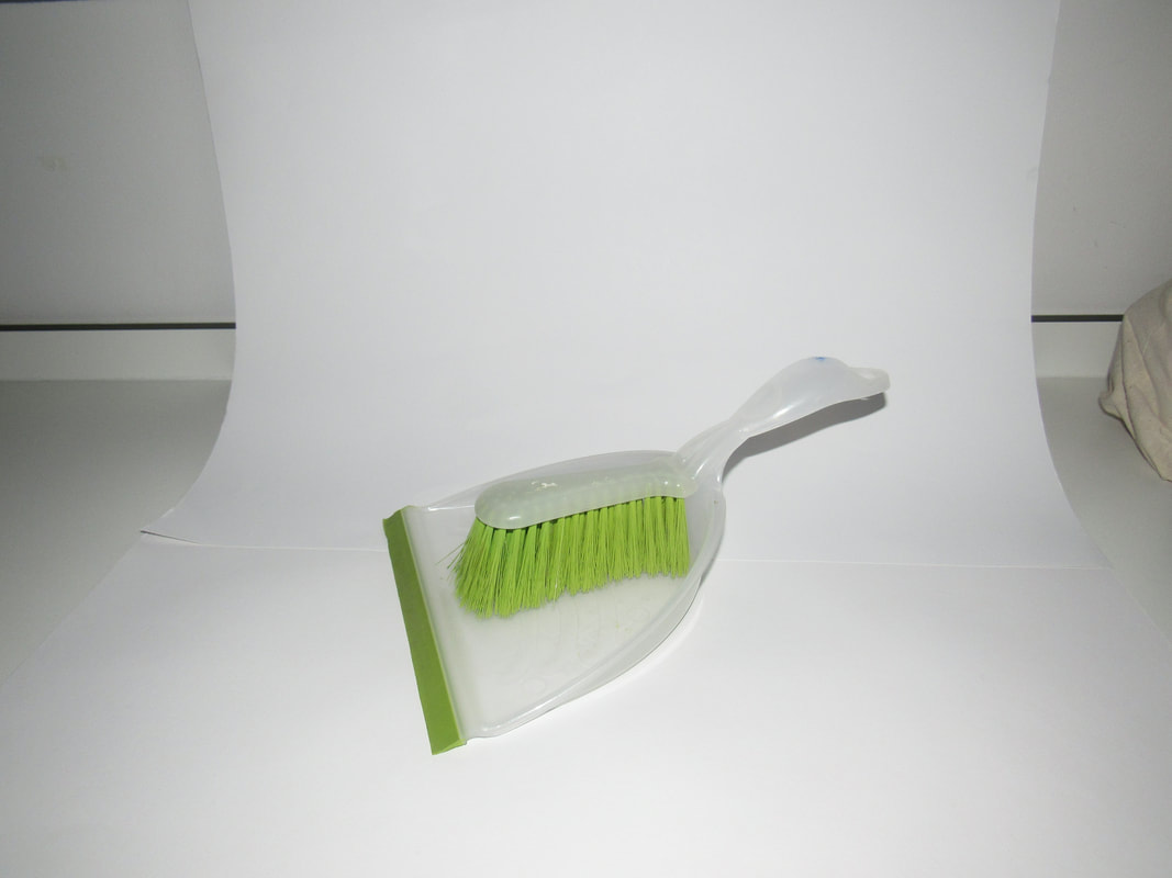
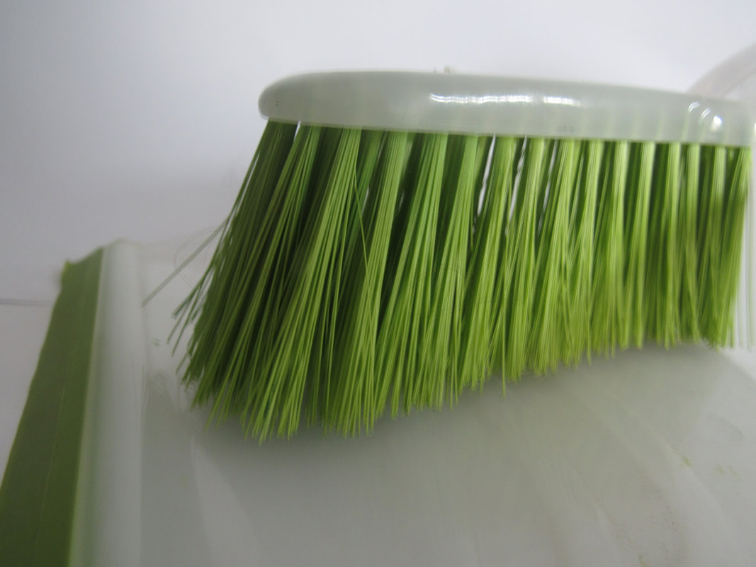
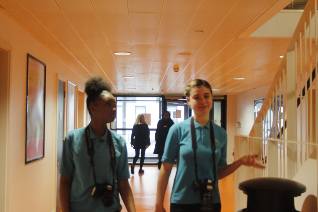
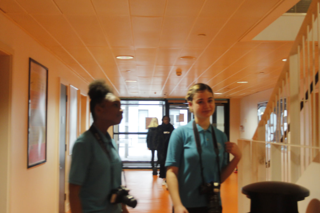
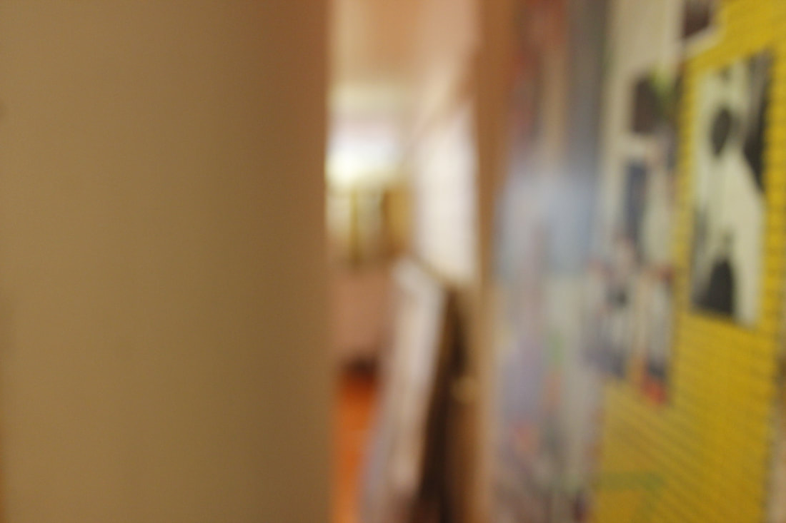
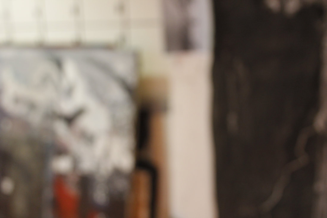
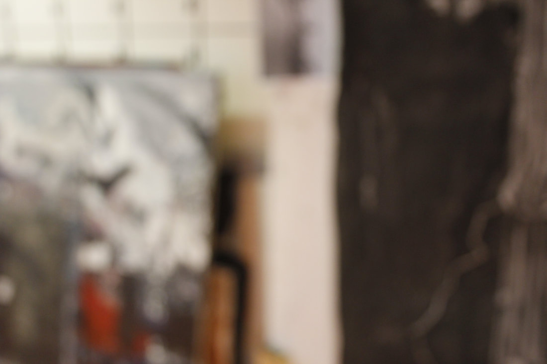
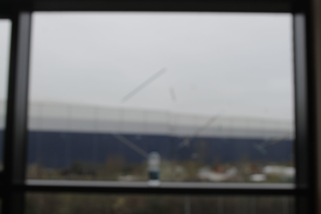
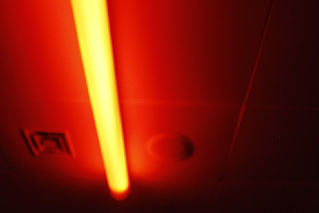
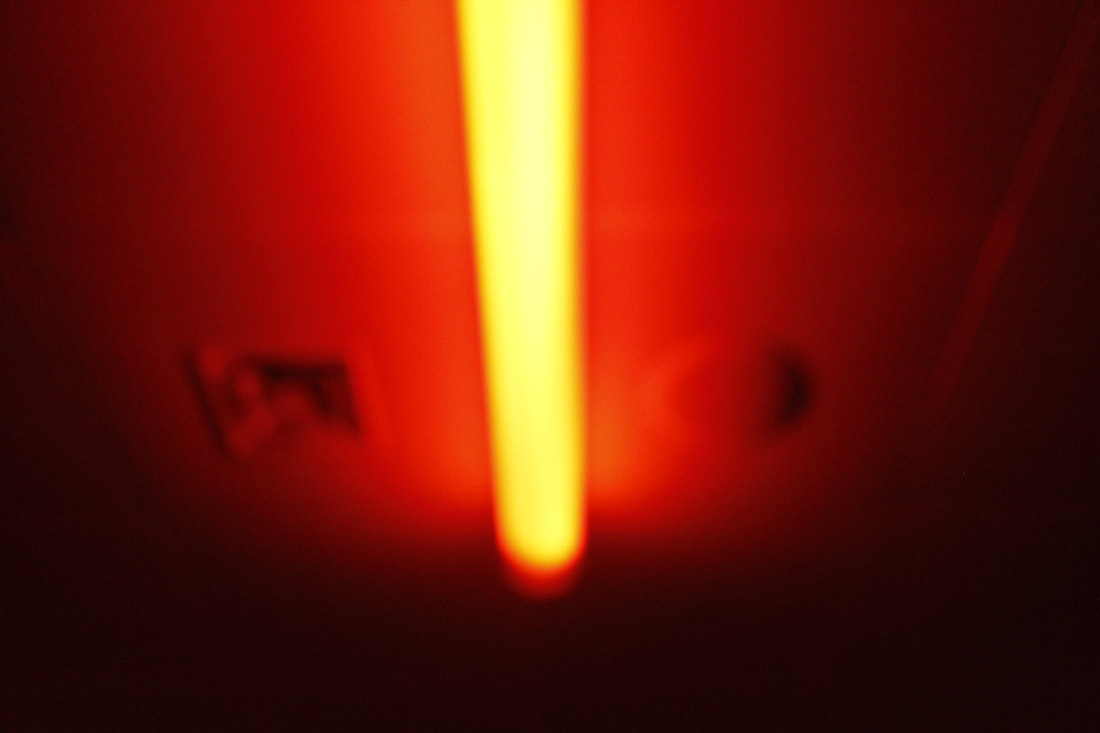
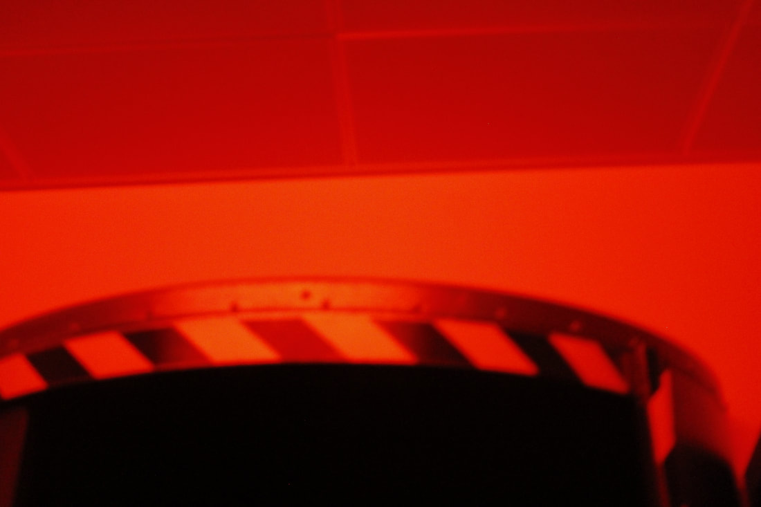
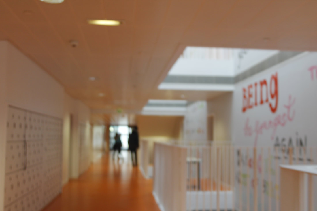
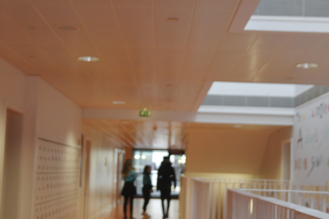
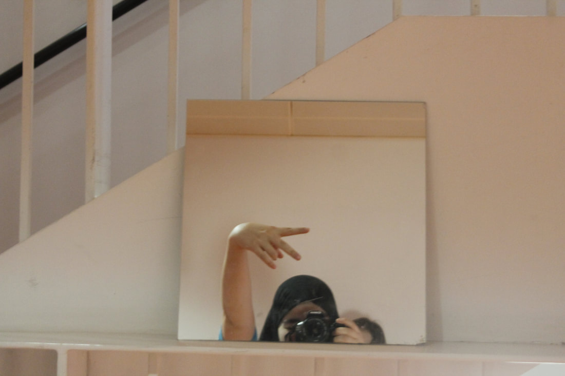
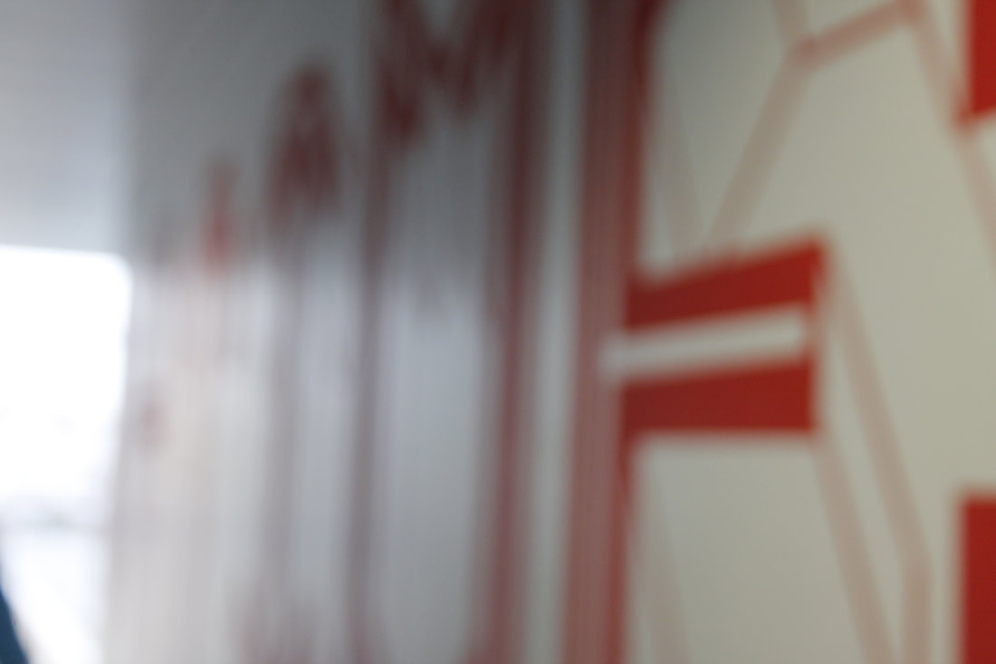
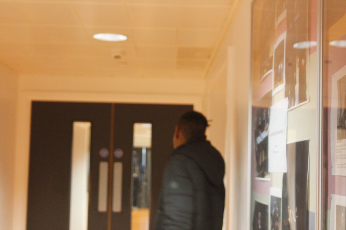
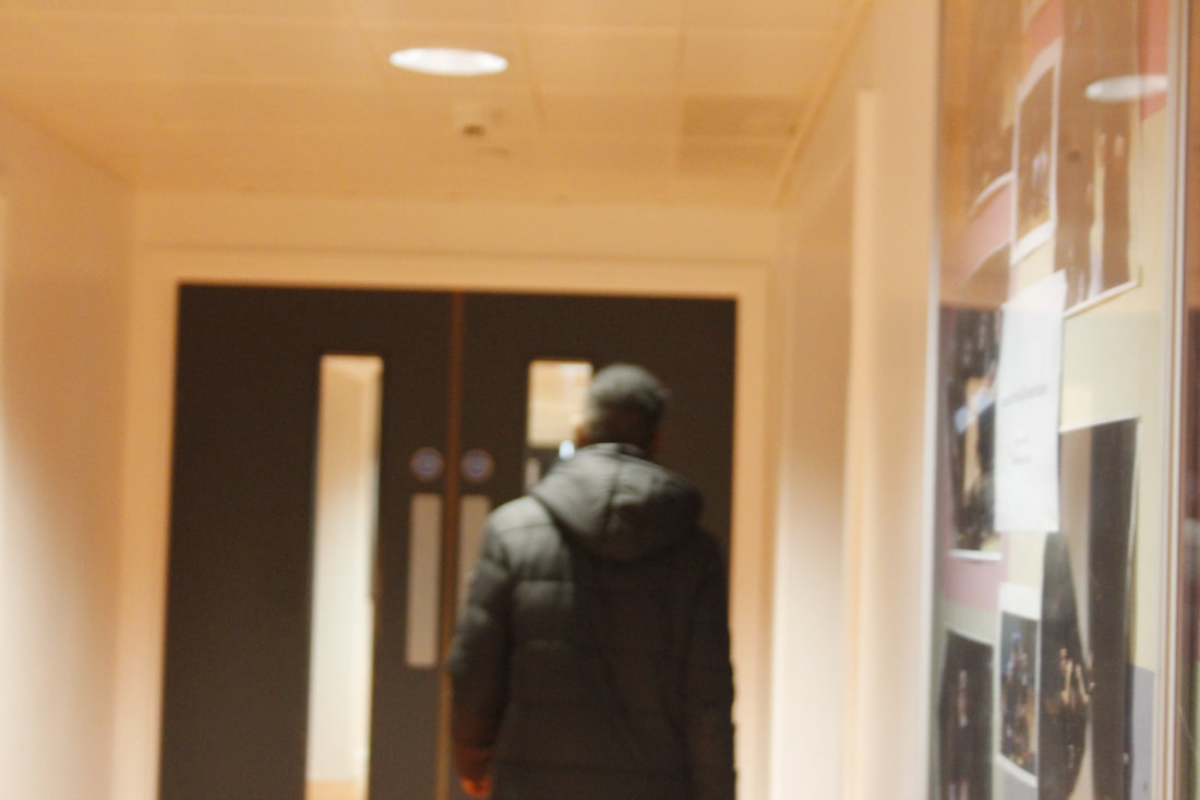
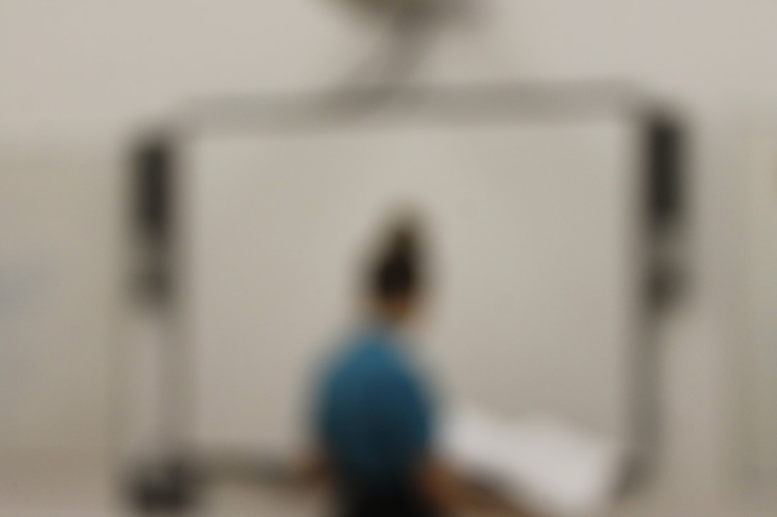
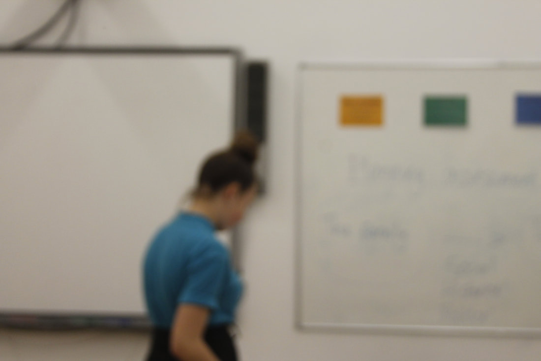
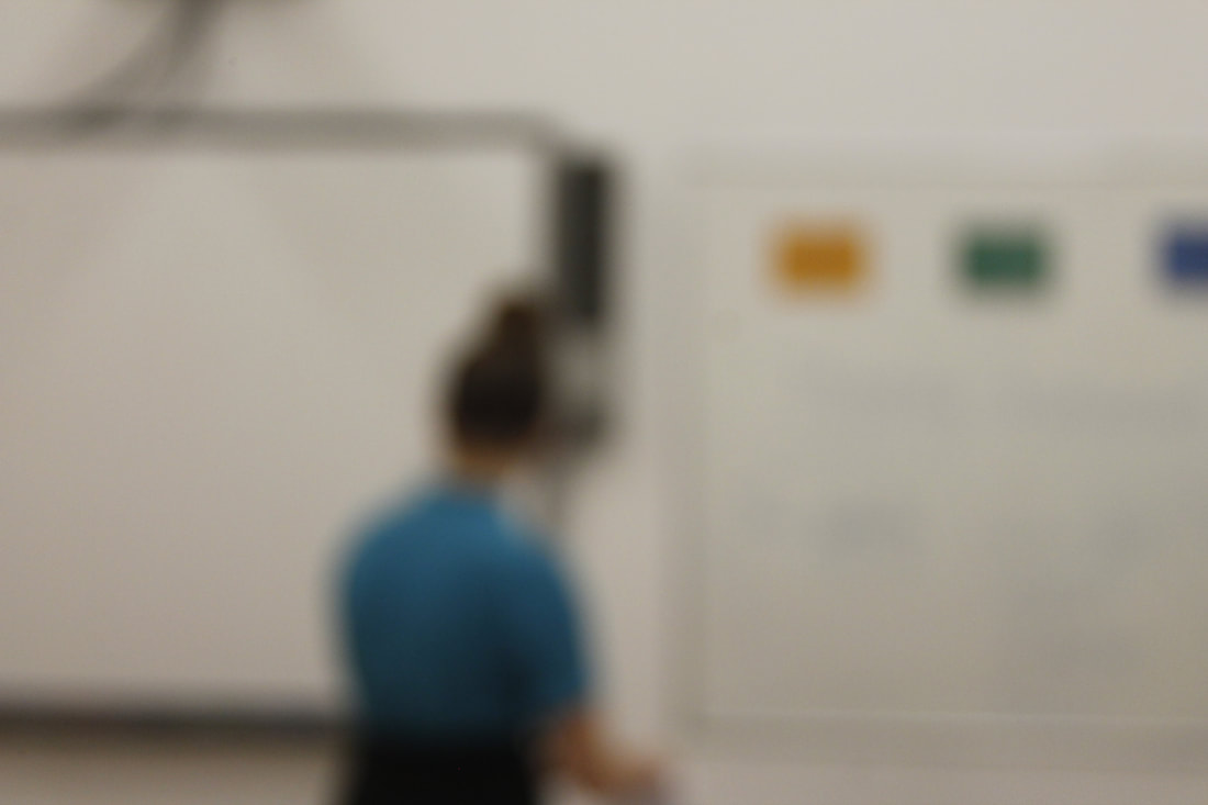
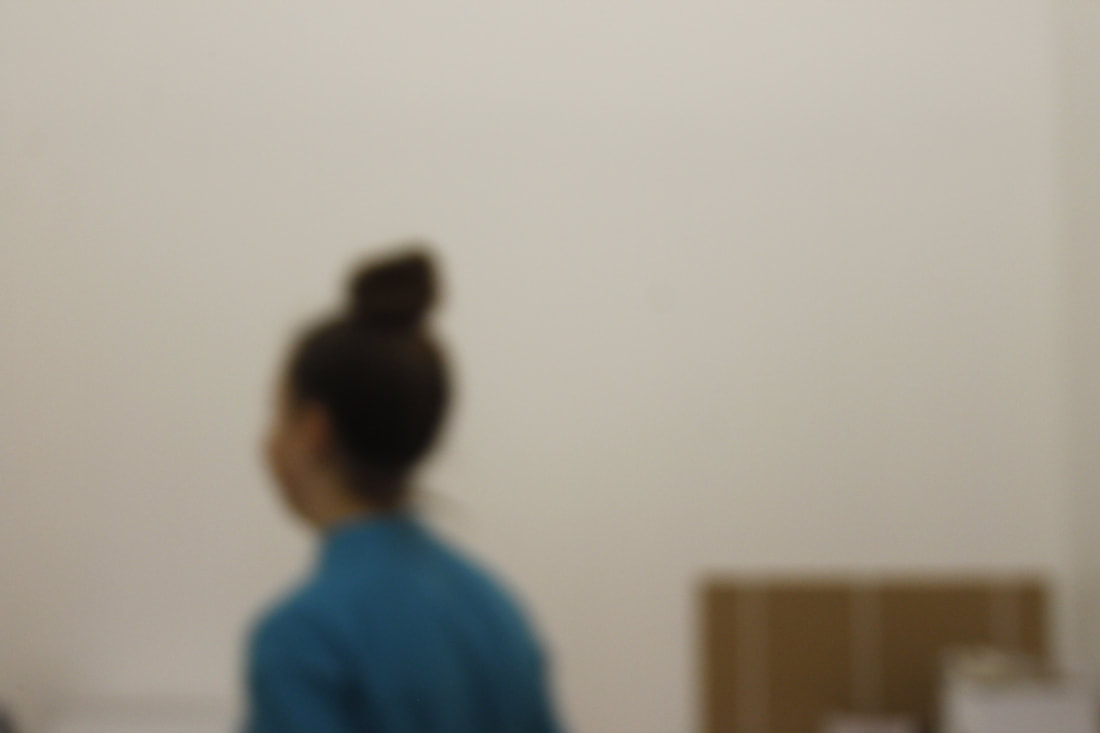
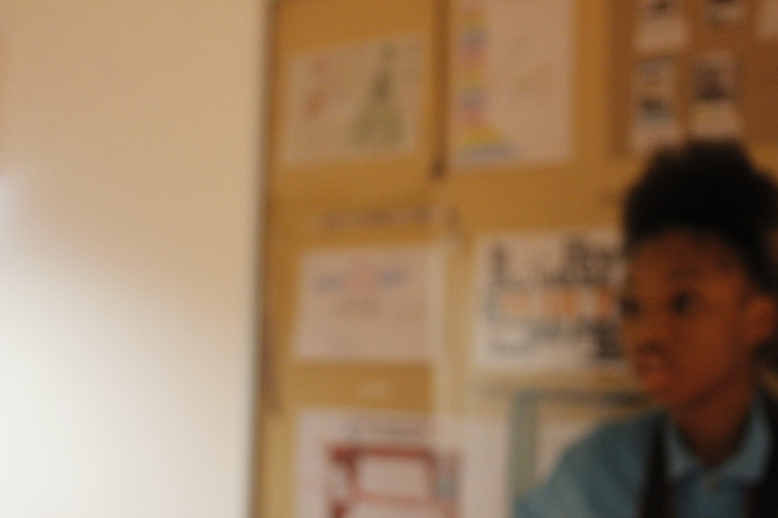
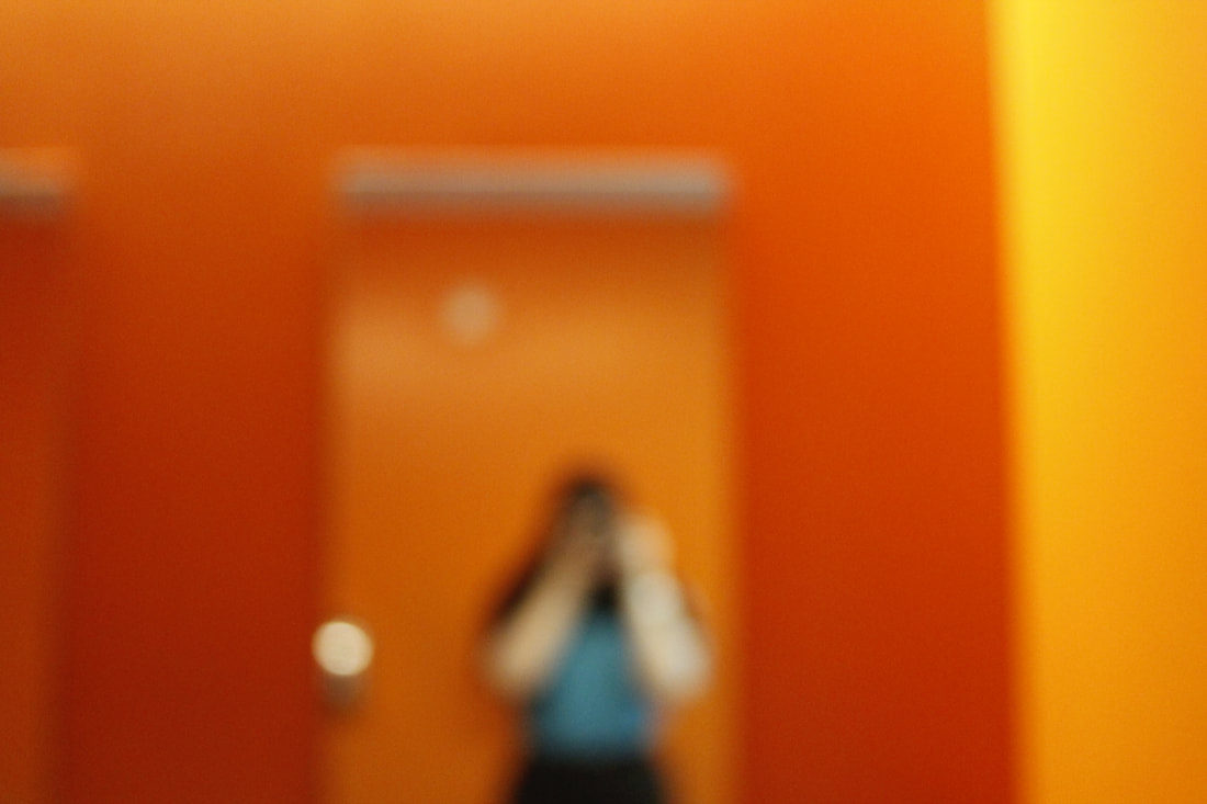
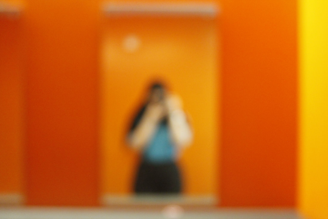
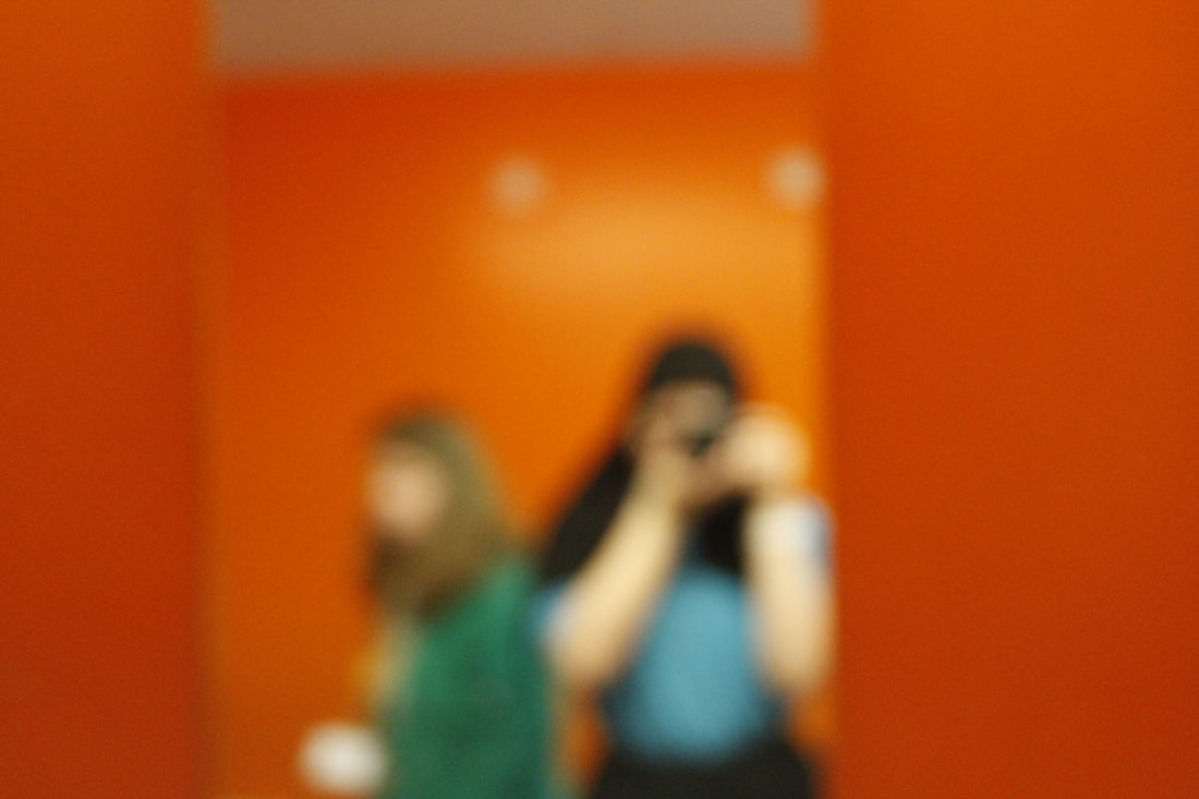
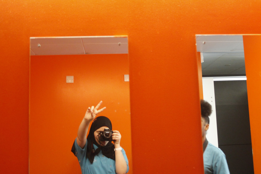
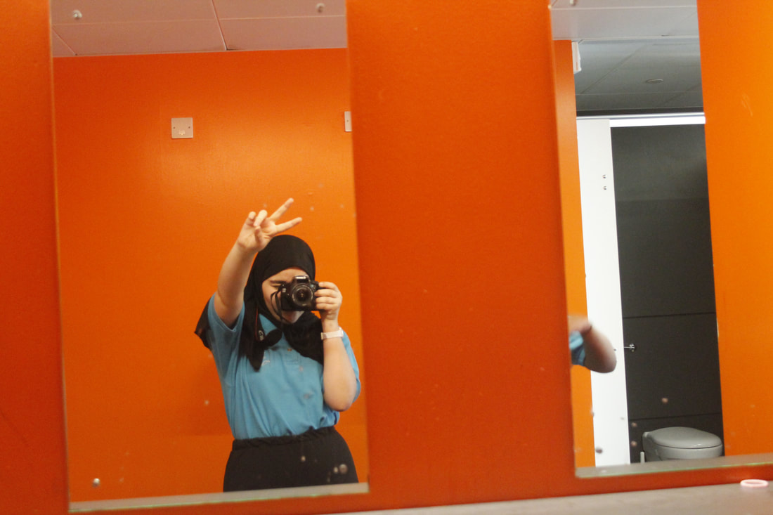
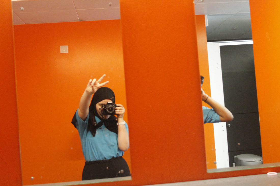
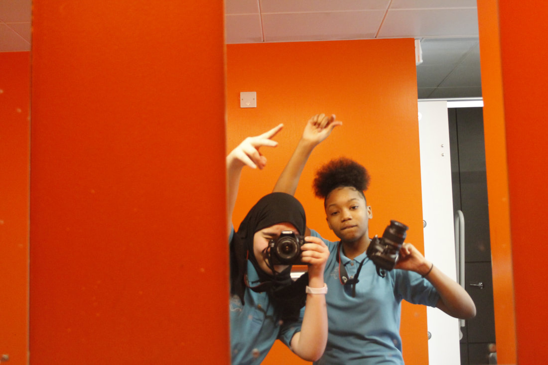
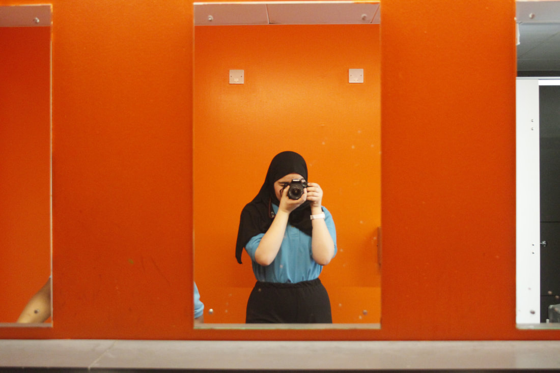
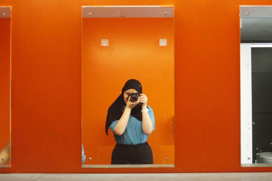
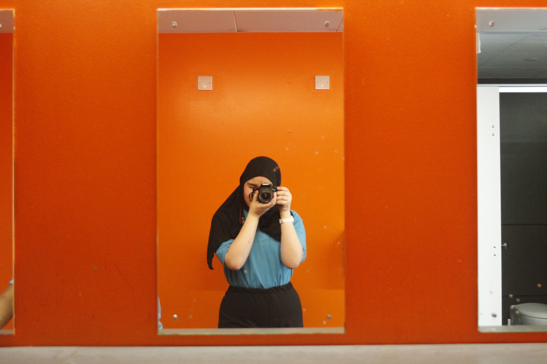
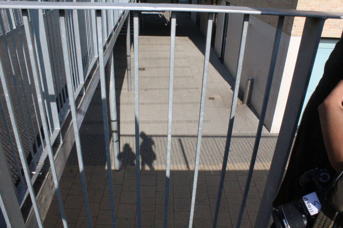
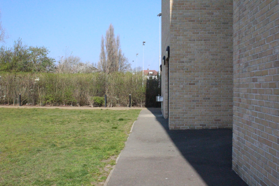
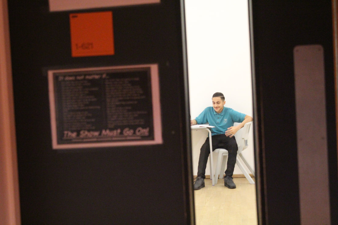
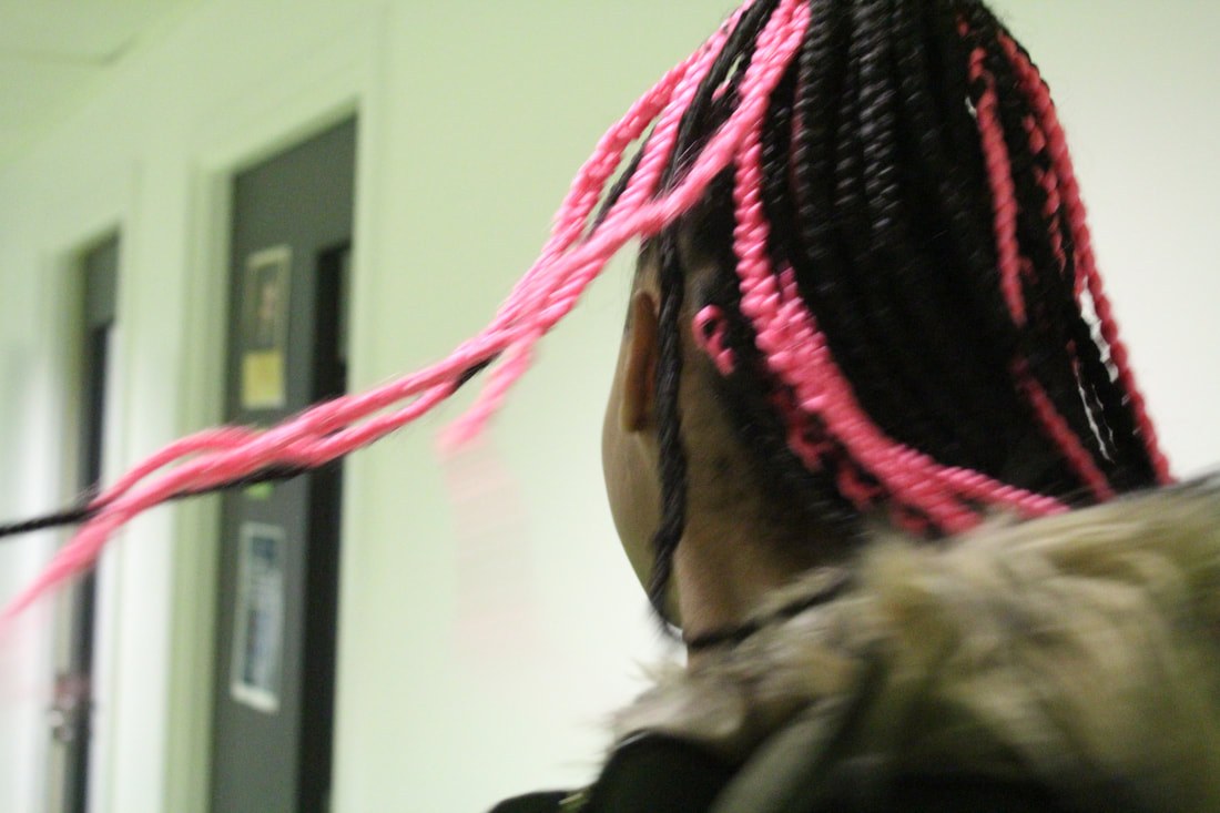
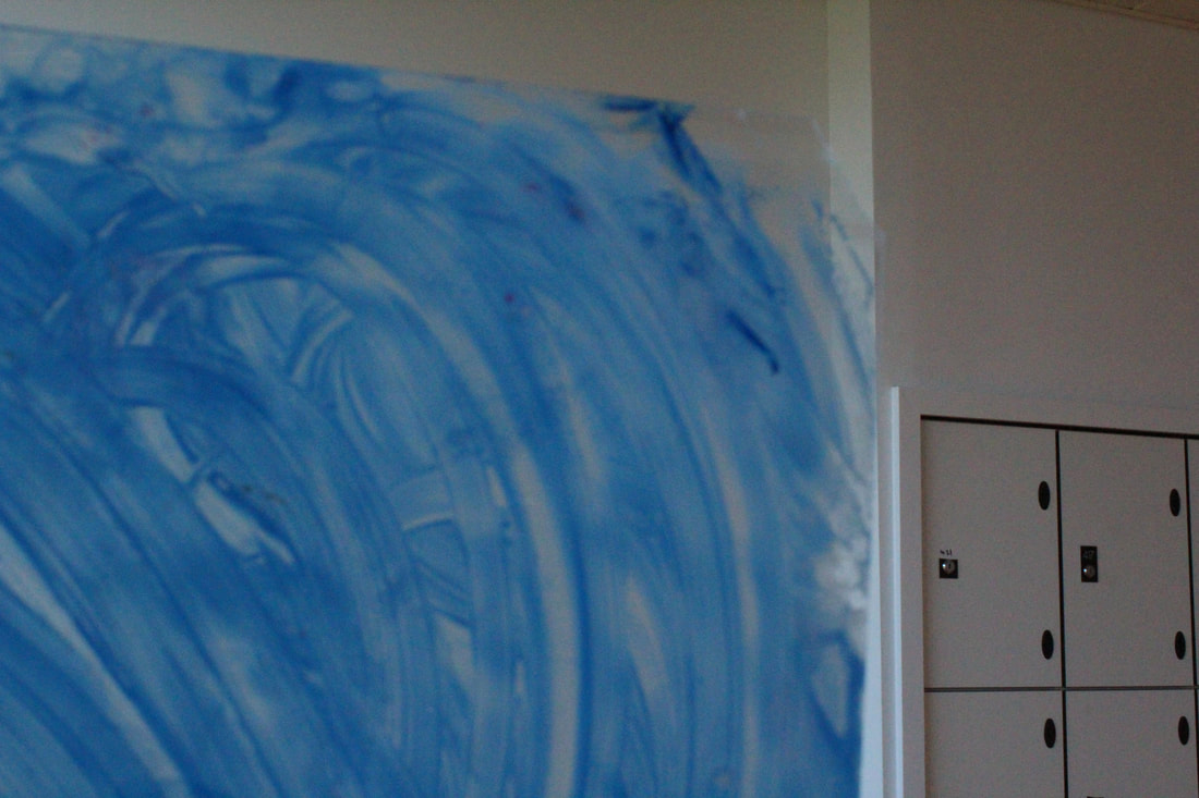
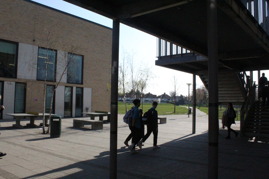
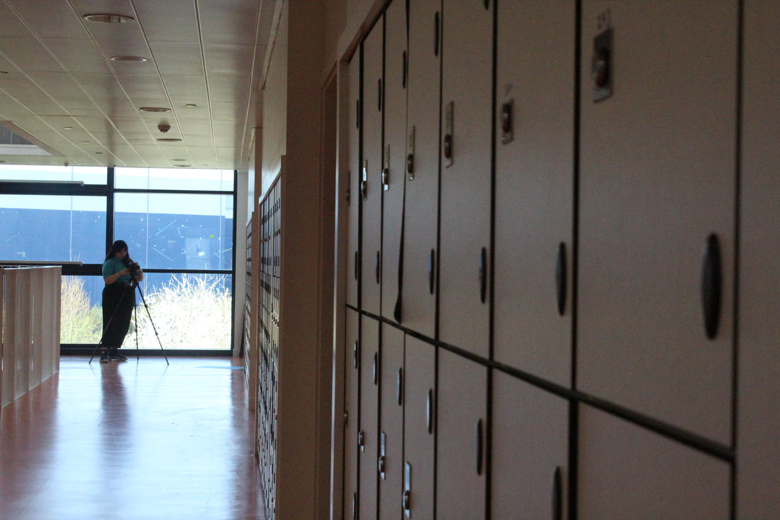
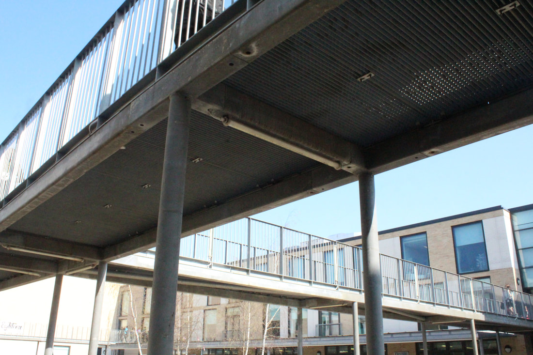
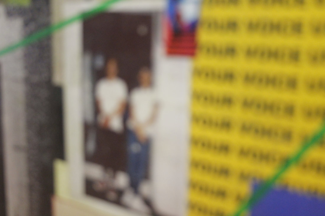
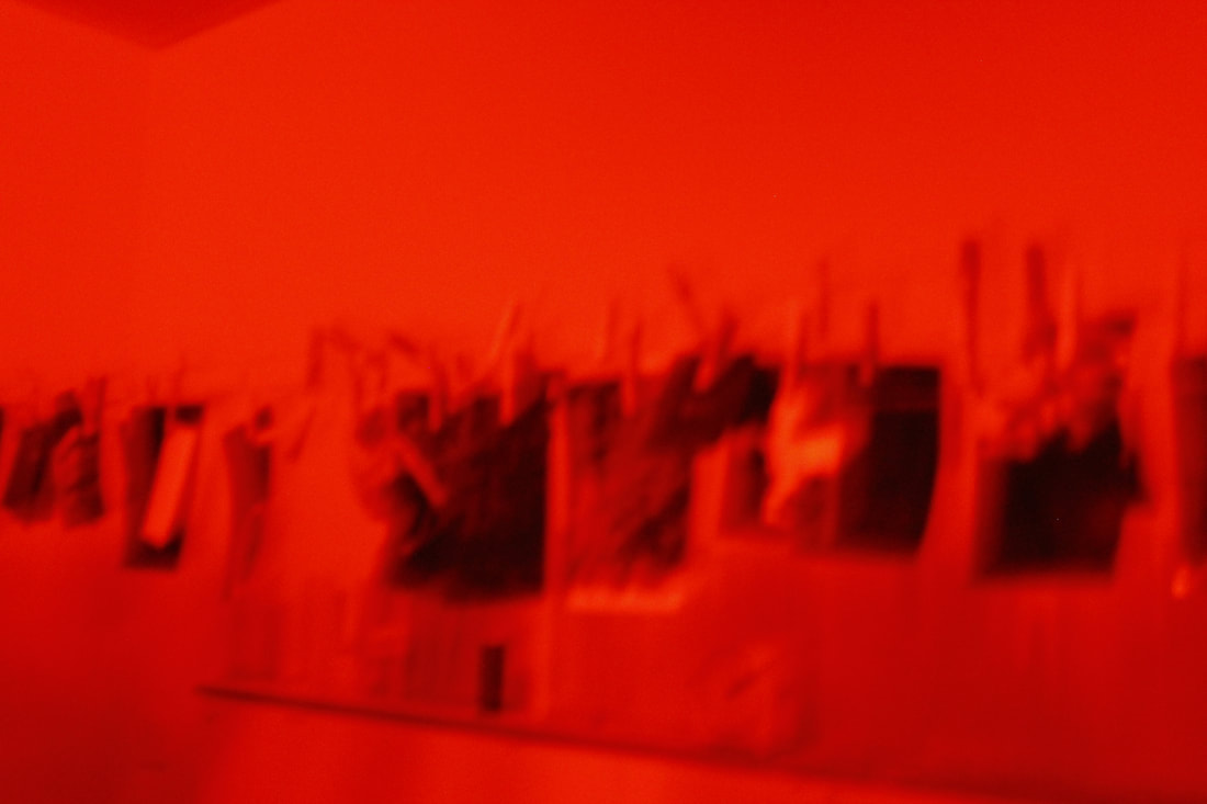
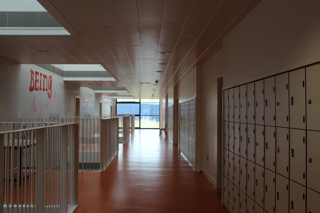
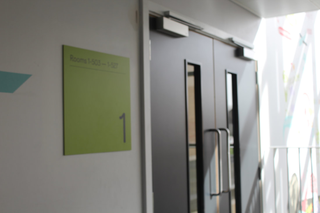
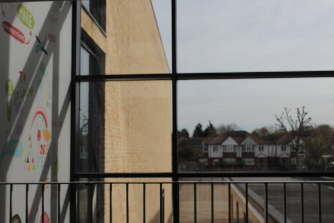
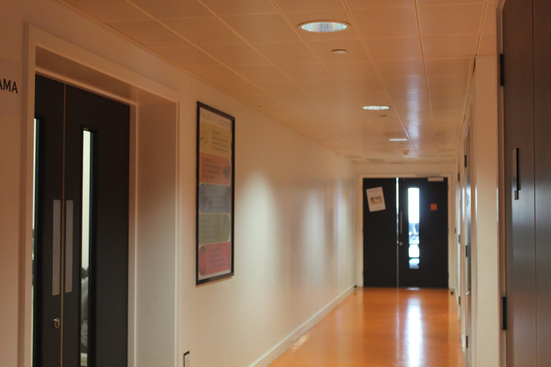
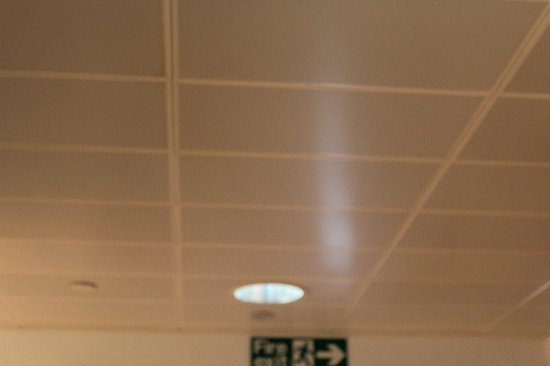
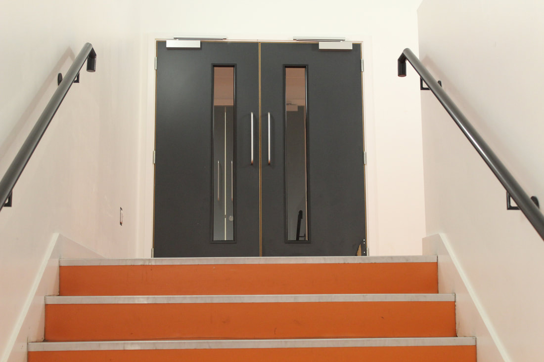
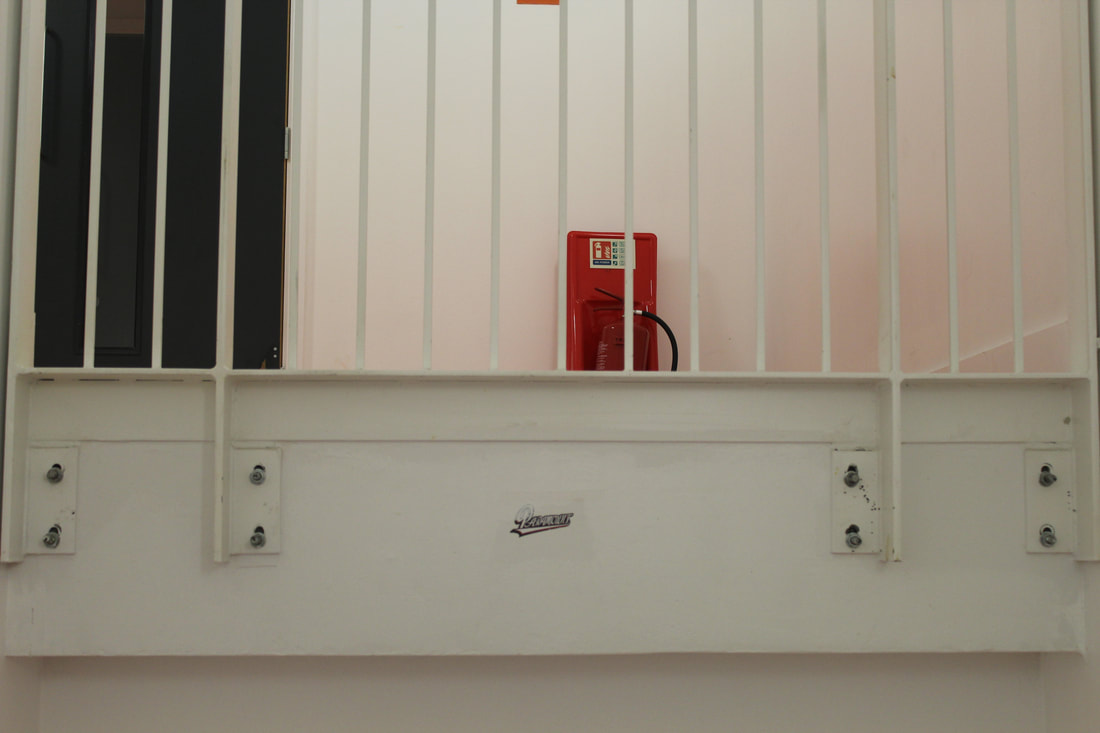
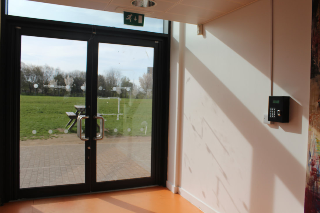
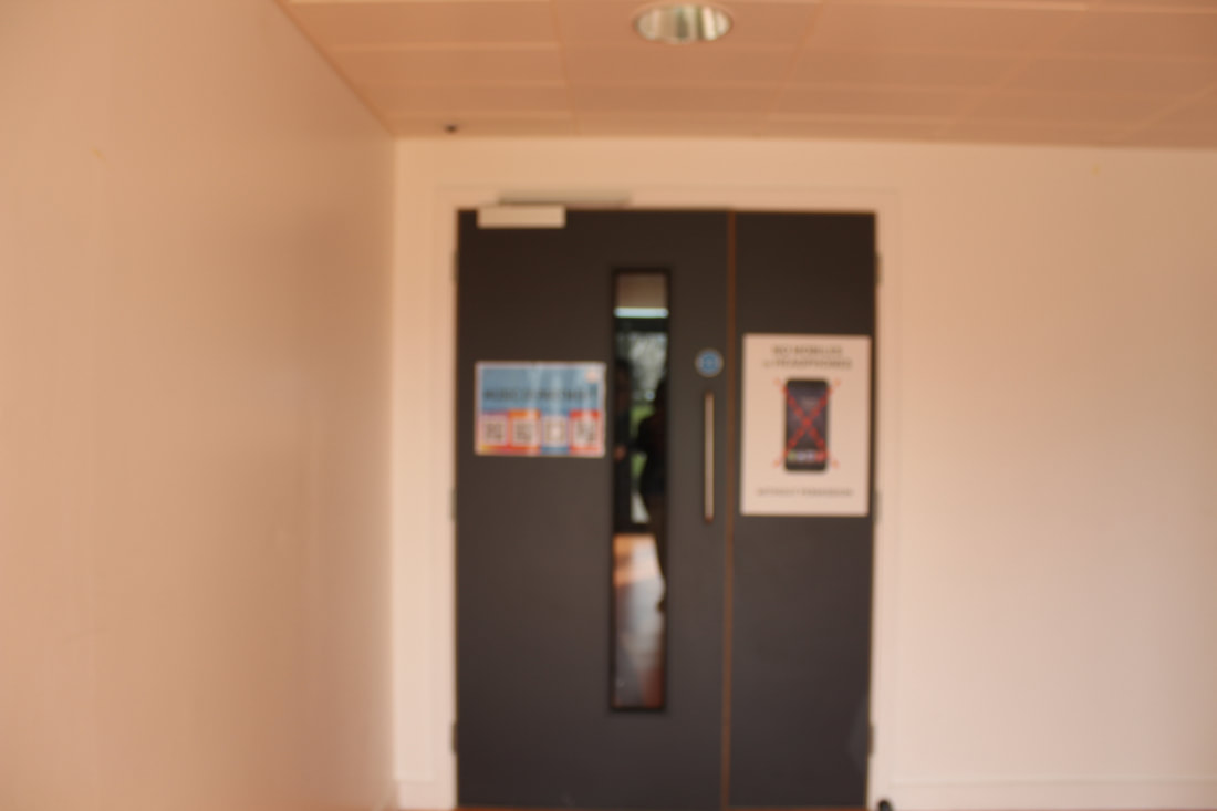
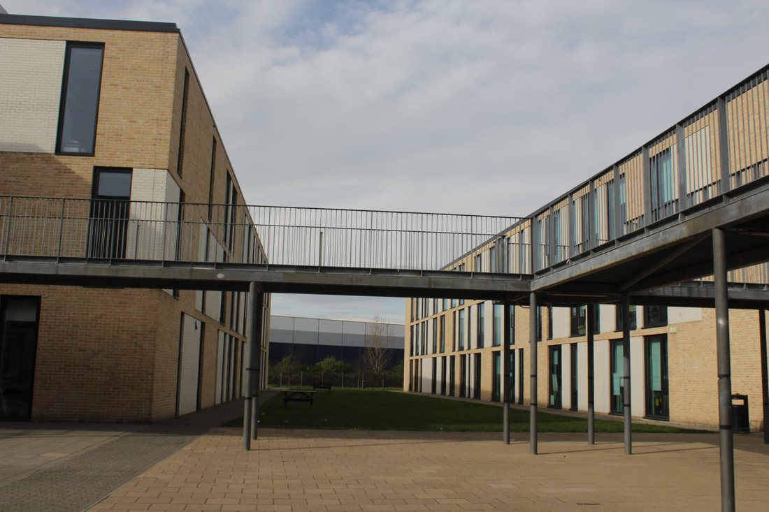
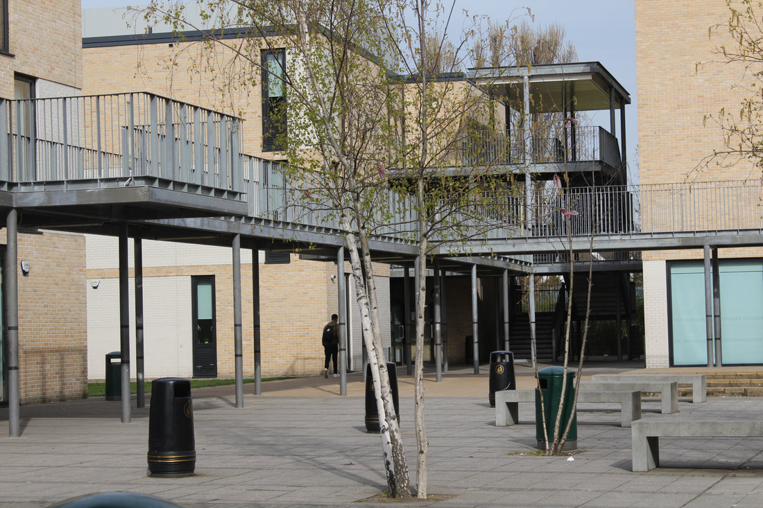
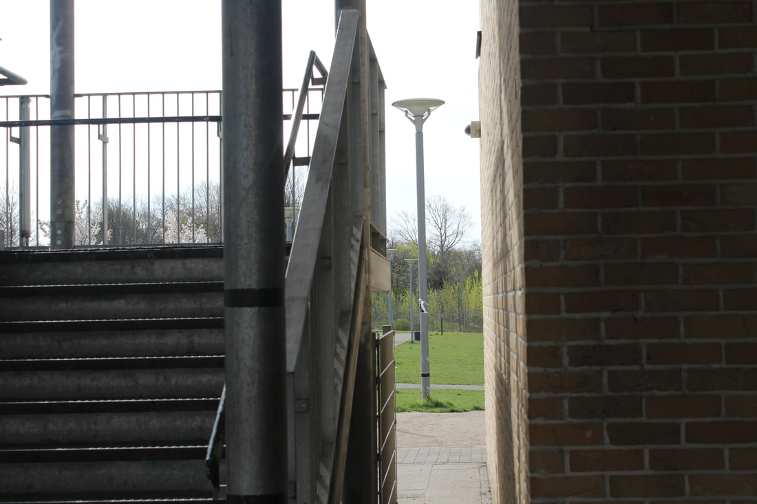
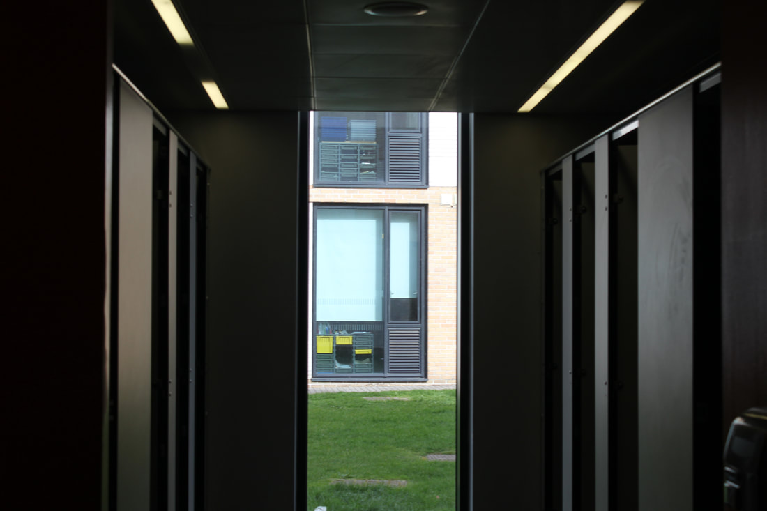
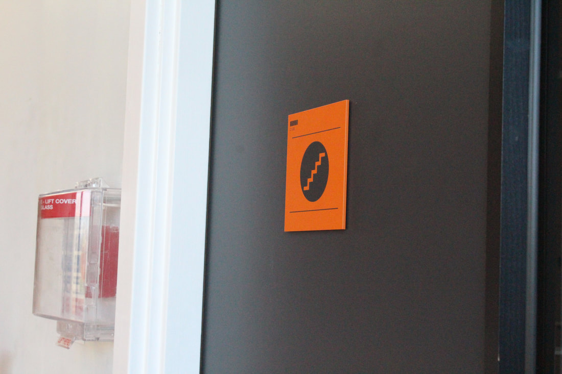
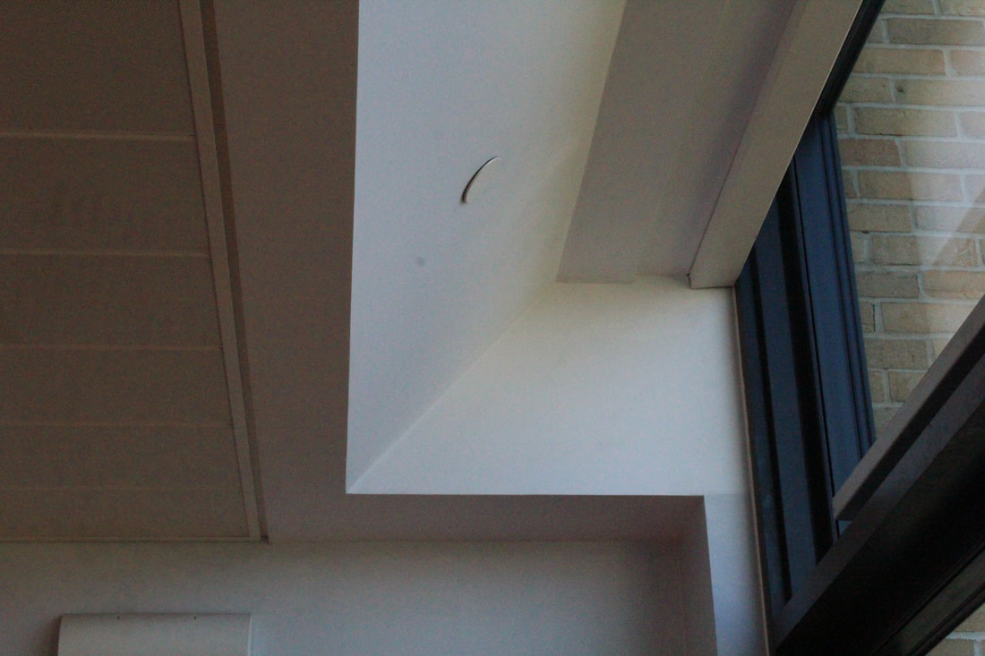
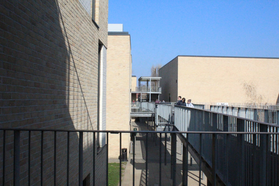
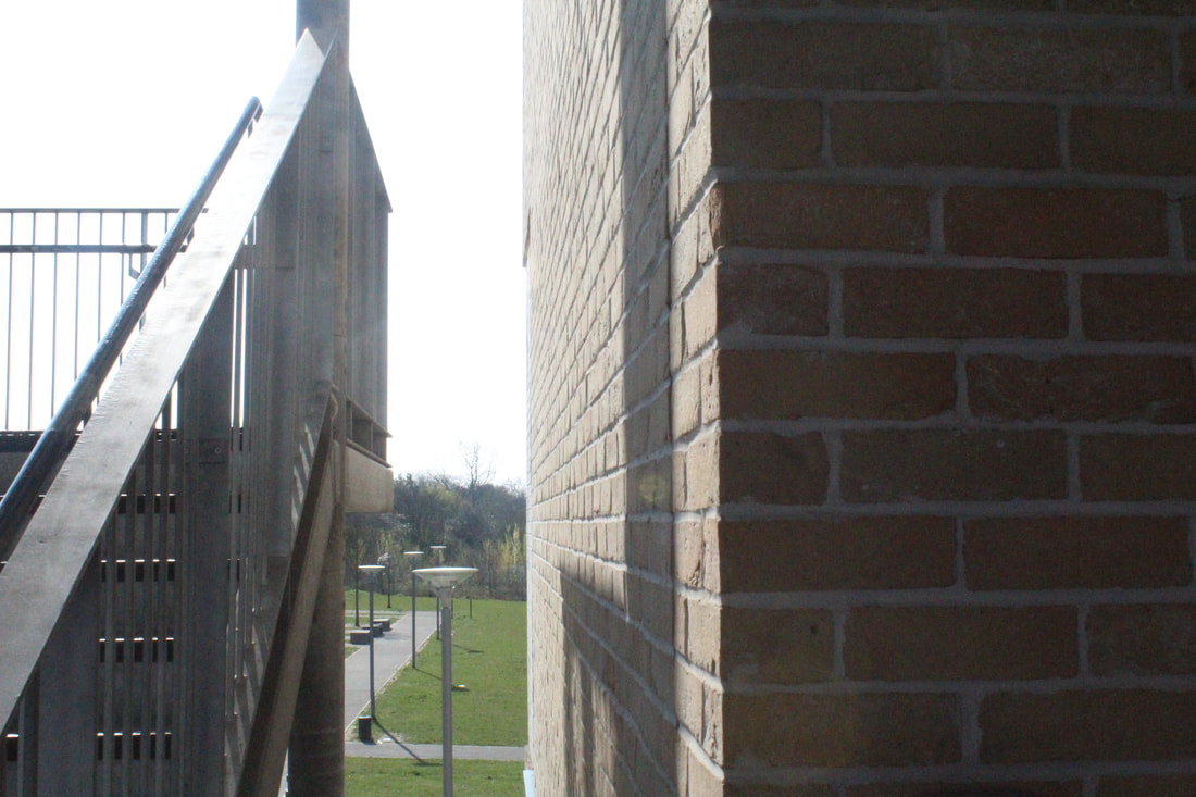
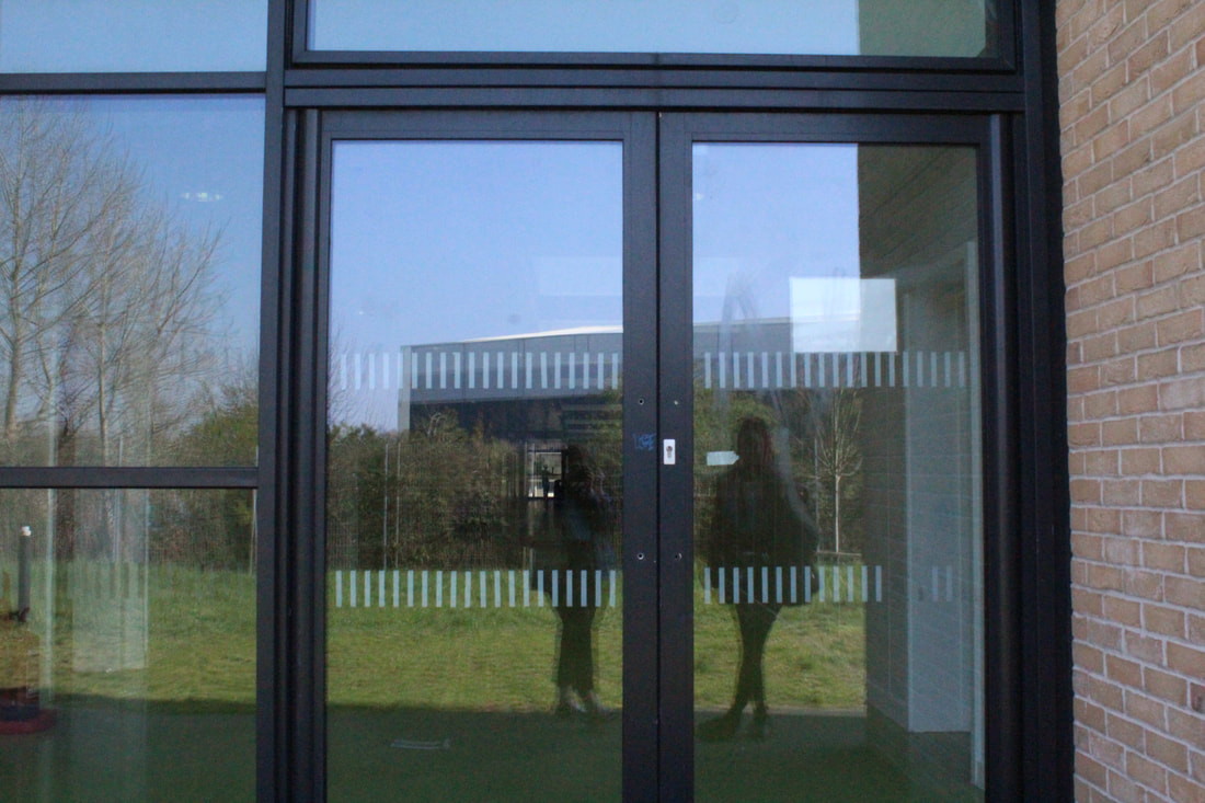
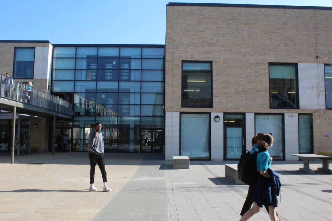
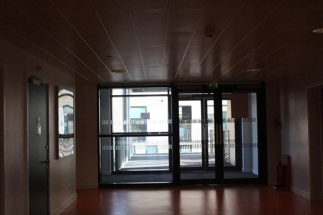
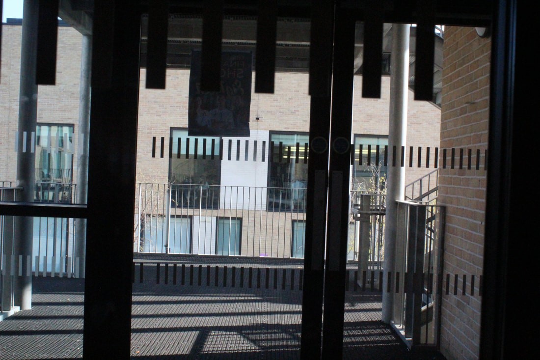
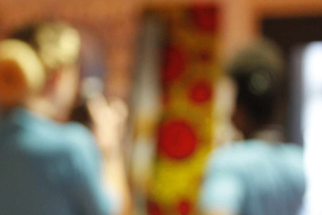
I decided to go out and take some pictures that really define the Formal Elements. I mainly focused on Lines, Texture and Shape. If I wasn't to focus on the formal elements I wouldn't have taken these picture for sure. I would have been distracted by the subject of the picture i was going to take.
WWW: I was very pleased on how my photos turned out.
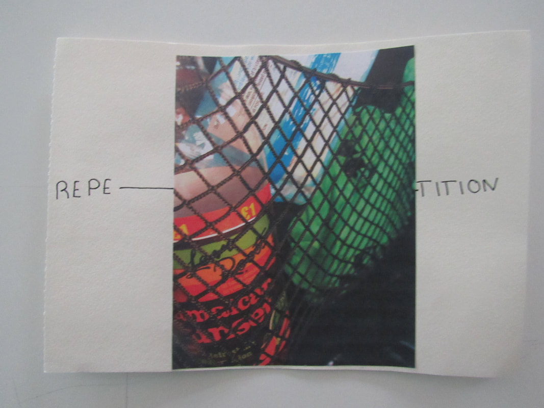
EBI: When i take more pictures Im going to focus on the repetition. And more different formal elements. |
|
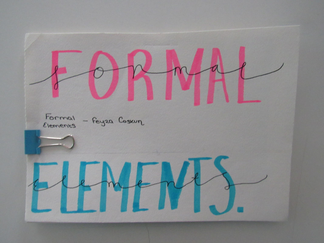
The Formal Elements:
|
Focus:
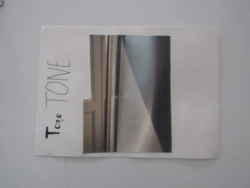
Light: Line: Repetiton: Shape: Space: Texture: Value/Tone: |
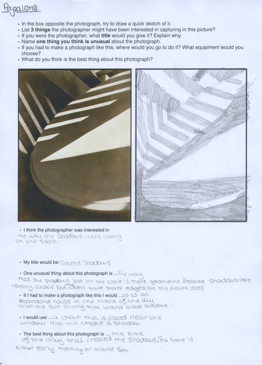
Which areas appear clearest or sharpest in the photograph? Which do not?
Which areas of the photograph are brightest? Are there any shadows? Does the photograph allow you to guess the time of day? Is the light natural or artificial? Harsh or soft? Reflected or direct? Are there objects in the photograph that act as lines? Are they straight, curvy, thin, thick? Do the lines create direction in the photograph? Do they outline? Do the lines show movement or energy? Are there any objects, shapes or lines which repeat and create a pattern? Do you see geometric (straight edged) or organic (curvy) shapes? Which are they? Is there depth to the photograph or does it seem shallow? What creates this appearance? Are there important negative (empty) spaces in addition to positive (solid) spaces? Is there depth created by spatial illusions i.e. perspective? If you could touch the surface of the photograph how would it feel? How do the objects in the picture look like they would feel? Is there a range of tones from dark to light? Where is the darkest value? Where is the lightest? |
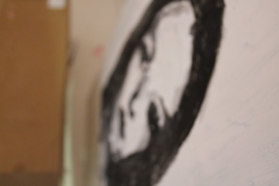
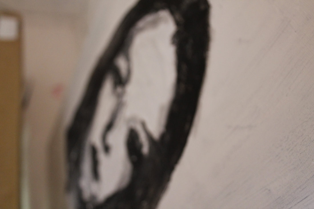
Antony Cairns, LDN5_051 2017 © Courtesy of the artist Antony Cairns
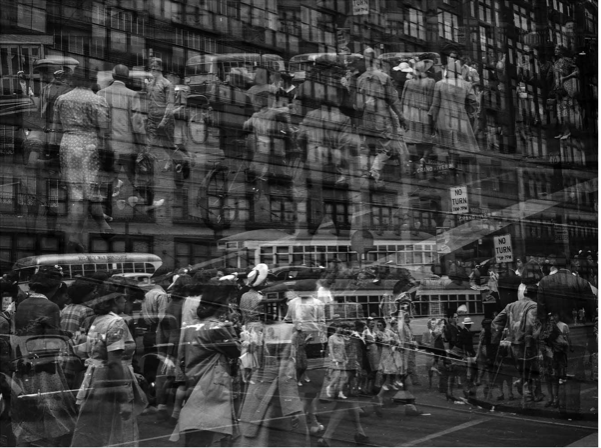
This picture represents abstraction the best for me because it makes you genuinely look at it and not be so passive about it.
My Response for Formal Elements:
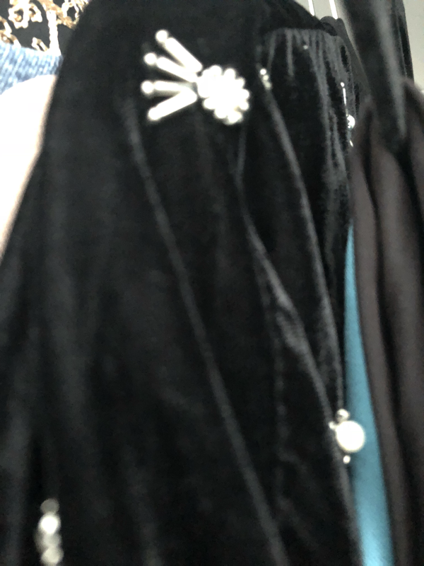
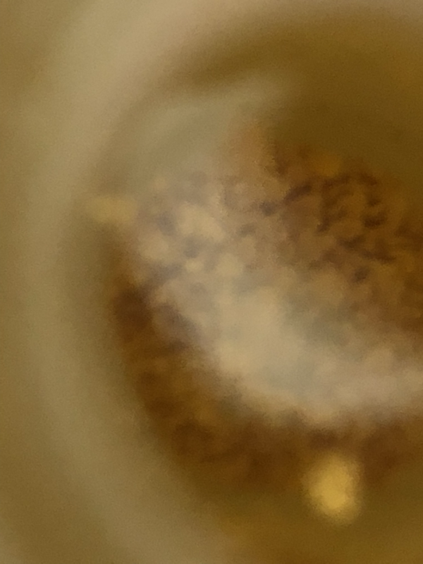
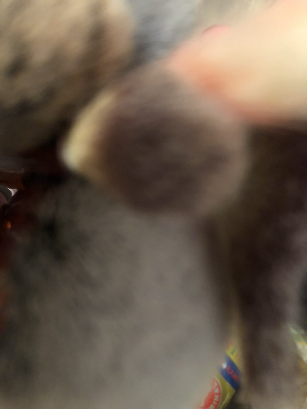
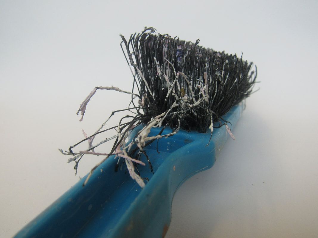
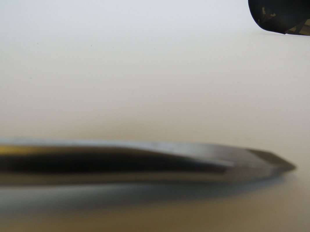
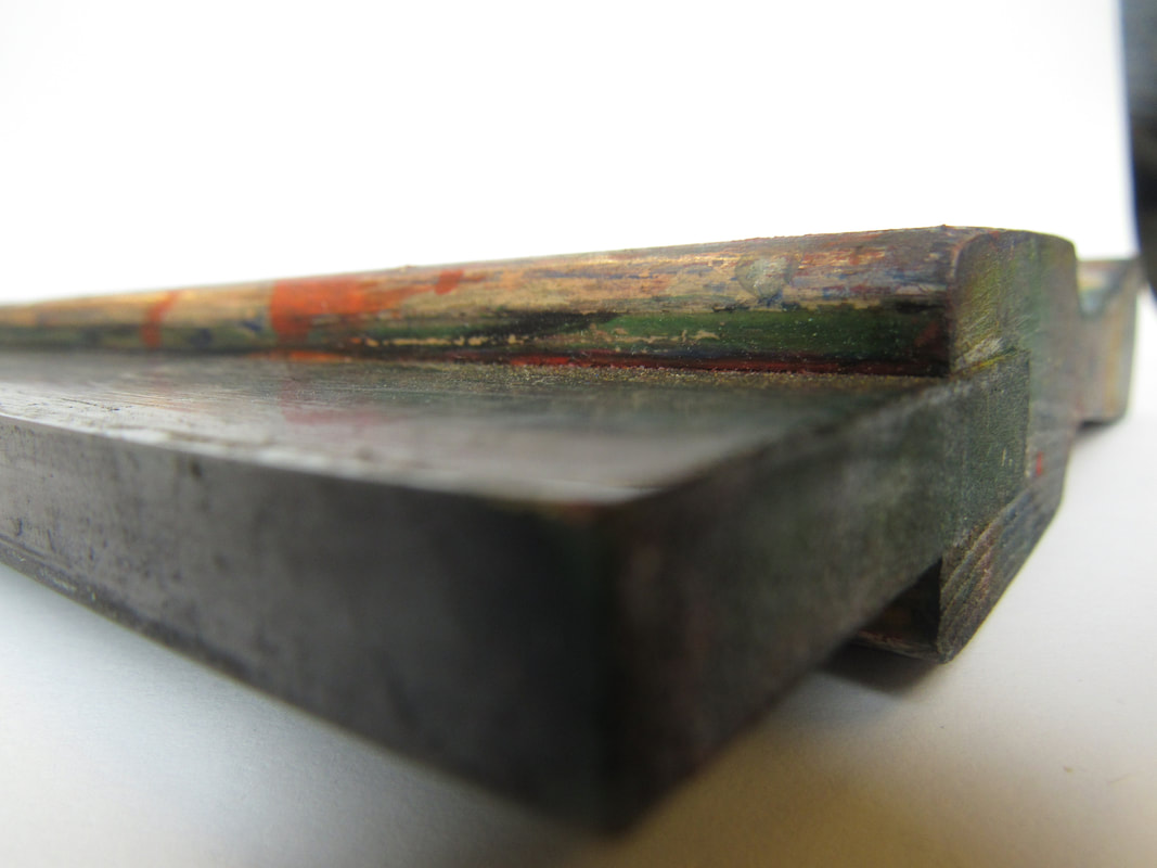
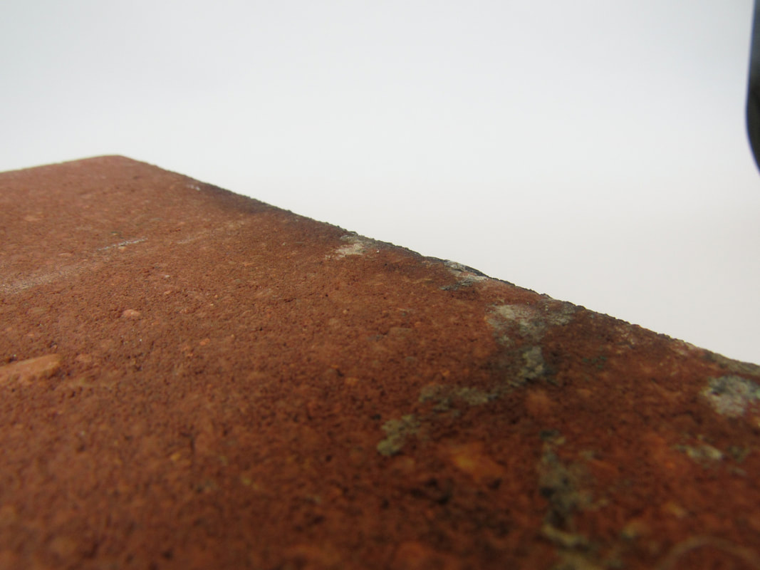
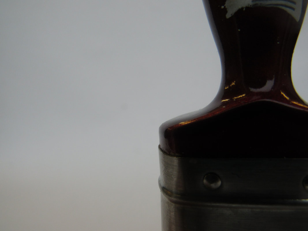
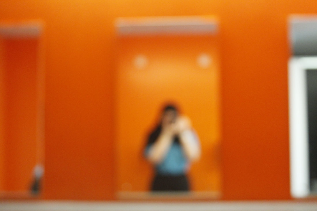
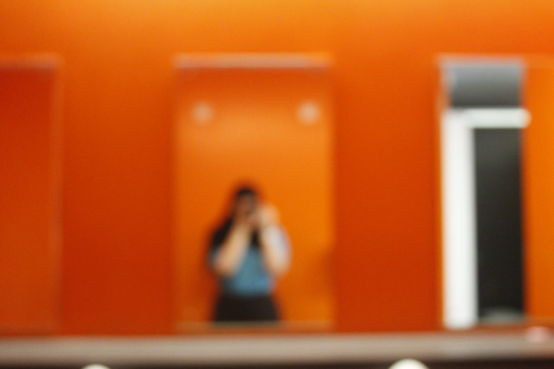
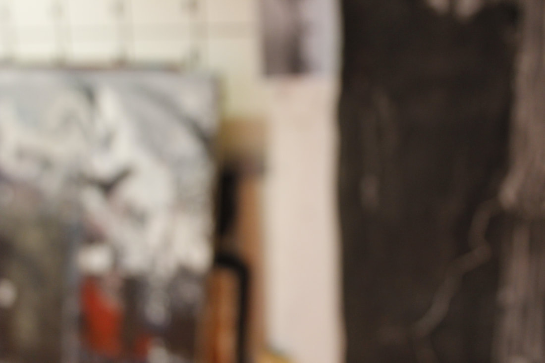
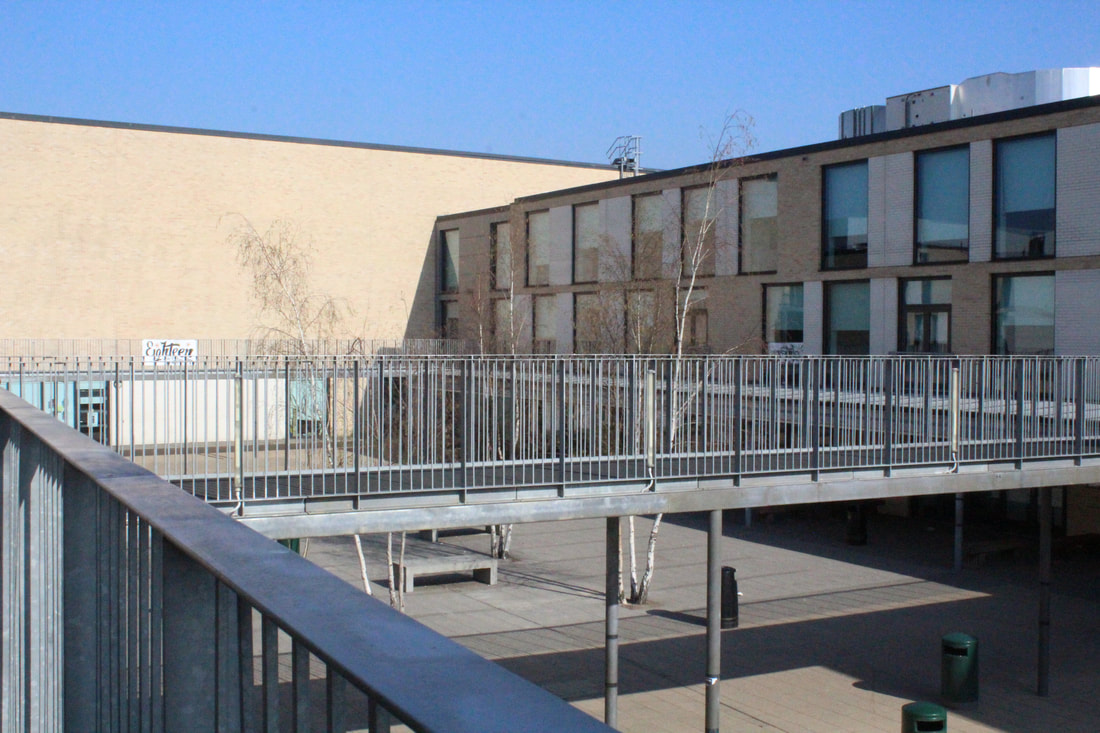
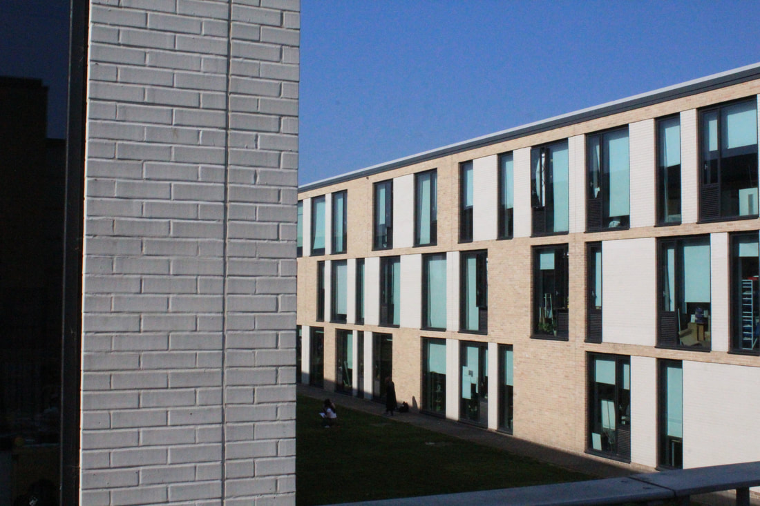
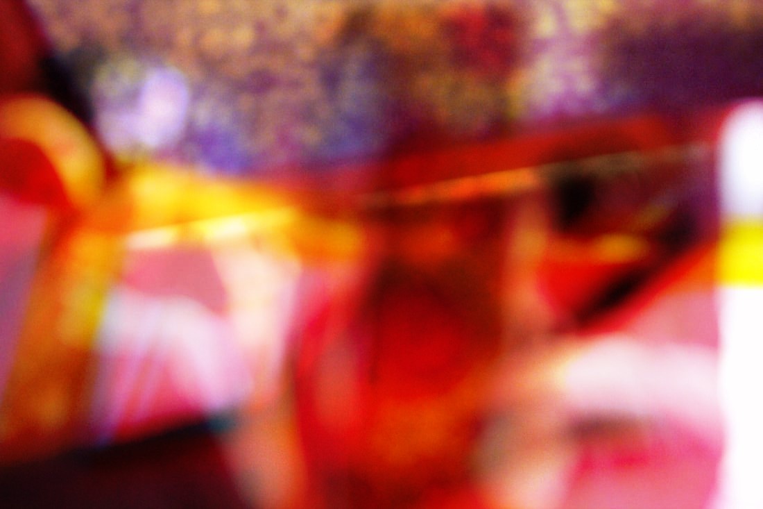
Anyone can look at something and call it abstract because for them its different they could be looking for texture on something. I chose to look at line and to create a photoshoot, here are my pictures:
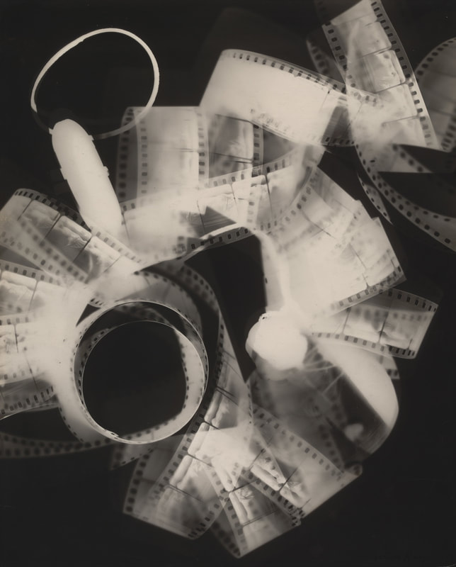
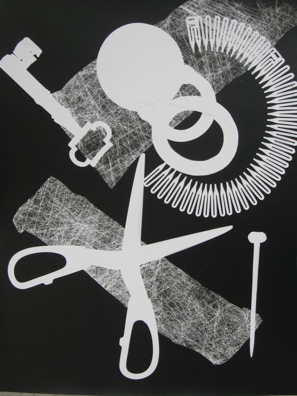
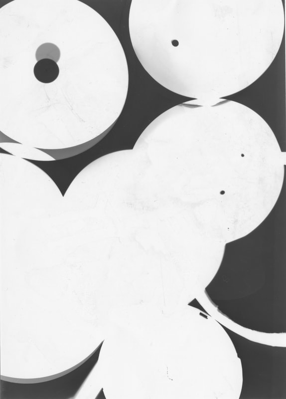
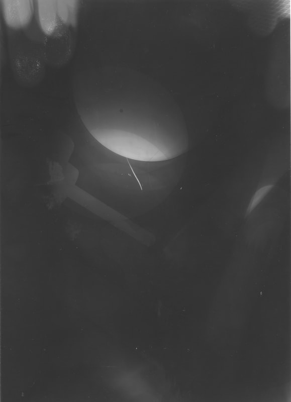
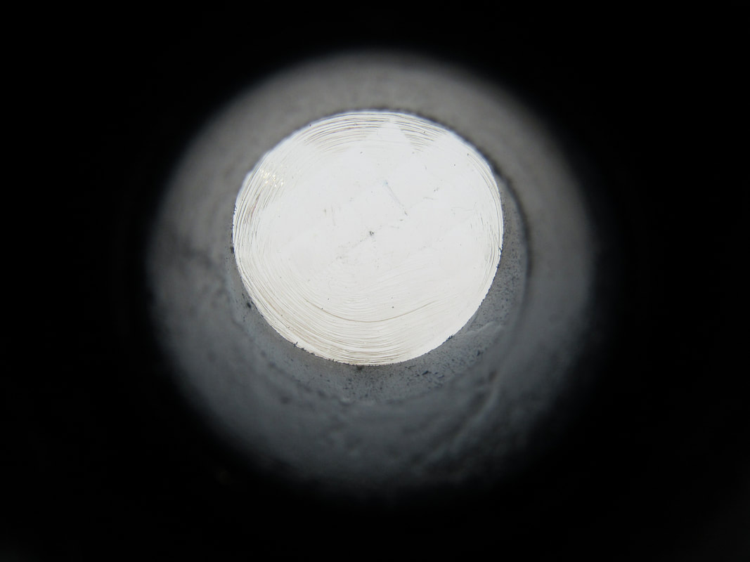
Photograms:
What is a photogram?
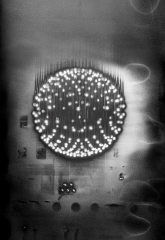
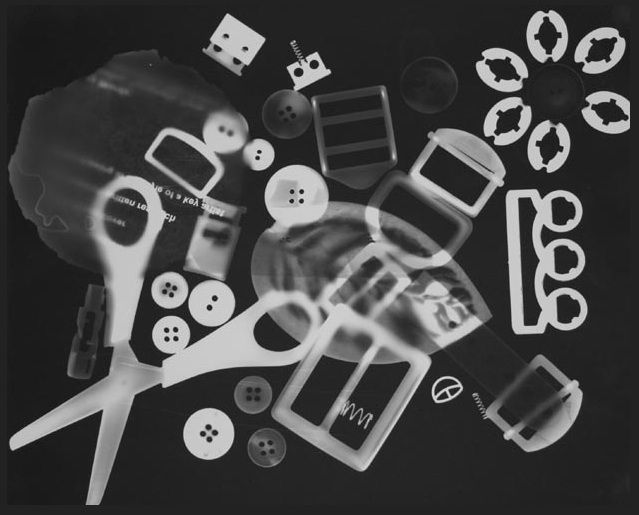
A photogram is an image where you don't need a camera at all. All you do is place objects on a light-sensitive material (photographic paper) and then expose it to light. Man Ray mostly used this technique and he made a nick name called Rayographs. Here are some of his photograms: .
Here are some examples of Photograms or Rayograms:
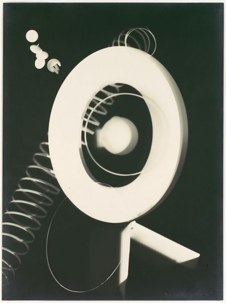
The first person to come up with Photograms ( Rayographs) was a man called Emmanuel Radnitzky or more commonly known as Man Ray. My favourite photogram of his is the first on from the left because you can't necessarily understand what it is but you know what he was aiming for. He uses curves and circles mostly to create a calming and symmetrical picture.
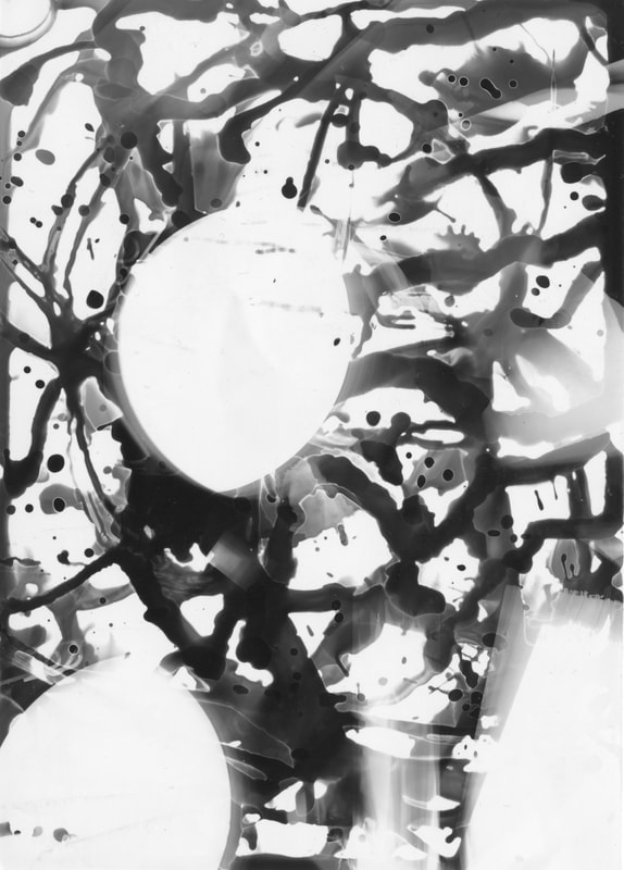
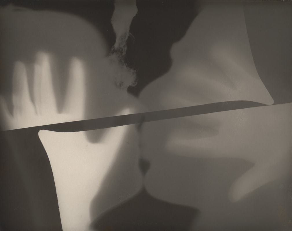
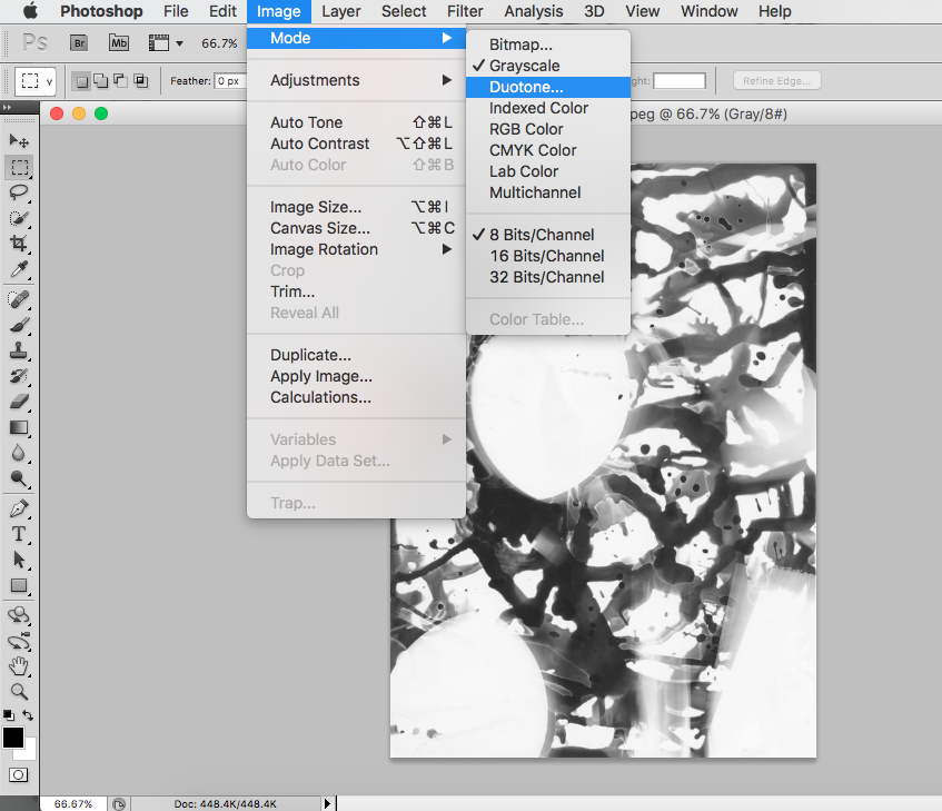
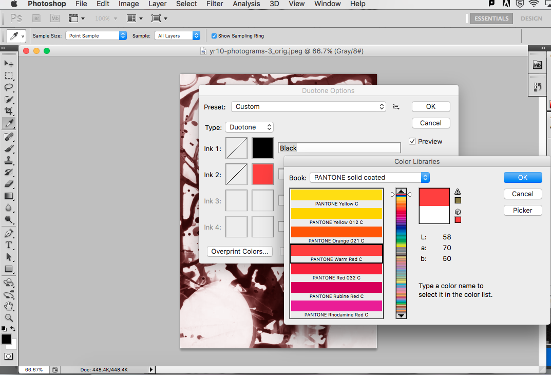
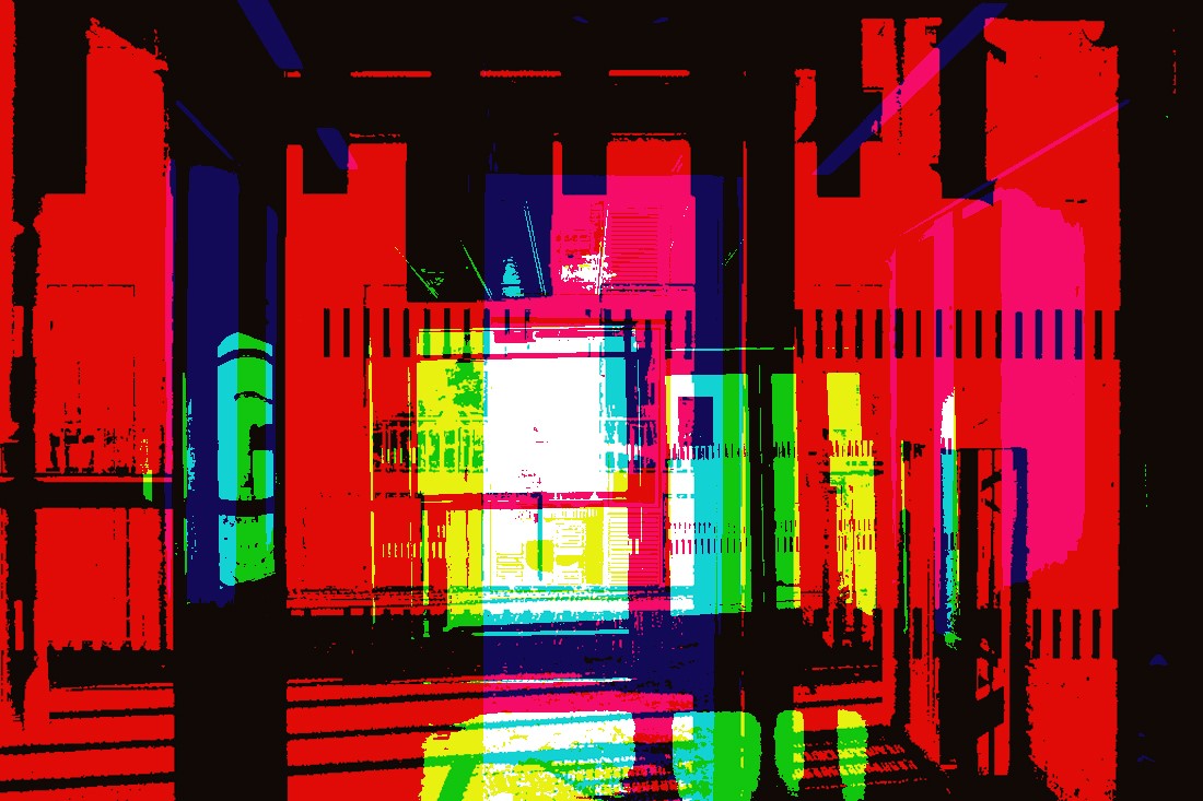
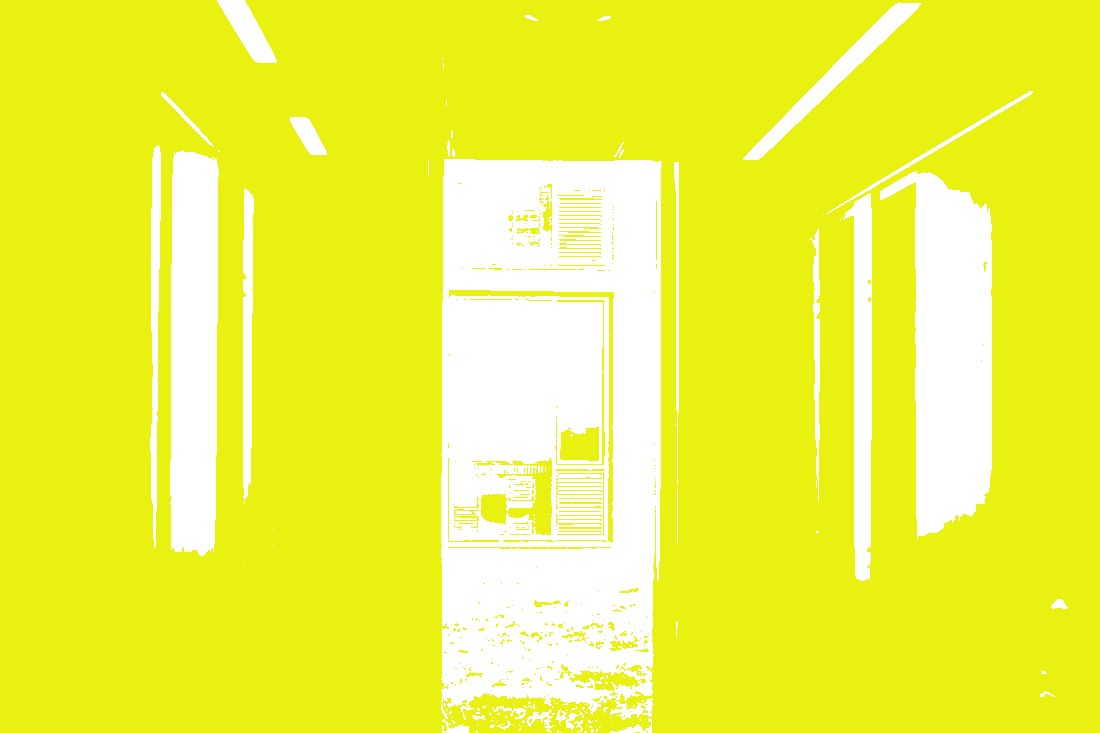
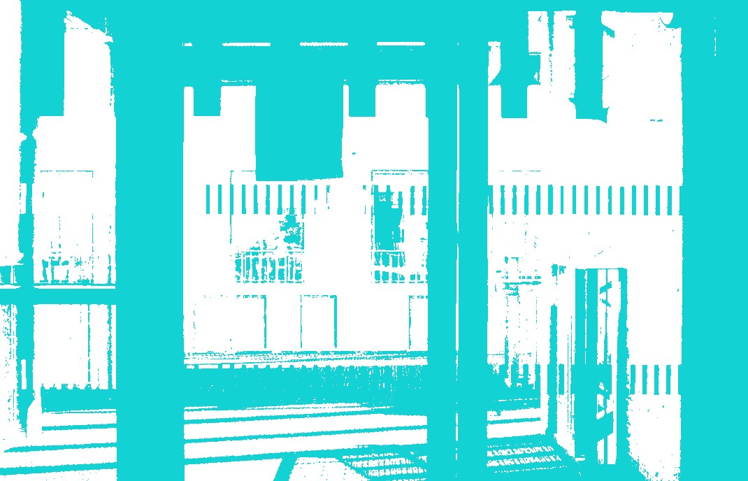
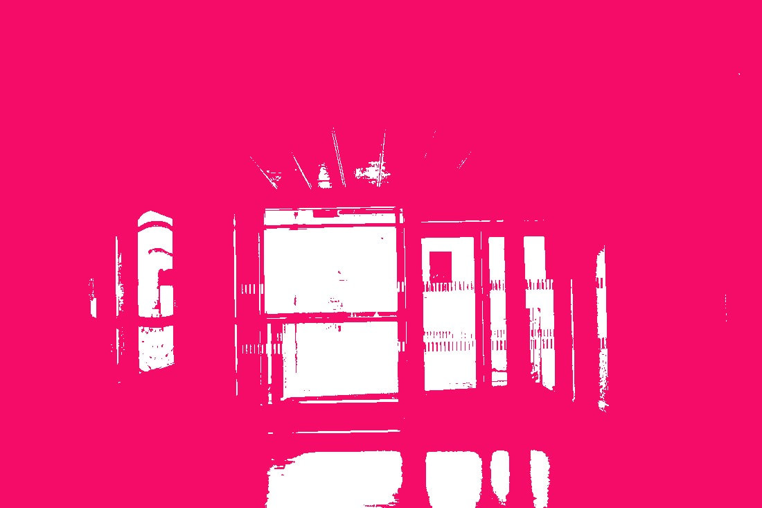
Duotone:
A duotone is simply 1 photogram that you have created then adjusting the colours to your liking, then adding another picture which isn't a photogram and merging them together to create an abstract picture.
Evaluation:
WWW:
The pictures I chose I was really happy with, and the way it turned out. The pictures I chose really complemented each other and I definitely wasn't expecting that especially when the light on the original, it complements each other really well and it turned out really well.
EBI: I could do more examples and make them really contrasting, and to also get the hang of it and not to be as confused as I was as the first few times as I was.


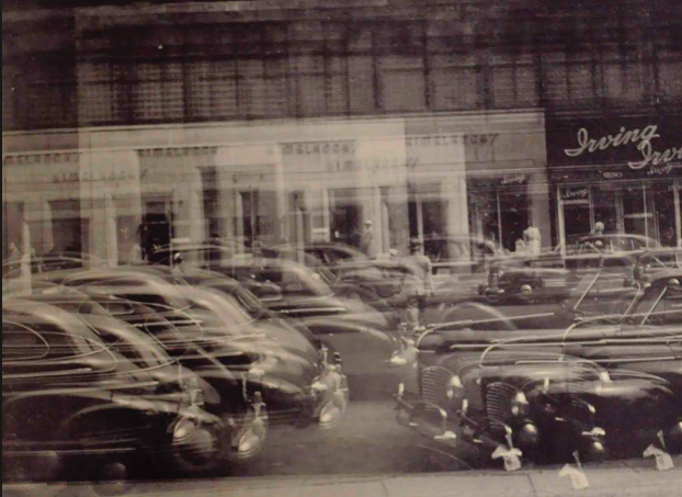
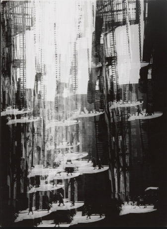
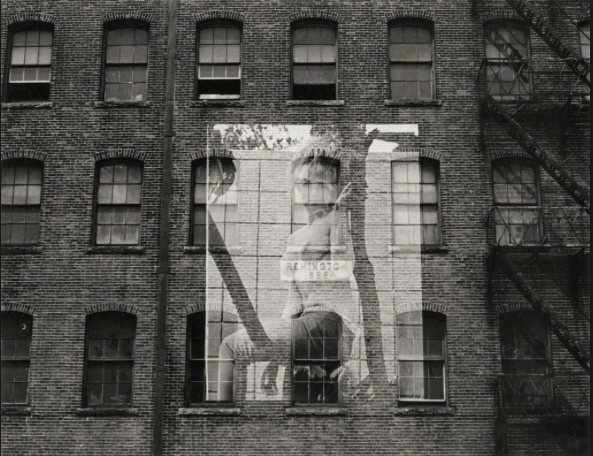
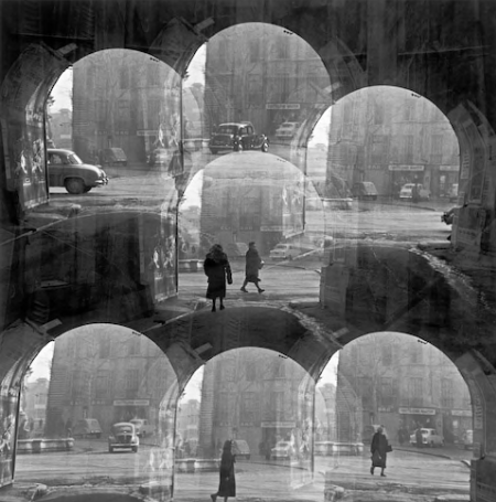
Harry Callahan:
|
|
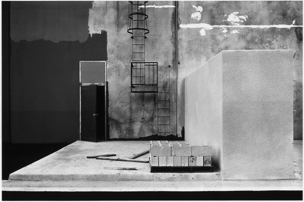
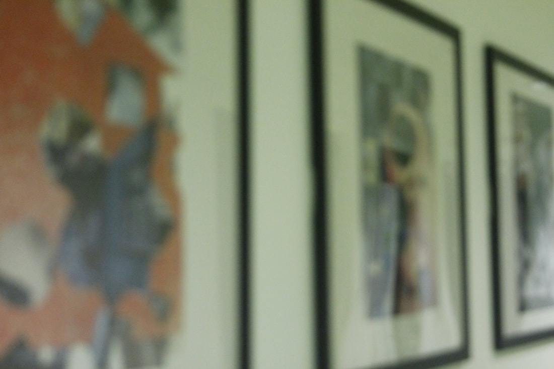
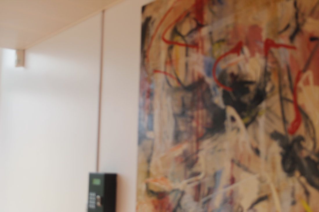
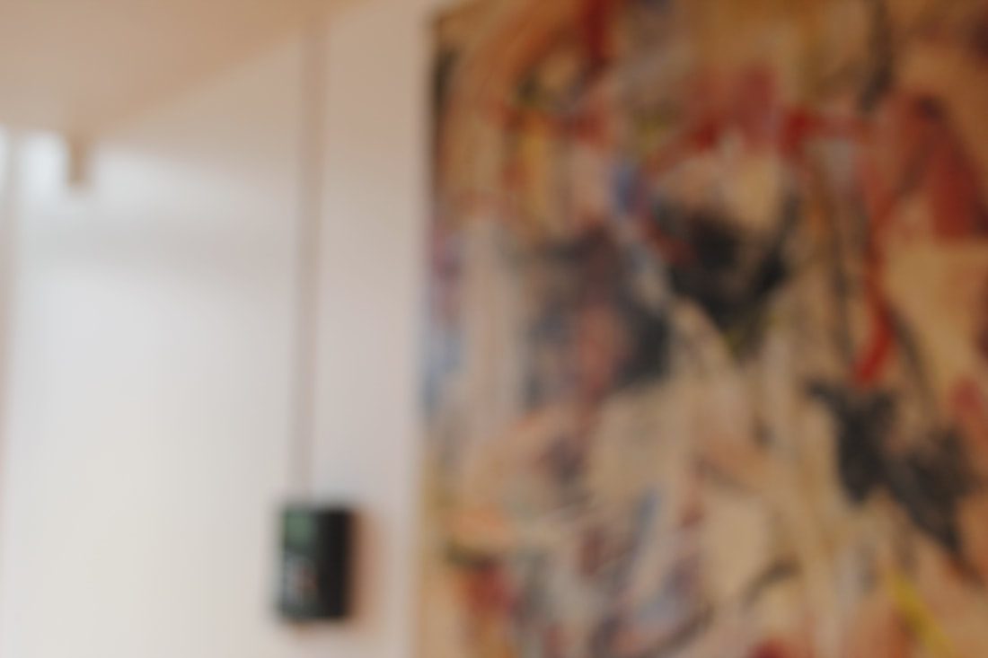
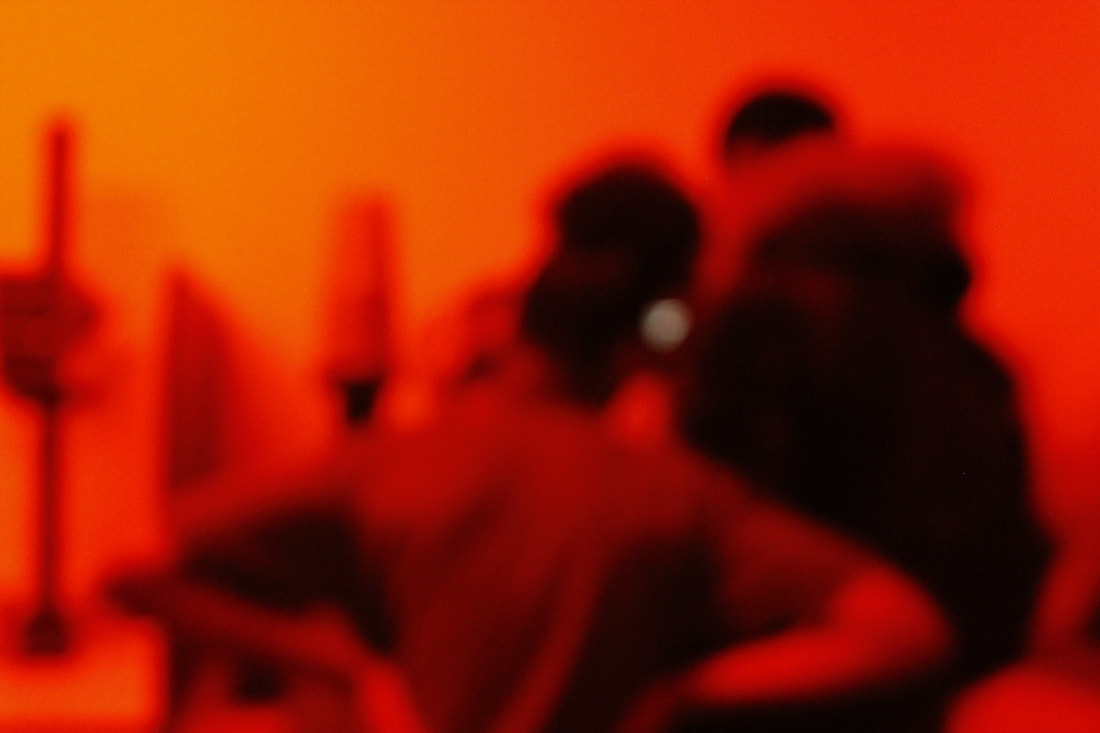
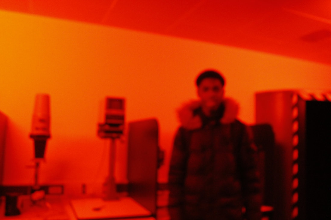
Harry Callahan's photography has been one of the most interesting to research about, he doesn't just simply take a picture and hope for the best he exposes his photographs or his camera which causes him to have an abstract picture, he also adds architecture into his pictures. Here are my favourite ones:
My favourite one is definitely the one with the cars and the women on the building. Because its just so unusual.
|
|
|
Callahan took pictures of 3 main things: Nature, Buildings, People. He would photograph for a while, leave it then return back to it. He, in other words, was a part time photographer. He was an all around photographer, or in his words he was an "art photographer", he would found a subject then photograph it. He was not that bothered on what his subject was specifically, but his pictures turned out really good. The pictures I chose he was staying in Providence because he was teaching at a university, so he was taking several pictures of buildings. He mostly used a wide angle sots, to get a lot of details and definition. He found architecture interesting because he lived in Chicago and he was just photographing the things around him. Chicago is famous for architecture because the land is so flat its the easiest to build from and that encourages architects to build beautiful, big skyscrapers. |
Assessment:
Puzzled’ em
Our challenge :
create our own version of the game "Puzzled 'Em", using our own pictures.We must decide:
1.How many cards that are going to be in the game.
2.The objects that we are going to use, to photograph for the game
3.How will we photograph the pictures? How will we confuse the player?
Remember, the aim of the game is to confuse the player by how you've photographed the objects.
Also remember, to document your process of this whole game, from the objects that you've chosen, to the box that will hold the cards.


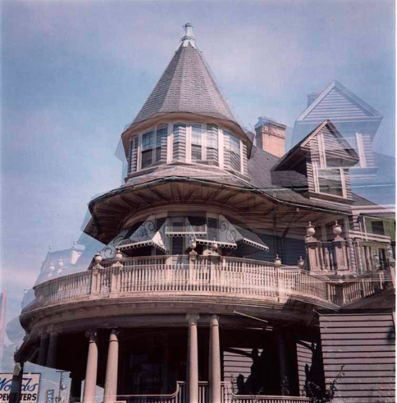
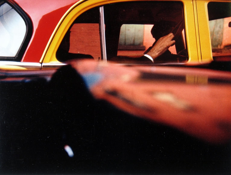
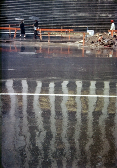
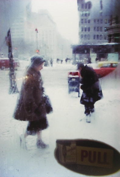
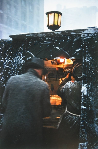
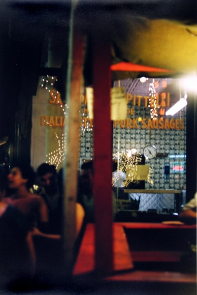
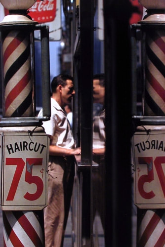
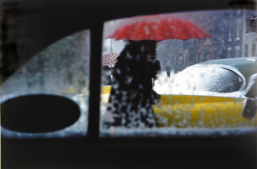
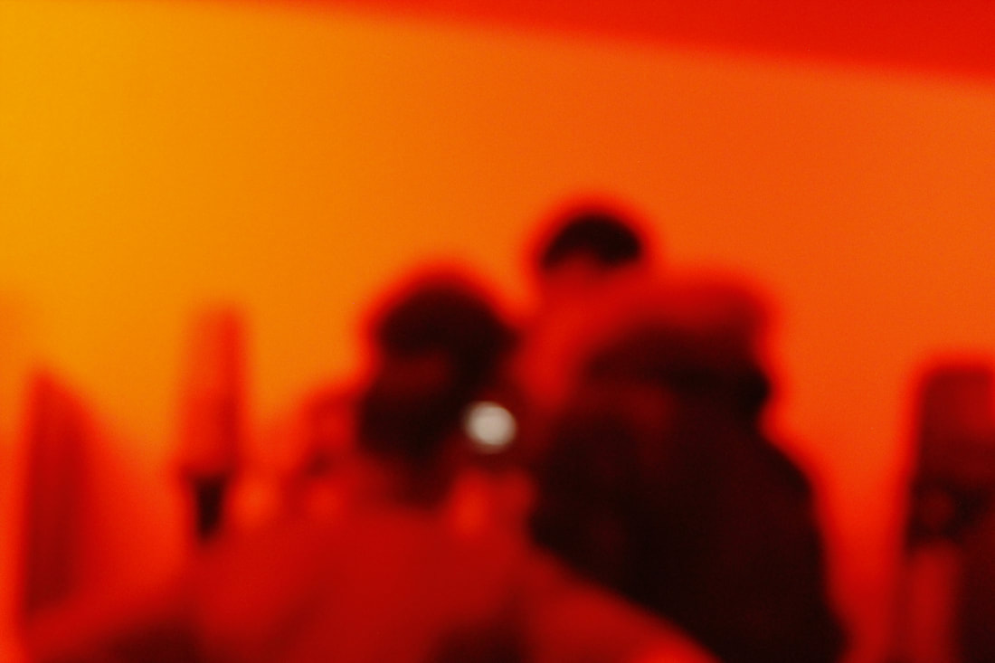
Saul Leiter:

Personal Project:
For my personal project I chose 3 formal elements and I found an artist for each:
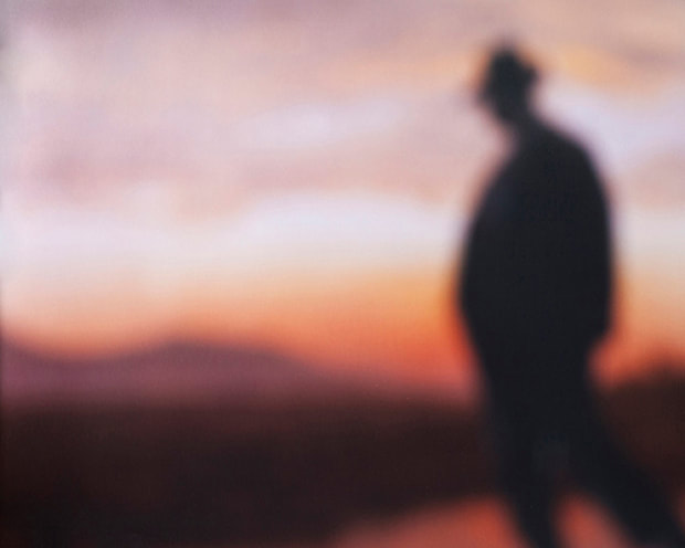
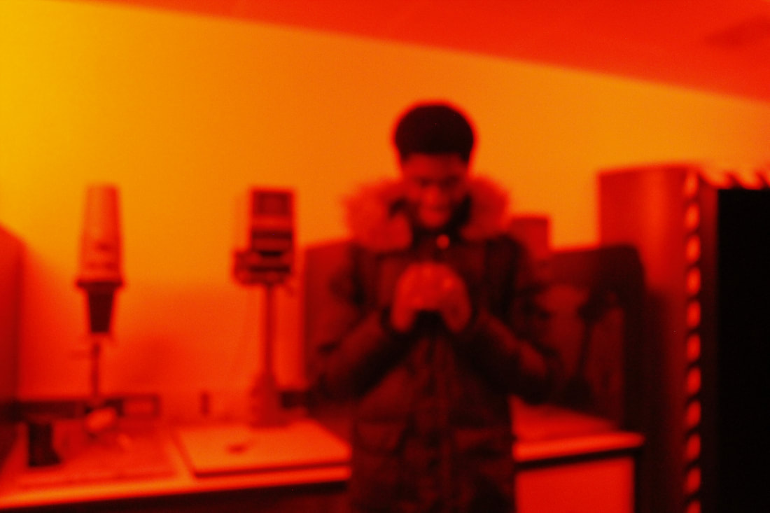
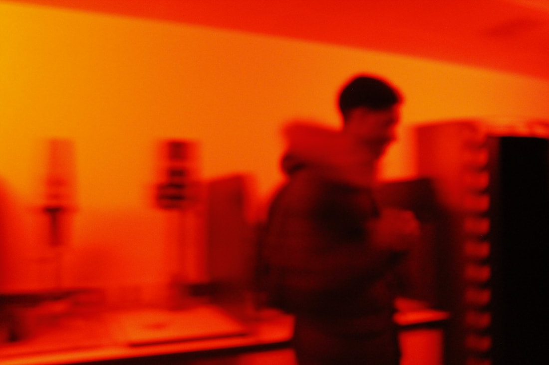
Focus/ no focus: Bill Armstrong
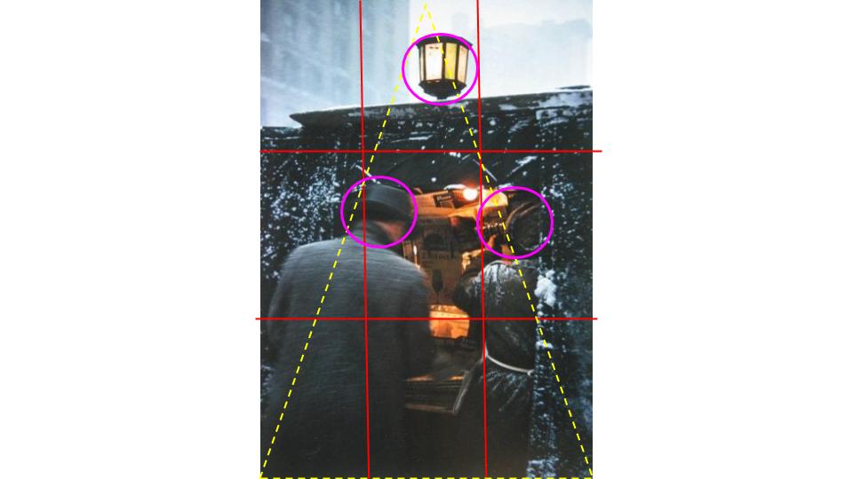
Line:Lewis Baltz
Colour: William Eggleston
The reason why I chose these photographers is because they all have their own interpretations on these formal elements.
I chose Armstrong for focus because you can tell what the subject is but not in so much detail just that its a figure.
I chose Baltz for line because he makes sure he only captures things where a lot of lines are visible.
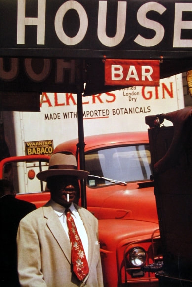
I chose Eggleston for colour because he has such a nice colour palette in the 1970s, it had such a nice aesthetic and I'm always interested in the 1970-2000 and he gives off that feeling which I really enjoy learning about.
I tried to replicate some of their pictures and this is what I got:
Focus/ no focus: Bill Armstrong
Line:Lewis Baltz
Colour: William Eggleston
The reason why I chose these photographers is because they all have their own interpretations on these formal elements.
I chose Armstrong for focus because you can tell what the subject is but not in so much detail just that its a figure.
I chose Baltz for line because he makes sure he only captures things where a lot of lines are visible.
I chose Eggleston for colour because he has such a nice colour palette in the 1970s, it had such a nice aesthetic and I'm always interested in the 1970-2000 and he gives off that feeling which I really enjoy learning about.
I tried to replicate some of their pictures and this is what I got:


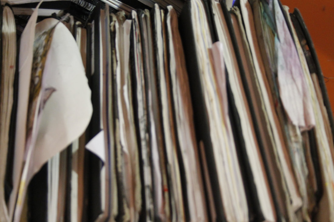
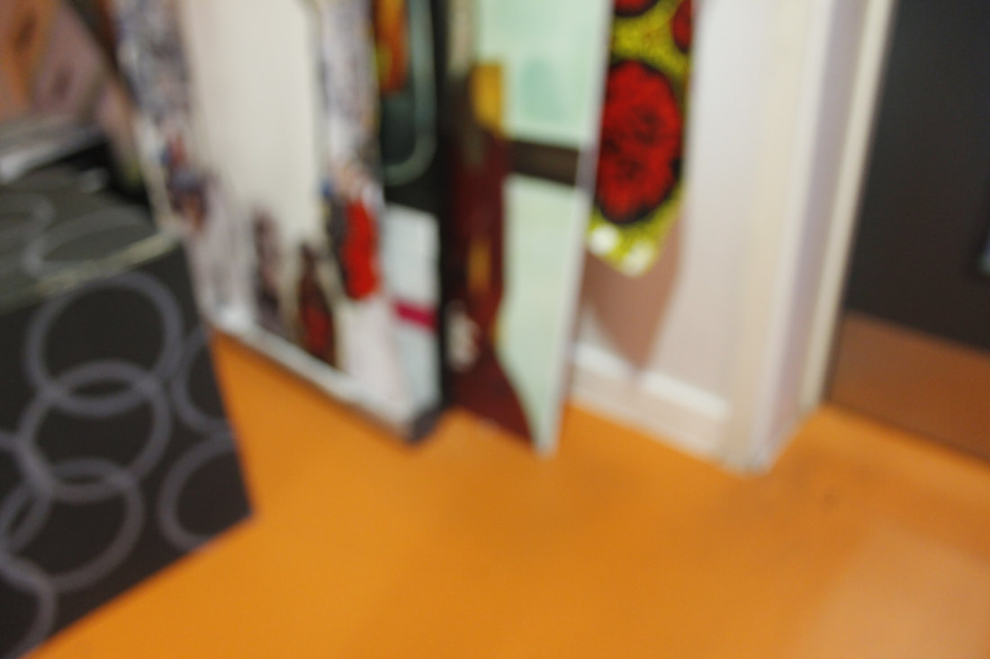
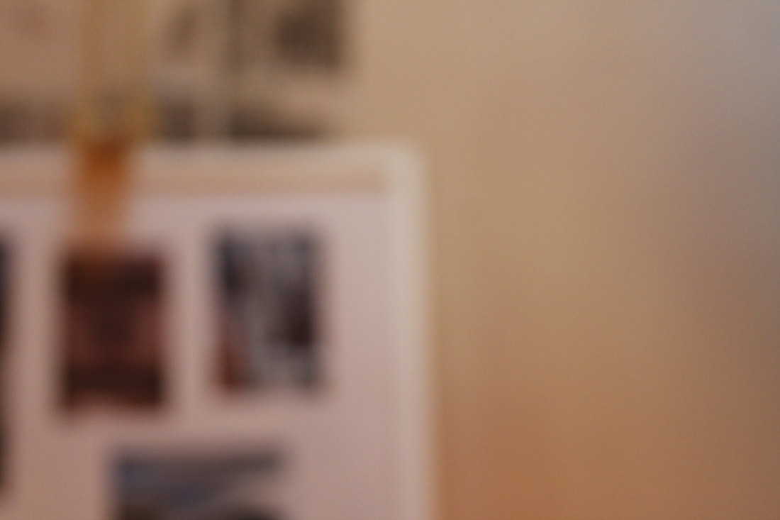


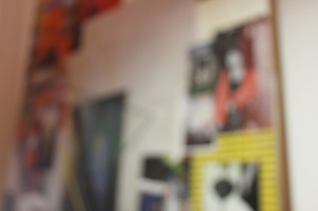
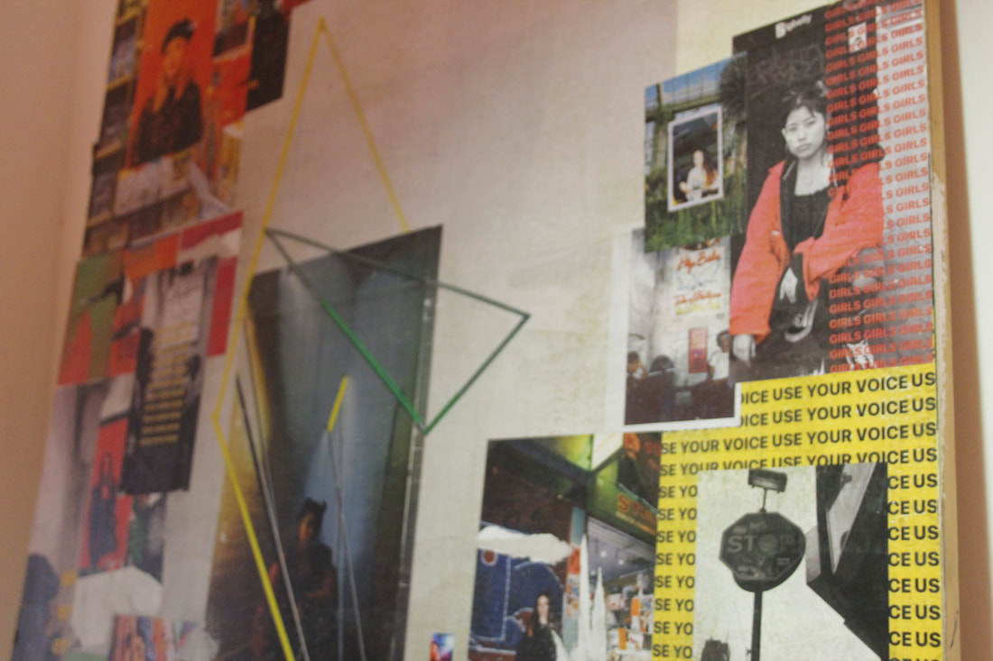
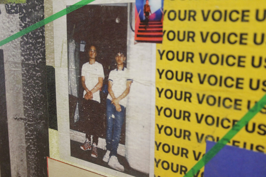

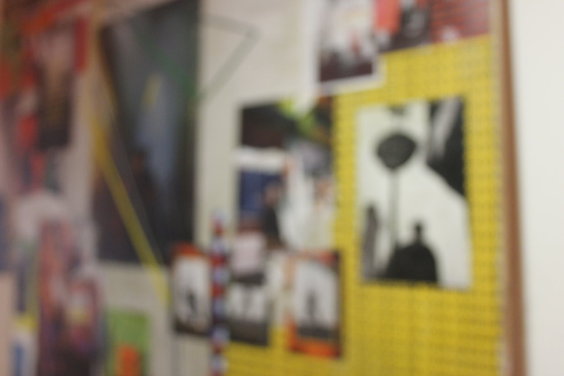


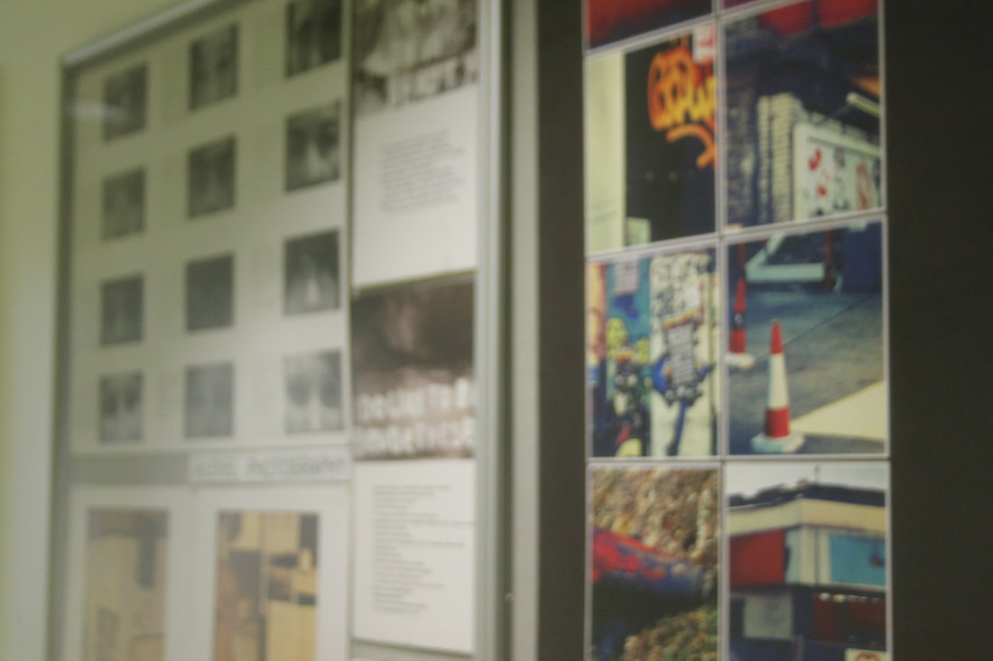
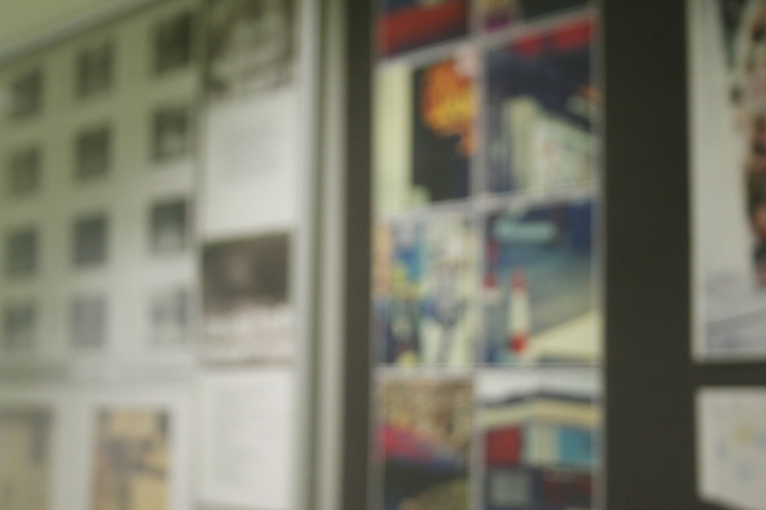


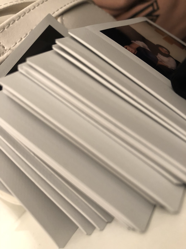
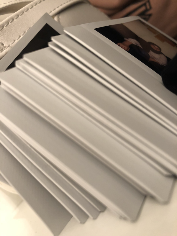
My Final Pieces Outcome:
I picked only a few of the pictures i took that i thought were good and worthy. i decided to put them on card because my outcome was so abstract that I didn't want to "confuse" the person who sees it.


I really liked this project that we done, it pushed me to be creative and improvise with things I didn't really want but then they turned out better then expected. The artists that i researched i.e; Harry Callahan and Sual Leiter, really helped with what I wanted to do. Researching about them allowed me to think about how I'm photographing something more care free but worrying about how it turned out only.